

 v2.1.0
alphabet_navigation
アルファベット順にインデックス付けされたリストビューを提供するFlutterパッケージ。
13いいね 7230日間ダウンロード150Pub ポイント
AndroidiOSWebmacOSWindowsLinux
アルファベットインデックス付きの動的でスクロール可能なリストビューを提供するFlutterパッケージ
以下は英語原文のスナップショットです。最新版は GitHub をご覧ください。


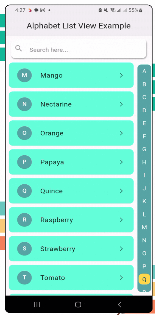
alphabet_navigation is a Flutter package that provides a dynamic, scrollable list view with an alphabetical index. It’s perfect for apps that need a quick and intuitive way to navigate long lists by alphabet.
To use the alphabet_navigation package, follow these steps:
Run this on your project terminal:
flutter pub add alphabet_navigation
or manually configure pubspec.yml file
Add the package to your pubspec.yaml file:
dependencies:
  alphabet_navigation: ^2.1.0 // replace with latest version
Run the following command to get the package:
flutter pub get
Here’s how you can use the AlphabetNavigation widget in your app:
AlphabetNavigation(
  stringList: stringList, // Pass the string list for alphabet mapping
  dynamicList: dynamicList, // Pass the dynamic list for content
  dynamicListHeight: 80, // Dynamic list height (optional)
  showSearchField: true, // Toggle for search field (optional)
  circleSelectedLetter: true, // Is circle apply for the selected letter (optional)
  itemBuilder: (context, index, searchFilterList) {}, // Item builder
)
AlphabetNavigation(
  stringList: stringList, // Pass the string list for alphabet mapping
  dynamicList: dynamicList, // Pass the dynamic list for content
  searchFieldHintText: "Search here...", // Search field hint text
  searchFieldTextStyle: TextStyle(
   color: Colors.blue.shade800,
   fontWeight: FontWeight.w500,
   fontSize: 16,
  ),
  searchFieldHintTextStyle: TextStyle(
    color: Colors.grey.shade300,
    fontWeight: FontWeight.w500,
    fontSize: 16,
  ),
  searchFieldIcon: Icon(Icons.search, color: Colors.blue.shade800,), // Search field icon
  searchFieldEndIconColor: Colors.blue.shade800, // Search field clear icon color
  listDirection: ListDirection.left, // Direction of the list. If [ListDirection.left], the list will be from right to left (optional)
  showSearchField: true, // Toggle for search field (optional)
  circleSelectedLetter: true, // Is circle apply for the selected letter (optional)
  itemBuilder: (context, index, searchFilterList) {}, // Item builder
)
AlphabetNavigation(
  stringList: stringList, // Pass the string list for alphabet mapping
  dynamicList: dynamicList, // Pass the dynamic list for content
  showSearchField: true, // Toggle for search field (optional)
  alphabetListBackgroundColor: Colors.tealAccent, // Alphabet list background color
  selectedColor: Colors.white70, // Selected color for the alphabet
  unselectedColor: Colors.black38, // Unselected color for the alphabet
  circleSelectedLetter: true, // Is circle apply for the selected letter (optional)
  circleSelectedBackgroundColor: Colors.blue, // Selected circle background color
  itemBuilder: (context, index, searchFilterList) {}, // Item builder
)
AlphabetNavigation(
  stringList: stringList, // Pass the string list for alphabet mapping
  dynamicList: dynamicList, // Pass the dynamic list for content
  showSearchField: false, // Toggle for search field (optional)
  circleSelectedLetter: false, // Is circle apply for the selected letter (optional)
  itemBuilder: (context, index, searchFilterList) {}, // Item builder
)
AlphabetNavigation(
  stringList: stringList, // Pass the string list for alphabet mapping
  dynamicList: dynamicList, // Pass the dynamic list for content
  circleSelectedLetter: false, // Is circle apply for the selected letter (optional)
  alphabetListBackgroundColor: Colors.transparent, // Alphabet list background color
  selectedColor: Colors.blue, // Selected color for the alphabet
  unselectedColor: Colors.grey.shade600, // Unselected color for the alphabet
  itemBuilder: (context, index, searchFilterList) {}, // Item builder
)
AlphabetNavigation(
  stringList: stringList, // Pass the string list for alphabet mapping
  dynamicList: dynamicList, // Pass the dynamic list for content
  showSearchField: true, // Toggle for search field (optional)
  circleSelectedLetter: true, // Is circle apply for the selected letter (optional)
  circleBorderRadius: 50.0, // Border radius for the selected letter circle and alphabet list border
  scrollAnimationCurve: Curves.easeInCubic, // Scroll animation curve
  itemBuilder: (context, index, searchFilterList) {}, // Item builder
)
| Example 1 | Example 2 | Example 3 |
|---|---|---|
| Example 4 | Example 5 | Example 6 |
|---|---|---|
| Parameter | Type | Description |
|---|---|---|
stringList |
List<String> |
List of strings for alphabetical grouping. |
dynamicList |
List<dynamic> |
Data list to be displayed. |
dynamicListHeight |
double |
Dynamic list height. |
listDirection |
ListDirection |
Direction of the list. |
showSearchField |
bool |
Toggle for search field. |
searchFieldTextStyle |
TextStyle |
Search field text style. |
searchFieldHintText |
String |
Search field hint text. |
searchFieldHintTextStyle |
TextStyle |
Search field hint style. |
searchFieldIcon |
Icon |
Search field icon. |
searchFieldBackgroundColor |
Color |
Search field background color. |
searchFieldEndIconColor |
Color |
Search field icon color. |
alphabetListBackgroundColor |
Color |
Alphabet list background color. |
selectedColor |
Color |
Selected alphabet color |
unselectedColor |
Color |
Unselected alphabet color |
circleSelectedLetter |
bool |
Is circle apply for the selected letter. |
circleSelectedBackgroundColor |
Color |
Circle background color for the selected letter. |
circleBorderRadius |
double |
Border radius for the selected letter circle |
scrollAnimationCurve |
Curve |
Scroll animation curve. |
itemBuilder |
Function(BuildContext, int, dynamic) |
Function to build list items dynamically. |
Here are some planned features for future releases:
We welcome contributions from the community! If you encounter any issues or have feature suggestions, feel free to open an issue or submit a pull request on our GitHub repository.
This project is licensed under the MIT License - see the LICENSE file for details.

依存関係一覧 3 件
{"sdk":"flutter"}{"sdk":"flutter"}^2.0.0用途で絞り込み、開発状況を比較し、採用前に元のリポジトリで要件を確認しましょう。
“A repository is the most basic element of GitHub.”
GitHub Docs — About repositories ↗