

 v2.0.2
flutter_progress_hud
フェードアニメーションを備えた高度にカスタマイズ可能なモーダル進行状況インジケーター。
131いいね 2.9万30日間ダウンロード150Pub ポイント
AndroidiOSWebmacOSWindowsLinux
FlorinMihalache/flutter_progress_hud open-source repository details.

以下は英語原文のスナップショットです。最新版は GitHub をご覧ください。

Highly customizable modal progress indicator with fade animation.
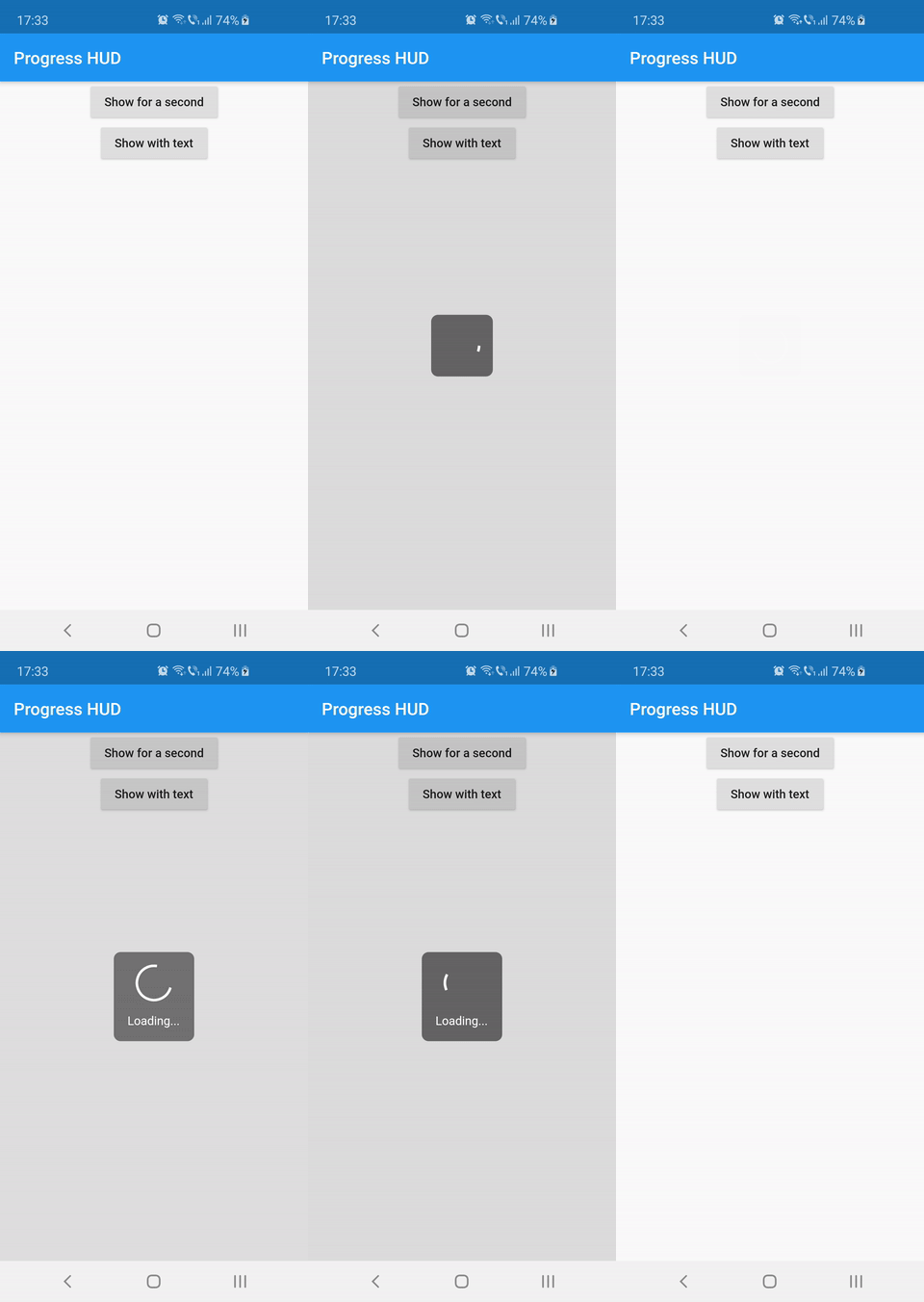
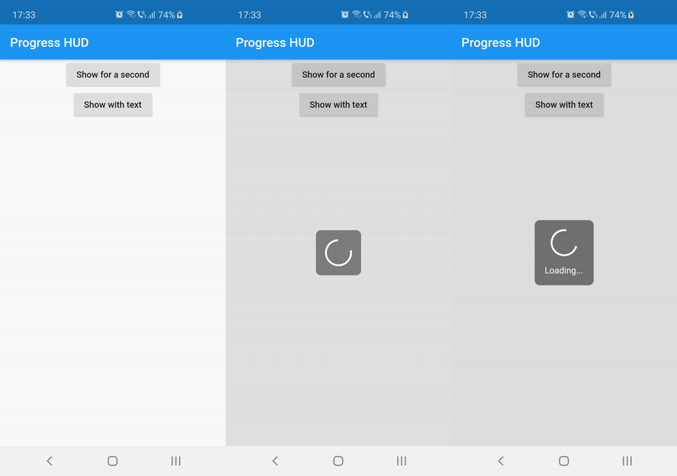
Wrap with ProgressHUD the widget on top of which you want to show the modal indicator.
ProgressHUD(
  child: HomePage(),
)
Get a reference of ProgressHUD
final progress = ProgressHUD.of(context);
Show indeterminate progress
progress.show();
Or a progress with text
progress.showWithText('Loading...');
Then dismiss
progress.dismiss();
ProgressHUD(
        child: Builder(
          builder: (context) => Center(
                child: Column(
                  children: <Widget>[
                    RaisedButton(
                      child: Text('Show for a second'),
                      onPressed: () {
                        final progress = ProgressHUD.of(context);
                        progress.show();
                        Future.delayed(Duration(seconds: 1), () {
                          progress.dismiss();
                        });
                      },
                    ),
                    RaisedButton(
                      child: Text('Show with text'),
                      onPressed: () {
                        final progress = ProgressHUD.of(context);
                        progress.showWithText('Loading...');
                        Future.delayed(Duration(seconds: 1), () {
                          progress.dismiss();
                        });
                      },
                    ),
                  ],
                ),
              ),
        ),
      ),
| Attribute Name | Default Value | Description |
|---|---|---|
| indicatorColor | Colors.white | When using the default indicator widget, this is how you set its color |
| indicatorWidget | A basic CircularProgressIndicator | Custom indicator widget |
| backgroundColor | Colors.black54 | Indicator background color |
| backgroundRadius | Radius.circular(8.0) | Indicator background radius |
| borderColor | Colors.white | Indicator background border color |
| borderWidth | 0.0 | Indicator background border width |
| barrierEnabled | true | You can disable the modal barrier if you want to allow touches while the progress is shown |
| barrierColor | Colors.black12 | Color of the Barrier displayed behind the indicator |
| textStyle | TextStyle(color: Colors.white, fontSize: 14.0) | TextStyle for the Text displayed below the indicator |
| padding | EdgeInsets.all(16.0)} | Indicator content padding |
依存関係一覧 2 件
{"sdk":"flutter"}{"sdk":"flutter"}用途で絞り込み、開発状況を比較し、採用前に元のリポジトリで要件を確認しましょう。
“A repository is the most basic element of GitHub.”
GitHub Docs — About repositories ↗