
 v2.0.2
selection_menu
タップで開閉できる高度にカスタマイズ可能な選択/セレクトメニュー。オプションで検索機能を提供します。
71いいね 19230日間ダウンロード70Pub ポイント
プラットフォーム情報なし
リスト内のアイテムから項目を選択するための、非常にカスタマイズ可能なFlutterウィジェットです。

{"sdk":"flutter"}{"sdk":"flutter"}以下は英語原文のスナップショットです。最新版は GitHub をご覧ください。
A highly customizable selection/select menu to choose an item from a list, with optional search feature.
The package provides two libraries:
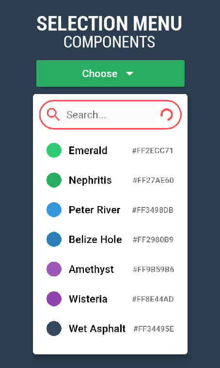
The image shows the same SelectionMenu Widget with three different ComponentsConfigurations.
Select Menu in different styles
import 'package:selection_menu/selection_menu.dart';

SelectionMenu<String>(
    itemsList: <String>['A','B','C'],
    onItemSelected: (String selectedItem)
    {
      print(selectedItem);
    },
    itemBuilder: (BuildContext context, String item, OnItemTapped onItemTapped)
    {
       return Material(
         InkWell(
           onTap: onItemTapped,
           child: Text(item),
         ),
       );
    },
    // other Properties...
);
Using A ComponentsConfiguration
import 'package:selection_menu/selection_menu.dart';

// IMPORT this package to get access to configuration classes.
import 'package:selection_menu/components_configurations.dart';

SelectionMenu<String>(
  itemsList: <String>['A','B','C'],
  onItemSelected: (String selectedItem)
  {
    print(selectedItem);
  },
  itemBuilder: (BuildContext context, String item, OnItemTapped onItemTapped)
  {
    return Material(
      InkWell(
        onTap: onItemTapped,
        child: Text(item),
      ),
    );
  },
  componentsConfigurations: DropdownComponentsConfigurations<String>(),
);
The menu is divided into parts called Components which allows to
change one part while the others remain intact.
A ComponentsConfiguration is simply a container for all Components
and configurations.
Reading the examples is recommended because there are a lot of things to cover and an intro page shouldn't be that long.
A series of examples can be found here.
You may make changes and open pull requests on GitHub. :)