

 v2.3.0
toggle_switch
トグルスイッチ - 簡単なトグルスイッチウィジェットです。必要なアイコン、幅、色、テキスト、角の半径などを使って完全にカスタマイズできます。選択状態も維持します。
1640いいね 21.7万30日間ダウンロード160Pub ポイント
AndroidiOSWebmacOSWindowsLinux
Flutter用のシンプルなトグルスイッチウィジェット。

以下は英語原文のスナップショットです。最新版は GitHub をご覧ください。
A simple toggle switch widget. It can be fully customized with desired icons, width, colors, text, corner radius, animation etc. It also maintains selection state.
In the pubspec.yaml of your flutter project, add the following dependency:
dependencies:
  ...
  toggle_switch: ^2.3.0
Import it:
import 'package:toggle_switch/toggle_switch.dart';
// Here, default theme colors are used for activeBgColor, activeFgColor, inactiveBgColor and inactiveFgColor
ToggleSwitch(
  initialLabelIndex: 0,
  totalSwitches: 3,
  labels: ['America', 'Canada', 'Mexico'],
  onToggle: (index) {
    print('switched to: $index');
  },
),

ToggleSwitch(
  minWidth: 90.0,
  minHeight: 90.0,
  fontSize: 16.0,
  initialLabelIndex: 1,
  activeBgColor: [Colors.green],
  activeFgColor: Colors.white,
  inactiveBgColor: Colors.grey,
  inactiveFgColor: Colors.grey[900],
  totalSwitches: 3,
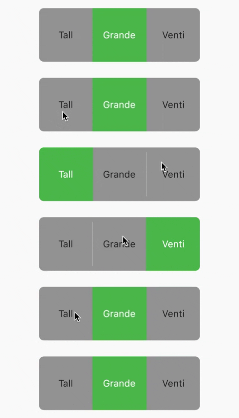
  labels: ['Tall', 'Grande', 'Venti'],
  onToggle: (index) {
    print('switched to: $index');
  },
),
ToggleSwitch(
  customWidths: [90.0, 50.0],
  cornerRadius: 20.0,
  activeBgColors: [[Colors.cyan], [Colors.redAccent]],
  activeFgColor: Colors.white,
  inactiveBgColor: Colors.grey,
  inactiveFgColor: Colors.white,
  totalSwitches: 2,
  labels: ['YES', ''],
  icons: [null, FontAwesomeIcons.times],
  onToggle: (index) {
    print('switched to: $index');
  },
),

ToggleSwitch(
  minWidth: 90.0,
  initialLabelIndex: 1,
  cornerRadius: 20.0,
  activeFgColor: Colors.white,
  inactiveBgColor: Colors.grey,
  inactiveFgColor: Colors.white,
  totalSwitches: 2,
  labels: ['Male', 'Female'],
  icons: [FontAwesomeIcons.mars, FontAwesomeIcons.venus],
  activeBgColors: [[Colors.blue],[Colors.pink]],
  onToggle: (index) {
    print('switched to: $index');
  },
),

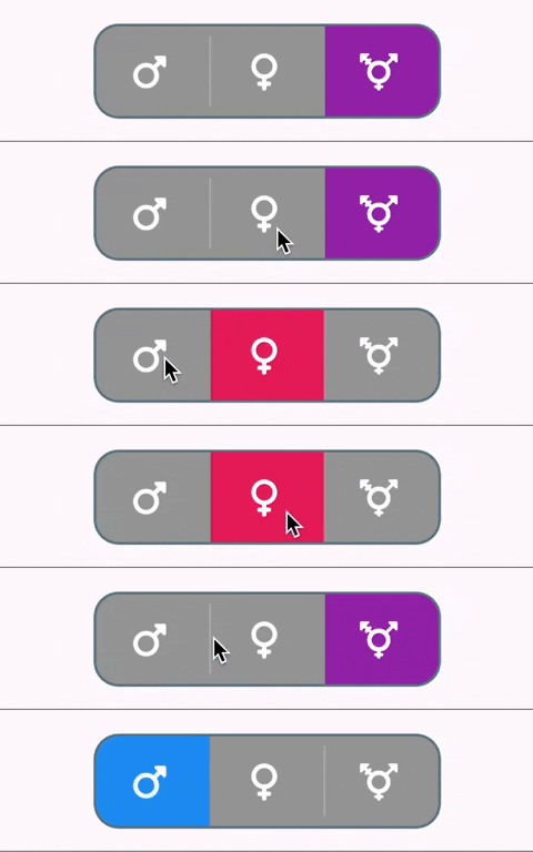
ToggleSwitch(
  minWidth: 90.0,
  minHeight: 70.0,
  initialLabelIndex: 2,
  cornerRadius: 20.0,
  activeFgColor: Colors.white,
  inactiveBgColor: Colors.grey,
  inactiveFgColor: Colors.white,
  totalSwitches: 3,
  icons: [
    FontAwesomeIcons.mars,
    FontAwesomeIcons.venus,
    FontAwesomeIcons.transgender
  ],
  iconSize: 30.0,
  borderWidth: 2.0,
  borderColor: [Colors.blueGrey],
  activeBgColors: [[Colors.blue], [Colors.pink], [Colors.purple]],
  onToggle: (index) {
    print('switched to: $index');
  },
),
ToggleSwitch(
  minWidth: 90.0,
  minHeight: 70.0,
  initialLabelIndex: 0,
  cornerRadius: 20.0,
  activeFgColor: Colors.white,
  inactiveBgColor: Colors.grey,
  inactiveFgColor: Colors.white,
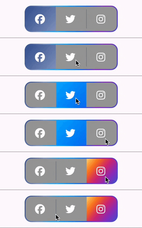
  totalSwitches: 3,
  icons: [
    FontAwesomeIcons.facebook,
    FontAwesomeIcons.twitter,
    FontAwesomeIcons.instagram
  ],
  iconSize: 30.0,
  borderColor: [Color(0xff3b5998), Color(0xff8b9dc3), Color(0xff00aeff), Color(0xff0077f2), Color(0xff962fbf), Color(0xff4f5bd5)],
  dividerColor: Colors.blueGrey,
  activeBgColors: [[Color(0xff3b5998), Color(0xff8b9dc3)], [Color(0xff00aeff), Color(0xff0077f2)], [Color(0xfffeda75), Color(0xfffa7e1e), Color(0xffd62976), Color(0xff962fbf), Color(0xff4f5bd5)]],
  onToggle: (index) {
    print('switched to: $index');
  },
),
ToggleSwitch(
  minWidth: 90.0,
  minHeight: 70.0,
  initialLabelIndex: 0,
  cornerRadius: 20.0,
  activeFgColor: Colors.white,
  inactiveBgColor: Colors.grey,
  inactiveFgColor: Colors.white,
  totalSwitches: 2,
  icons: [
    FontAwesomeIcons.lightbulb,
    FontAwesomeIcons.solidLightbulb,
  ],
  iconSize: 30.0,
  activeBgColors: [[Colors.black45, Colors.black26], [Colors.yellow, Colors.orange]],
  animate: true, // with just animate set to true, default curve = Curves.easeIn
  curve: Curves.bounceInOut, // animate must be set to true when using custom curve
  onToggle: (index) {
    print('switched to: $index');
  },
),

ToggleSwitch(
  minWidth: 90.0,
  cornerRadius: 20.0,
  activeBgColors: [[Colors.green[800]!], [Colors.red[800]!]],
  activeFgColor: Colors.white,
  inactiveBgColor: Colors.grey,
  inactiveFgColor: Colors.white,
  initialLabelIndex: 1,
  totalSwitches: 2,
  labels: ['True', 'False'],
  radiusStyle: true,
  onToggle: (index) {
    print('switched to: $index');
  },
),

ToggleSwitch(
  minWidth: 90.0,
  cornerRadius: 20.0,
  inactiveFgColor: Colors.white,
  initialLabelIndex: null,
  doubleTapDisable: true, // re-tap active widget to de-activate
  totalSwitches: 3,
  labels: ['Normal', 'Bold', 'Italic'],
  customTextStyles: [
    null,
    TextStyle(
        color: Colors.brown,
        fontSize: 18.0,
        fontWeight: FontWeight.w900),
    TextStyle(
        color: Colors.black,
        fontSize: 16.0,
        fontStyle: FontStyle.italic)
  ],
  onToggle: (index) {
    print('switched to: $index');
  },
),

ToggleSwitch(
  minWidth: 90.0,
  minHeight: 90.0,
  cornerRadius: 20.0,
  activeBgColors: [
    [Color(0xfffdbb0a)],
    [Colors.black54],
    [Colors.white54]
  ],
  inactiveFgColor: Colors.white,
  initialLabelIndex: 2,
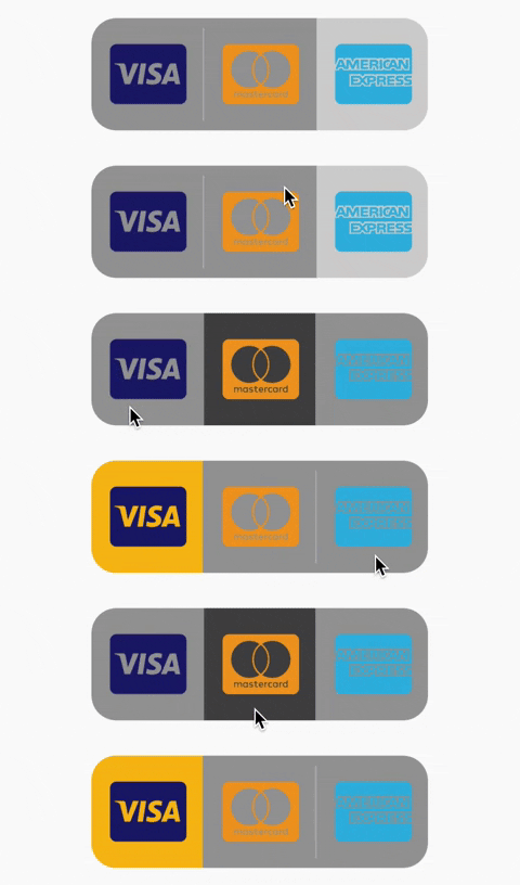
  totalSwitches: 3,
  customIcons: [
    Icon(
      FontAwesomeIcons.ccVisa,
      color: Color(0xff1a1f71),
      size: 55.0,
    ),
    Icon(
      FontAwesomeIcons.ccMastercard,
      color: Color(0xffF79E1B),
      size: 55.0,
    ),
    Icon(
      FontAwesomeIcons.ccAmex,
      color: Color(0xff27AEE3),
      size: 55.0,
    )
  ],
  onToggle: (index) {
    print('switched to: $index');
  },
),
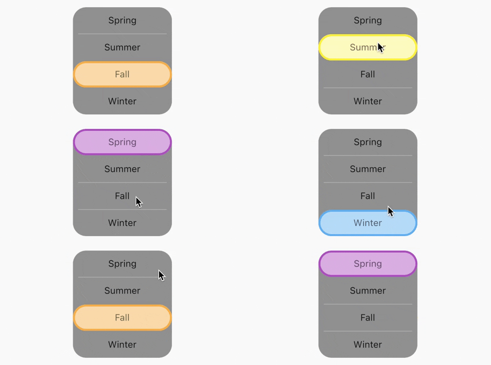
ToggleSwitch(
  activeBorders: [
    Border.all(
      color: Colors.purple,
      width: 3.0,
    ),
    Border.all(
      color: Colors.yellow.shade700,
      width: 3.0,
    ),
    Border.all(
      color: Colors.deepOrangeAccent,
      width: 3.0,
    ),
    Border.all(
      color: Colors.blue.shade500,
      width: 3.0,
    ),
  ],
  activeFgColor: Colors.black54,
  isVertical: true,
  minWidth: 150.0,
  radiusStyle: true,
  cornerRadius: 20.0,
  initialLabelIndex: 2,
  activeBgColors: [
    [Colors.purpleAccent],
    [Colors.yellow],
    [Colors.orange],
    [Colors.lightBlueAccent]
  ],
  labels: ['Spring', 'Summer', 'Fall', 'Winter'],
  onToggle: (index) {
    print('switched to: $index');
  },
),
SingleChildScrollView(
  scrollDirection: Axis.horizontal,
  child: Scrollbar(
    child: Padding(
      padding: const EdgeInsets.symmetric(horizontal: 10.0),
      child: ToggleSwitch(
        customWidths: [300.0, 100.0, 100.0],
        cornerRadius: 20.0,
        activeBgColors: [
          [Colors.green],
          [Colors.redAccent],
          [Colors.blue]
        ],
        activeFgColor: Colors.white,
        inactiveBgColor: Colors.grey,
        inactiveFgColor: Colors.white,
        labels: ['Yes, the statement above is true', 'False', 'Other'],
        onToggle: (index) {
          print('switched to: $index');
        },
      ),
    ),
  ),
),

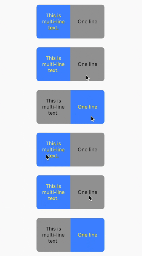
ToggleSwitch(
  initialLabelIndex: 0,
  minHeight: 100.0,
  minWidth: 100.0,
  activeBgColor: [Colors.blueAccent.shade200],
  activeFgColor: Colors.yellow,
  customTextStyles: [
    TextStyle(
      fontSize: 15.0
    )
  ],
  multiLineText: true,
  centerText: true,
  totalSwitches: 2,
  labels: ['This is multi-line text.', 'One line'],
  onToggle: (index) {
    print('switched to: $index');
  },
),
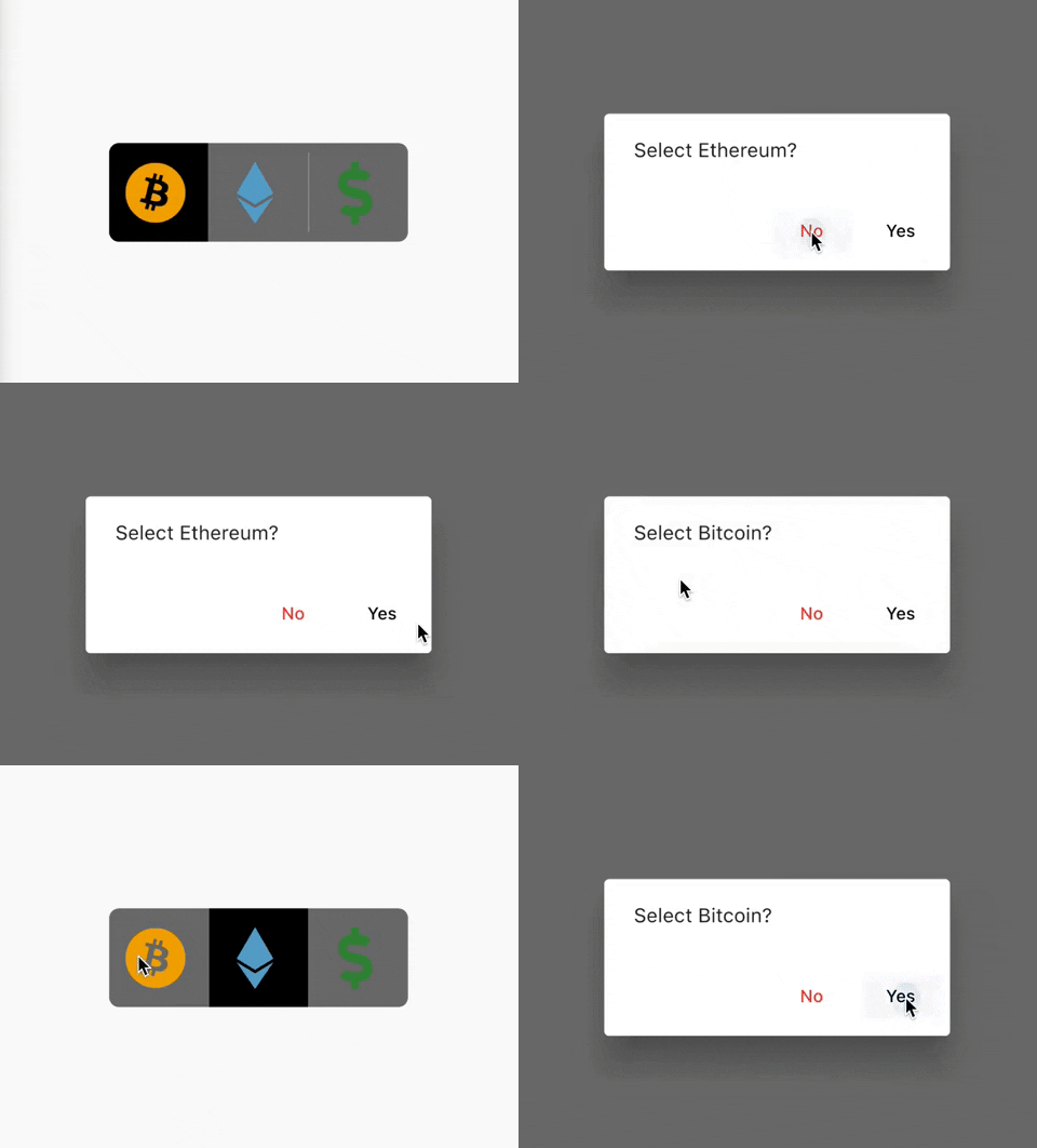
ToggleSwitch(
  initialLabelIndex: 0,
  inactiveBgColor: Colors.black54,
  activeBgColor: [Colors.black],
  totalSwitches: 3,
  minHeight: 80.0,
  minWidth: 80.0,
  customIcons: [
    Icon(
      FontAwesomeIcons.bitcoin,
      color: Color(0xFFF2A900),
      size: 50.0,
    ),
    Icon(
      FontAwesomeIcons.ethereum,
      color: Color(0xFF5ca6ce),
      size: 50.0,
    ),
    Icon(
      FontAwesomeIcons.dollarSign,
      color: Colors.green.shade700,
      size: 50.0,
    )
  ],
  onToggle: (index) {
    print('switched to: $index');
  },
  cancelToggle: (index) async {
    String selection = index == 0
        ? 'Bitcoin'
        : index == 1
            ? 'Ethereum'
            : 'Fiat';
    return await showDialog(
      context: context,
      builder: (dialogContext) => AlertDialog(
        content: Text("Select $selection?"),
        actions: [
          TextButton(
              child: Text("No",
                  style: TextStyle(color: Colors.red)),
              onPressed: () {
                Navigator.pop(dialogContext, true);
              }),
          TextButton(
              child: Text("Yes",
                  style: TextStyle(color: Colors.black)),
              onPressed: () {
                Navigator.pop(dialogContext, false);
              })
        ],
      ),
    );
  },
),
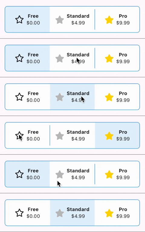
ToggleSwitch(
  initialLabelIndex: 0,
  minHeight: 75.0,
  minWidth: double.maxFinite,
  activeBgColor: [Colors.blue.shade50],
  inactiveBgColor: Colors.white,
  dividerColor: Colors.blue,
  borderColor: [Colors.blue],
  borderWidth: 1.0,
  customWidgets: [
    // Overrides default widgets, foreground colors
    Row(
      mainAxisAlignment: MainAxisAlignment.center,
      children: [
        Icon(
          FontAwesomeIcons.star,
        ),
        const SizedBox(width: 10.0),
        Column(
          mainAxisAlignment: MainAxisAlignment.center,
          children: [
            Text(
              'Free',
              style: TextStyle(
                fontWeight: FontWeight.bold,
              ),
              maxLines: 1,
              overflow: TextOverflow.ellipsis,
            ),
            Text(
              '\$0.00',
              maxLines: 1,
              overflow: TextOverflow.ellipsis,
            ),
          ],
        ),
      ],
    ),
    Row(
      mainAxisAlignment: MainAxisAlignment.center,
      children: [
        Icon(
          FontAwesomeIcons.solidStar,
          color: Color(0xffC0C0C0),
        ),
        const SizedBox(width: 10.0),
        Column(
          mainAxisAlignment: MainAxisAlignment.center,
          children: [
            Text(
              'Standard',
              style: TextStyle(
                fontWeight: FontWeight.bold,
              ),
              maxLines: 1,
              overflow: TextOverflow.ellipsis,
            ),
            Text(
              '\$4.99',
              maxLines: 1,
              overflow: TextOverflow.ellipsis,
            ),
          ],
        ),
      ],
    ),
    Row(
      mainAxisAlignment: MainAxisAlignment.center,
      children: [
        Icon(
          FontAwesomeIcons.solidStar,
          color: Color(0xffFFD700),
        ),
        const SizedBox(width: 10.0),
        Column(
          mainAxisAlignment: MainAxisAlignment.center,
          children: [
            Text(
              'Pro',
              style: TextStyle(
                fontWeight: FontWeight.bold,
              ),
              maxLines: 1,
              overflow: TextOverflow.ellipsis,
            ),
            Text(
              '\$9.99',
              maxLines: 1,
              overflow: TextOverflow.ellipsis,
            ),
          ],
        ),
      ],
    ),
  ],
  onToggle: (index) {
    print('switched to: $index');
  },
),
// When ToggleSwitch is used with Directionality widget and textDirection is set to TextDirection.rtl (right-to-left),
// switches are displayed right to left along with their respective index values. In this case, corner radius of switches aren't set correctly.
// To fix this, please use textDirectionRTL parameter and set it to true as shown in the example below.
Directionality(
  textDirection: TextDirection.rtl,
  child: ToggleSwitch(
    initialLabelIndex: 0,
    cornerRadius: 12.0,
    textDirectionRTL: true,
    activeFgColor: Colors.white,
    totalSwitches: 2,
    labels: ['left', 'right'],
    onToggle: (index) {
      print('switched to: $index');
    },
  ),
),
依存関係一覧 2 件
{"sdk":"flutter"}{"sdk":"flutter"}用途で絞り込み、開発状況を比較し、採用前に元のリポジトリで要件を確認しましょう。
“A repository is the most basic element of GitHub.”
GitHub Docs — About repositories ↗