liquid_progress_indicator V2
Liquid progress indicator for Flutter.
This version fix the original package Liquid progress indicator issues after upgrading to flutter 3.10 which was making it incompatible.
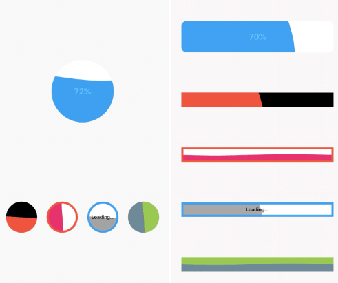
https://raw.githubusercontent.com/JordanADavies/liquid_progress_indicator/master/art/liquid_circular_progress_indicator.gif
https://raw.githubusercontent.com/JordanADavies/liquid_progress_indicator/master/art/liquid_linear_progress_indicator.gif
https://raw.githubusercontent.com/JordanADavies/liquid_progress_indicator/master/art/liquid_custom_progress_indicator.gif
Features
- Liquid circular progress indicator.
- Liquid linear progress indicator.
- Liquid custom progress indicator.
- Works similarly to Flutters own ProgressIndicator.
- Customise colors, borders, direction, etc.
Usage
import 'package:liquid_progress_indicator_v2/liquid_progress_indicator.dart';
LiquidCircularProgressIndicator
LiquidCircularProgressIndicator(
  value: 0.25, // Defaults to 0.5.
  valueColor: AlwaysStoppedAnimation(Colors.pink), // Defaults to the current Theme's accentColor.
  backgroundColor: Colors.white, // Defaults to the current Theme's backgroundColor.
  borderColor: Colors.red,
  borderWidth: 5.0,
  direction: Axis.horizontal, // The direction the liquid moves (Axis.vertical = bottom to top, Axis.horizontal = left to right). Defaults to Axis.vertical.
  center: Text("Loading..."),
);
LiquidLinearProgressIndicator
LiquidLinearProgressIndicator(
  value: 0.25, // Defaults to 0.5.
  valueColor: AlwaysStoppedAnimation(Colors.pink), // Defaults to the current Theme's accentColor.
  backgroundColor: Colors.white, // Defaults to the current Theme's backgroundColor.
  borderColor: Colors.red,
  borderWidth: 5.0,
  borderRadius: 12.0,
  direction: Axis.vertical, // The direction the liquid moves (Axis.vertical = bottom to top, Axis.horizontal = left to right). Defaults to Axis.horizontal.
  center: Text("Loading..."),
);
LiquidCustomProgressIndicator
LiquidCustomProgressIndicator(
  value: 0.2 // Defaults to 0.5.
  valueColor: AlwaysStoppedAnimation(Colors.pink), // Defaults to the current Theme's accentColor.
  backgroundColor: Colors.white, // Defaults to the current Theme's backgroundColor.
  direction: Axis.vertical, // The direction the liquid moves (Axis.vertical = bottom to top, Axis.horizontal = left to right).
  shapePath: _buildBoatPath(), // A Path object used to draw the shape of the progress indicator. The size of the progress indicator is created from the bounds of this path.
)
This version has been fixed to work on FENLES APP. However can be freely used as it contains only the fix for newer flutter versions


 v0.5.0