
BubbleShowcase
BubbleShowcase は、アプリの特定の部分を強調表示してユーザーに説明したり、アプリの新しい機能を紹介するのに役立つ、小さくても強力なFlutterパッケージです。

- スター
- 39
- フォーク
- 26
- 最終プッシュ(UTC)
- 2021/12/08
- プロジェクト状態
- アーカイブ済み
元の README
以下は英語原文のスナップショットです。最新版は GitHub をご覧ください。
BubbleShowcase
BubbleShowcase is a small but powerful flutter package that allows you to highlight specific parts of your app (to explain them to the user for instance) or to showcase your app new features.
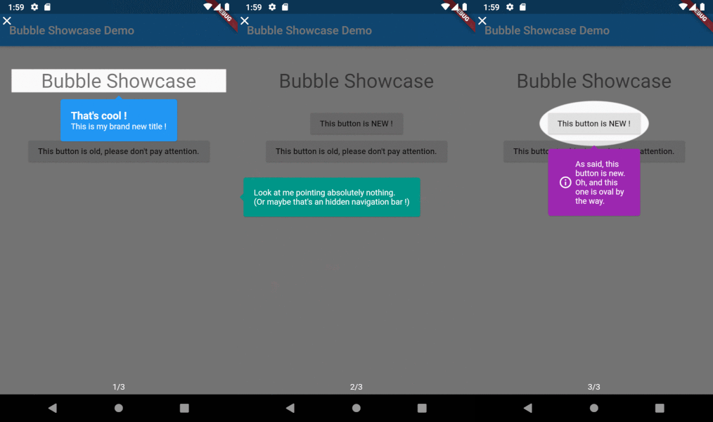
Getting Started
This package is easy to use. Take a look at the following snippet (which is using speech_bubble) :
BubbleShowcase(
  bubbleShowcaseId: 'my_bubble_showcase',
  bubbleShowcaseVersion: 1,
  bubbleSlides: [
    RelativeBubbleSlide(
      widgetKey: widgetToHighlightKey,
      child: RelativeBubbleSlideChild(
        direction: AxisDirection.right,
        widget: SpeechBubble(
          nipLocation: NipLocation.LEFT,
          color: Colors.blue,
          child: Padding(
            padding: EdgeInsets.all(10),
            child: Text(
              'This is a new cool feature !',
              style: TextStyle(color: Colors.white),
            ),
          ),
        ),
      ),
    ),
  ],
  child: MyMainWidget(),
);
It creates a BubbleShowcase widget with only one BubbleSlide.
This slide will highlight the widget that holds the key widgetToHighlightKey.
The speech bubble will be placed on the right of the widget.
BubbleShowcase is not limited to highlight a specific widget. You can also highlight a specific part of your app by its coordinates :
BubbleShowcase(
  bubbleShowcaseId: 'my_bubble_showcase',
  bubbleShowcaseVersion: 1,
  bubbleSlides: [
    AbsoluteBubbleSlide(
      positionCalculator: (size) => Position(
        top: 0,
        right: 0,
        bottom: 0,
        left: 0,
      ),
      child: AbsoluteBubbleSlideChild(
        positionCalculator: (size) => Position(
          top: 0,
          left: 0,
        ),
        widget: SpeechBubble(
          nipLocation: NipLocation.LEFT,
          color: Colors.blue,
          child: Padding(
            padding: EdgeInsets.all(10),
            child: Text(
              'This is the top left corner of your app.',
              style: TextStyle(color: Colors.white),
            ),
          ),
        ),
      ),
    ),
  ],
  child: MyMainWidget(),
);
This will display the speech bubble on the top left corner of your app.
Options
The showcase
The showcase is where everything begins. Let's see the available options :
bubbleShowcaseIdThe showcase identifier. Must be unique across the app as it is used as a saving mean; for instance when the showcase should not be reopened (required).bubbleShowcaseVersionThe showcase version. Increase it when you update the showcase, this allows to redisplay the it to the user ifdoNotReopenOnCloseis set totrue(required).doNotReopenOnCloseWhether this showcase should be reopened once closed.bubbleSlidesThe slides to display (required & must not be empty).childThe widget to display below the slides. It should be your app main widget.counterTextThe current slide counter text.:itargets the current slide number and:ntargets the maximum slide number.showCloseButtonWhether to show a little close button on the top left of the slide.
The slides
The slides is what is highlighting a specific part of your app. There are two main categories of positioning : Absolute and Relative. Here is a little summary :
| Position | Class name | Use case | Specific options |
|---|---|---|---|
| Absolute | AbsoluteBubbleSlide |
You want to position your slide according to a x, y position on the screen and not a specific widget. | positionCalculator The function that calculates the slide position on the screen. |
| Relative | RelativeBubbleSlide |
You want to position your slide according to a specific widget. | widgetKey The global key that the target widget is holding. |
All slides have these options in common :
shapeThe slide shape (available areRectangle,RoundedRectangle,OvalandCirclebut you can add a custom one by extending theShapeclass).boxShadowThe slide box shadow (containing the color, the blur radius, the spread radius, ...).childThe slide child, see below (required).
The slides children
Slides children are what are displayed according to what you are highlighting (it can be a speech bubble for example). The same positioning system is also available for children :
| Position | Class name | Use case | Specific options |
|---|---|---|---|
| Absolute | AbsoluteBubbleSlideChild |
You want to position the child according to a x, y position on the screen and not the highlighted part of the screen. | positionCalculator The function that calculates the child position on the screen. |
| Relative | RelativeBubbleSlideChild |
You want to position the child according to the highlighted zone. | direction Where to position the child compared to the highlighted zone. |
All children have these options in common :
widgetThe widget to display (required).
But you have a lot of other options ! Don't hesitate to check the API Reference or the Github repo.
Contributions
You have a lot of options to contribute to this project ! You can :

Hugo Delaunay ↗
カテゴリー
使用している依存関係
依存関係一覧 3 件
- flutter
{"sdk":"flutter"} - shared_preferences
>=2.0.0 <3.0.0 - flutter_lints開発用
>=1.0.4
プロジェクトに合うリポジトリを選ぶには?
用途で絞り込み、開発状況を比較し、採用前に元のリポジトリで要件を確認しましょう。
- 名前・作者・説明で検索し、技術トピックで絞り込みます。
- スター、フォーク、最近のプッシュを比較します。スターは関心の目安であり、品質の保証ではありません。
- 利用前に GitHub で README、ライセンス、Issues を確認します。
情報源と管理
“A repository is the most basic element of GitHub.”
GitHub Docs — About repositories ↗