

 v0.0.4
rolling_nav_bar
各アイコンの裏にローリングアクティブインジケーターがあるFlutterナビゲーションバー
62いいね 2930日間ダウンロード40Pub ポイント
プラットフォーム情報なし
Flutter 向けの遊び心がありカスタマイズ可能な下部ナビゲーションバー

以下は英語原文のスナップショットです。最新版は GitHub をご覧ください。
A bottom nav bar with layout inspired by this design and with heavily customizable animations, colors, and shapes.
To get started, place your RollingNavBar in the bottomNavigationCar slot of a
Scaffold, wrapped in a widget that provides max height. For example:
Scaffold(
  bottomNavigationBar: Container(
    height: 95,
    child: RollingNavBar(
      // nav items
    ),
  )
);
Alternatively, you can place it directly using a Stack:
Scaffold(
  body: Stack(
    children: <Widget>[
      Positioned(
        bottom: 0,
        height: 95,
        width: MediaQuery.of(context).size.width,
        child: RollingNavBar(
          // nav items
        ),
      )
    ]
  )
);
RollingNavBar is heavily customizable and works with 3, 4, or 5 navigation elements.
Each element is also fully customizable through the two primary ways to specify child
navigation elements.
The first option is to pass a list of IconData objects, along with optional lists
of Color objects.
RollingNavBar.iconData(
  iconData: <IconData>[
    Icons.home,
    Icons.people,
    Icons.settings,
  ],
  indicatorColors: <Color>[
    Colors.red,
    Colors.yellow,
    Colors.blue,
  ],
)
The second option is to provide a widget builder, though this comes with some loss of helpful active state management.
RollingNavBar.builder(
  builder: (context, index, info, update) {
    // The `iconData` constructor handles all active state management,
    // but this constructor, as it deals with completed widgets, must
    // assume that you have already made all relevant considerations.
    var textStyle = index == info.nextIndex
      ? TextStyle(color: Colors.white)
      : TextStyle(color: Colors.grey);
    return Text('${index + 1}', style: style);
  },
  indicatorColors: <Color>[
    Colors.red,
    Colors.yellow,
    Colors.blue,
  ],
  numChildren: 3,
)
RollingNavBar comes with four animation flavors for the active indicator's transition from
tab to tab.
The first animation type is the namesake: AnimationType.roll:
RollingNavBar.iconData(
  animationCurve: Curves.easeOut,  // `easeOut` (the default) is recommended here
  animationType: AnimationType.roll,
  baseAnimationSpeed: 200, // milliseconds
  iconData: <IconData>[
    ...
  ],
)
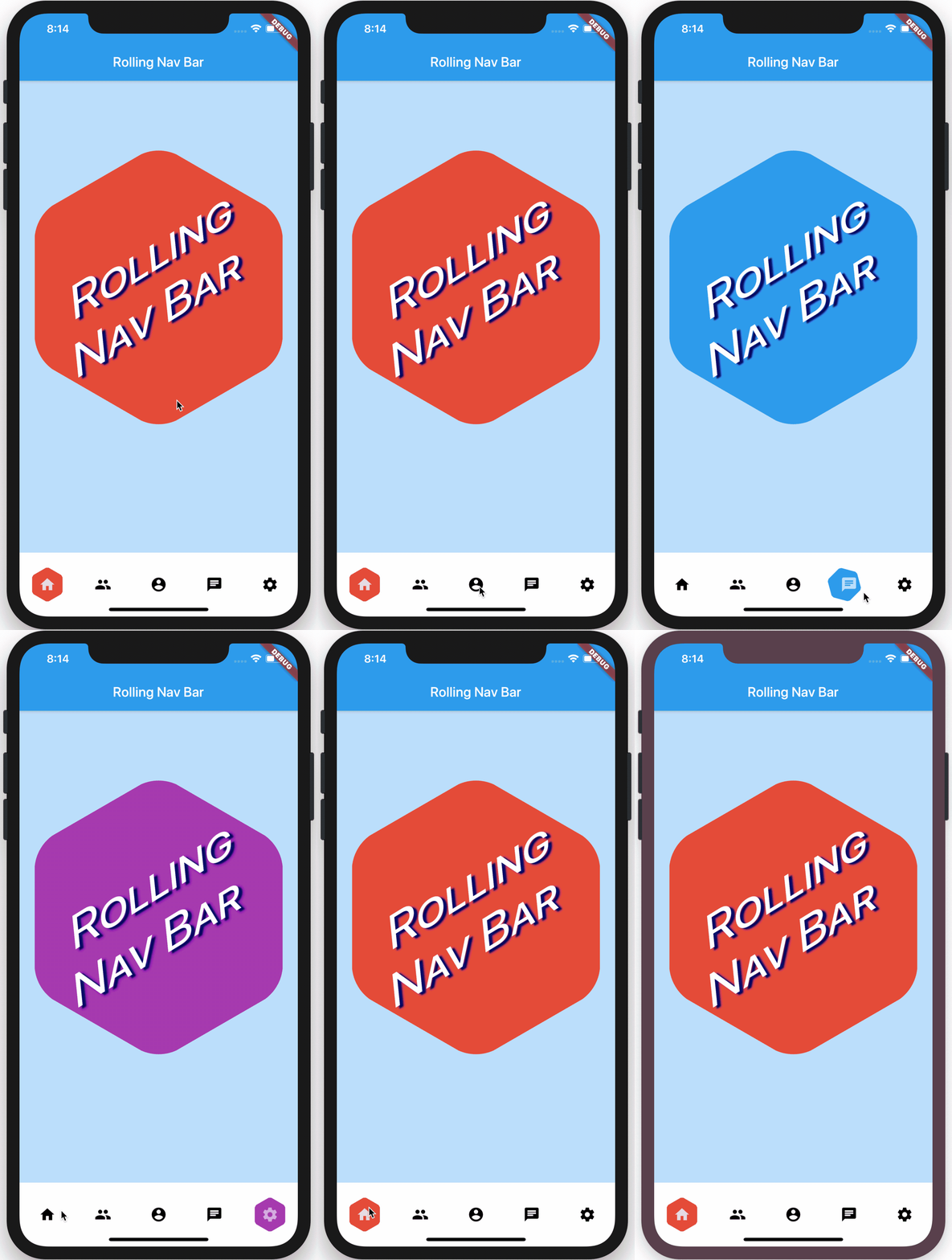
Note: For the
rollanimation type, your supplied animation speed is a multiplier considered against the distance the indicator must travel. This ensures a constant speed of travel no matter where the user clicks.
The second animation type is a fade-and-reappear effect:
RollingNavBar.iconData(
  animationCurve: Curves.linear, // `linear` is recommended for `shrinkOutIn`
  animationType: AnimationType.shrinkOutIn,
  baseAnimationSpeed: 500, // slower animations look nicer for `shrinkOutIn`
  iconData: <IconData>[
    ...
  ],
)
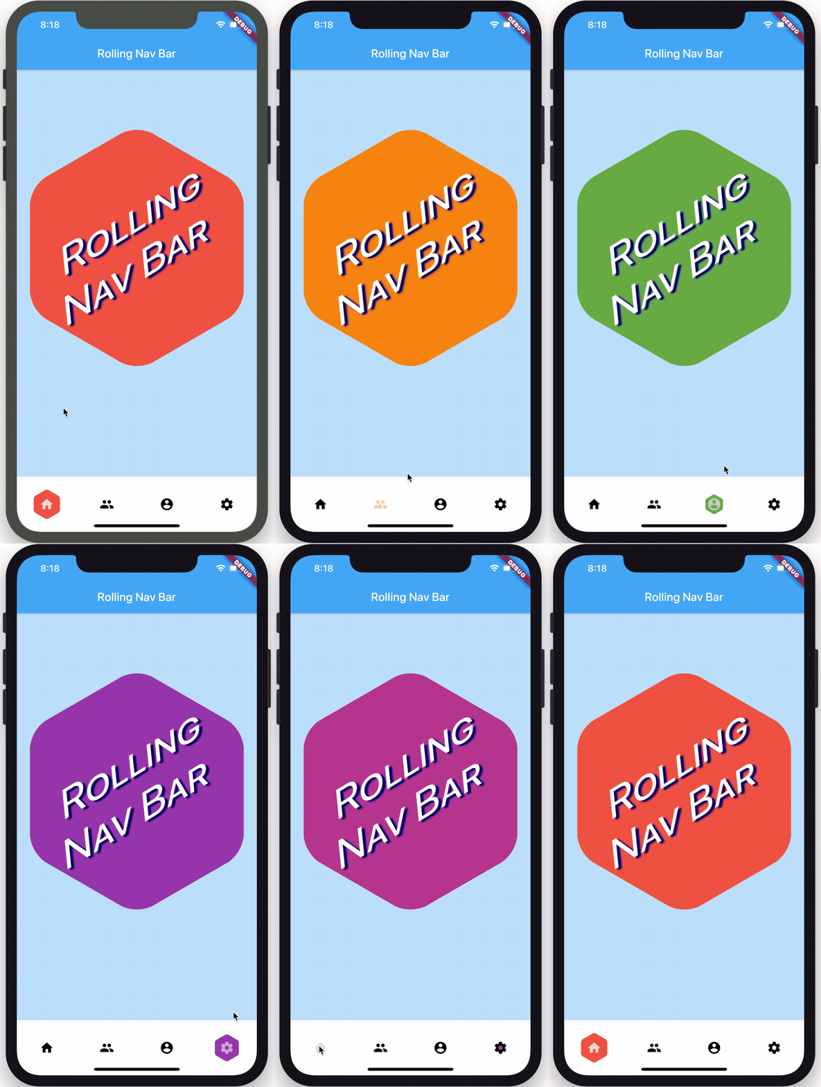
Note: For the
shinkOutInanimation type, your supplied animation speed is constant, since the active indicator never travels the intermediate distance.
The third animation type is a spinning version of fade-and-reappear:
RollingNavBar.iconData(
  animationCurve: Curves.linear, // `linear` is recommended for `spinOutIn`
  animationType: AnimationType.spinOutIn,
  baseAnimationSpeed: 500, // slower animations look nicer for `spinOutIn`
  iconData: <IconData>[
    ...
  ],
)
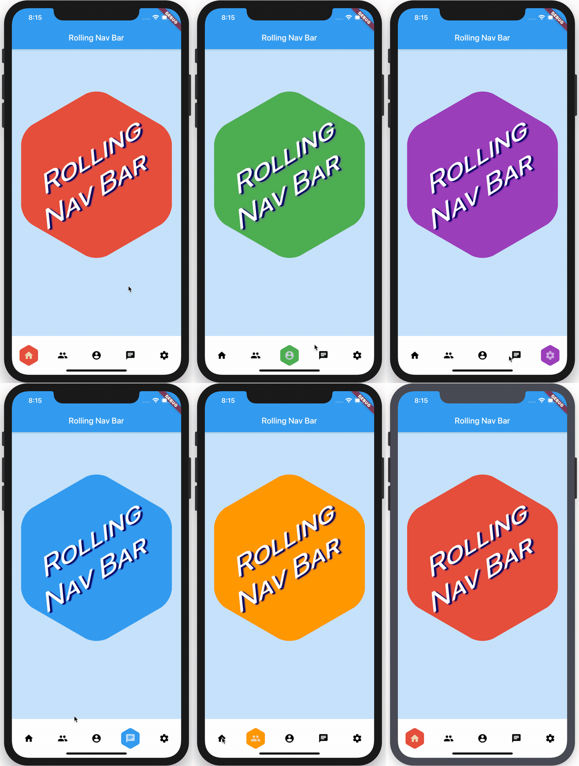
Note: Like with
shinkOutIn, for thespinOutInanimation type, your supplied animation speed is constant, since the active indicator never travels the intermediate distance.
The final animation flavor is a non-animation:
RollingNavBar.iconData(
  // `animationCurve` and `baseAnimationSpeed` are ignored
  animationType: AnimationType.snap,
  iconData: <IconData>[
    ...
  ],
)
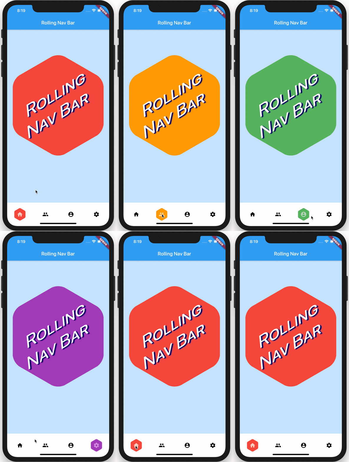
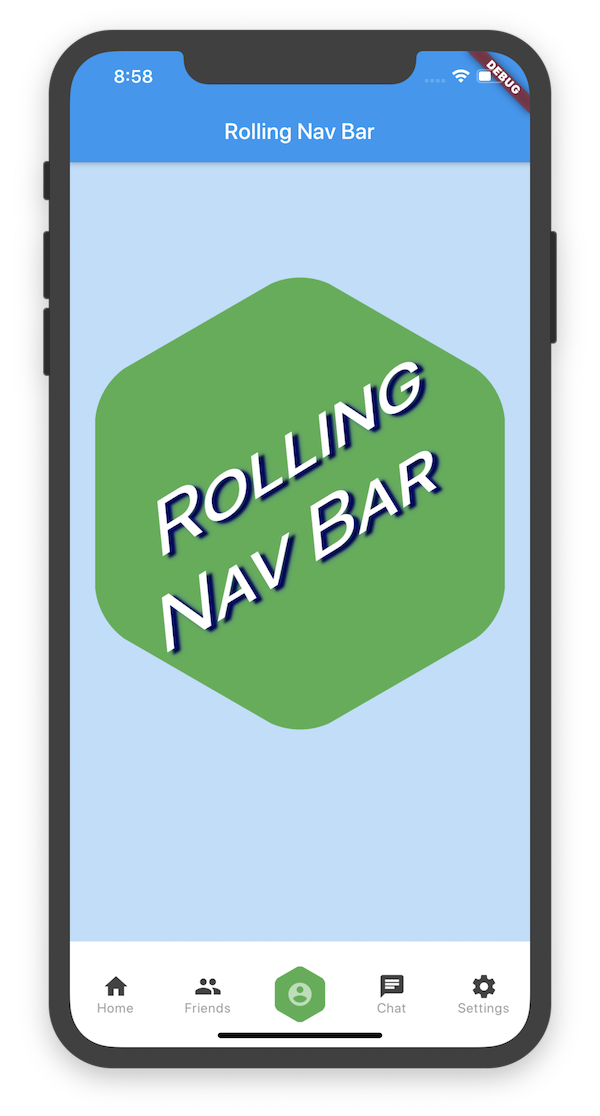
In the demo, the background of the larger hexagon matches the background of
the nav bar hexagon. To achieve this and similar effects, two callbacks, onTap and
onAnimate, are available. onAnimate can be particularly helpful for syncing
visual effects elsewhere in your app with nav bar progress.
If using the iconData constructor, you are also able to pass a list of widgets
to render as text below inactive icons.
RollingNavBar.iconData(
  // A list of length one implies the same color for all icons
  iconColors: <Color>[
    Colors.grey[800],
  ],
  iconData: <IconData>[
    Icons.home,
    Icons.friends,
    Icons.settings,
  ],
  iconText: <Widget>[
    Text('Home', style: TextStyle(color: Colors.grey, fontSize: 12)),
    Text('Friends', style: TextStyle(color: Colors.grey, fontSize: 12)),
    Text('Settings', style: TextStyle(color: Colors.grey, fontSize: 12)),
  ]
)
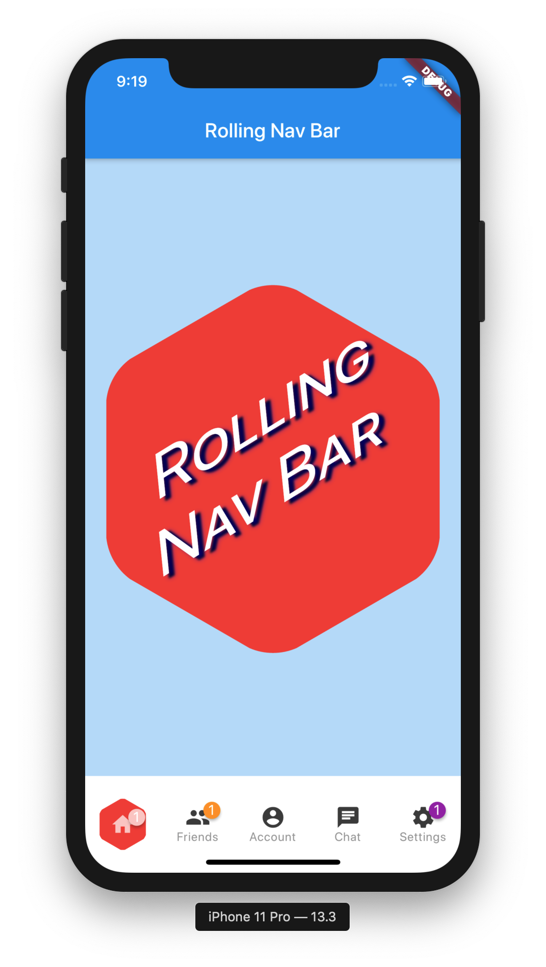
Using the Badges library, RollingNavBar is able to easily expose nav bar badges. The following works with either constructor.
RollingNavBar.iconData(
  badges: <Widget>[
    Text('1', style: TextStyle(Colors.white)),
    Text('1', style: TextStyle(Colors.white)),
    null,
    null,
    Text('1', style: TextStyle(Colors.white)),
  ],
  iconData: <IconData>[
    Icons.home,
    Icons.friends,
    Icons.account,
    Icons.chat,
    Icons.settings,
  ],
You can programmatically change the active navigation bar tab by passing a new activeIndex to the RollingNavBar widget. However, there are two steps to successfully keeping everything in sync.
class _MyAppState extends State<MyApp> {
  int activeIndex;

  /// Handler that responds to navigation events (likely derived
  /// from user clicks) and keeps the parent in sync.
  void _onTap(int index) {
    setState(() {
      activeIndex = index;
    });
  }

  /// Handler for when you want to programmatically change
  /// the active index. Calling `setState()` here causes
  /// Flutter to re-render the tree, which `RollingNavBar`
  /// responds to by running its normal animation.
  ///
  /// Note: This is an example function that you can define
  /// and call wherever you like. That is why it is not passed
  /// to `RollingNavBar.iconData` in the `build` method.
  void changeActiveIndex(int index) {
    setState((){
      activeIndex = index;
    });
  }

  Widget build(BuildContext context) {
    return RollingNavBar.iconData(
      activeIndex: activeIndex,
      iconData: iconData,
      onTap: _onTap,
    );
  }
}
依存関係一覧 5 件
^1.1.0^1.0.2^1.0.2{"sdk":"flutter"}{"sdk":"flutter"}用途で絞り込み、開発状況を比較し、採用前に元のリポジトリで要件を確認しましょう。
“A repository is the most basic element of GitHub.”
GitHub Docs — About repositories ↗