

 v4.2.5
percent_indicator
パーセンテージに基づいてプログレスウィジェットを表示できるライブラリで、円形または線形にすることができます。必要に応じてカスタマイズも可能です。
2780いいね 72.2万30日間ダウンロード140Pub ポイント
AndroidiOSWebmacOSWindowsLinux
Flutter パーセントインジケーターライブラリ

以下は英語原文のスナップショットです。最新版は GitHub をご覧ください。

Circular, Linear and Multi-segment linear percent indicators


You should ensure that you add the router as a dependency in your flutter project.
dependencies:
  percent_indicator: ^4.2.5
You should then run flutter packages upgrade or update your packages in IntelliJ.
There is a example project in the example folder. Check it out. Otherwise, keep reading to get up and running.
Need to include the import the package to the dart file where it will be used, use the below command,
import 'package:percent_indicator/percent_indicator.dart';
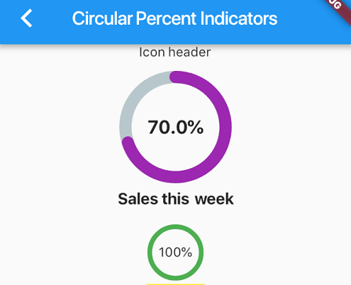
Circular percent indicator
Basic Widget
new CircularPercentIndicator(
                  radius: 60.0,
                  lineWidth: 5.0,
                  percent: 1.0,
                  center: new Text("100%"),
                  progressColor: Colors.green,
                )
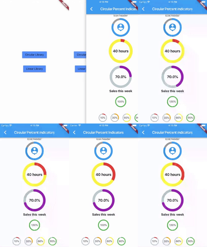
Complete example
  @override
  Widget build(BuildContext context) {
    return Scaffold(
      appBar: new AppBar(
        title: new Text("Circular Percent Indicators"),
      ),
          body: Center(
        child: ListView(
            children: <Widget>[
              new CircularPercentIndicator(
                radius: 100.0,
                lineWidth: 10.0,
                percent: 0.8,
                header: new Text("Icon header"),
                center: new Icon(
                  Icons.person_pin,
                  size: 50.0,
                  color: Colors.blue,
                ),
                backgroundColor: Colors.grey,
                progressColor: Colors.blue,
              ),
              new CircularPercentIndicator(
                radius: 130.0,
                animation: true,
                animationDuration: 1200,
                lineWidth: 15.0,
                percent: 0.4,
                center: new Text(
                  "40 hours",
                  style:
                      new TextStyle(fontWeight: FontWeight.bold, fontSize: 20.0),
                ),
                circularStrokeCap: CircularStrokeCap.butt,
                backgroundColor: Colors.yellow,
                progressColor: Colors.red,
              ),
              new CircularPercentIndicator(
                radius: 120.0,
                lineWidth: 13.0,
                animation: true,
                percent: 0.7,
                center: new Text(
                  "70.0%",
                  style:
                      new TextStyle(fontWeight: FontWeight.bold, fontSize: 20.0),
                ),
                footer: new Text(
                  "Sales this week",
                  style:
                      new TextStyle(fontWeight: FontWeight.bold, fontSize: 17.0),
                ),
                circularStrokeCap: CircularStrokeCap.round,
                progressColor: Colors.purple,
              ),
              Padding(
                padding: EdgeInsets.all(15.0),
                child: new CircularPercentIndicator(
                  radius: 60.0,
                  lineWidth: 5.0,
                  percent: 1.0,
                  center: new Text("100%"),
                  progressColor: Colors.green,
                ),
              ),
              Container(
                padding: EdgeInsets.all(15.0),
                child: new Row(
                  mainAxisAlignment: MainAxisAlignment.center,
                  children: <Widget>[
                    new CircularPercentIndicator(
                      radius: 45.0,
                      lineWidth: 4.0,
                      percent: 0.10,
                      center: new Text("10%"),
                      progressColor: Colors.red,
                    ),
                    new Padding(
                      padding: EdgeInsets.symmetric(horizontal: 10.0),
                    ),
                    new CircularPercentIndicator(
                      radius: 45.0,
                      lineWidth: 4.0,
                      percent: 0.30,
                      center: new Text("30%"),
                      progressColor: Colors.orange,
                    ),
                    new Padding(
                      padding: EdgeInsets.symmetric(horizontal: 10.0),
                    ),
                    new CircularPercentIndicator(
                      radius: 45.0,
                      lineWidth: 4.0,
                      percent: 0.60,
                      center: new Text("60%"),
                      progressColor: Colors.yellow,
                    ),
                    new Padding(
                      padding: EdgeInsets.symmetric(horizontal: 10.0),
                    ),
                    new CircularPercentIndicator(
                      radius: 45.0,
                      lineWidth: 4.0,
                      percent: 0.90,
                      center: new Text("90%"),
                      progressColor: Colors.green,
                    )
                  ],
                ),
              )
            ]),
      ),
    );
  }
Linear percent indicator
Basic Widget
new LinearPercentIndicator(
                width: 140.0,
                lineHeight: 14.0,
                percent: 0.5,
                backgroundColor: Colors.grey,
                progressColor: Colors.blue,
              ),
Complete example
@override
  Widget build(BuildContext context) {
    return Scaffold(
      appBar: new AppBar(
        title: new Text("Linear Percent Indicators"),
      ),
      body: Center(
        child: Column(
          mainAxisAlignment: MainAxisAlignment.center,
          children: <Widget>[
            Padding(
              padding: EdgeInsets.all(15.0),
              child: new LinearPercentIndicator(
                width: 140.0,
                lineHeight: 14.0,
                percent: 0.5,
                center: Text(
                  "50.0%",
                  style: new TextStyle(fontSize: 12.0),
                ),
                trailing: Icon(Icons.mood),
                linearStrokeCap: LinearStrokeCap.roundAll,
                backgroundColor: Colors.grey,
                progressColor: Colors.blue,
              ),
            ),
            Padding(
              padding: EdgeInsets.all(15.0),
              child: new LinearPercentIndicator(
                width: 170.0,
                animation: true,
                animationDuration: 1000,
                lineHeight: 20.0,
                leading: new Text("left content"),
                trailing: new Text("right content"),
                percent: 0.2,
                center: Text("20.0%"),
                linearStrokeCap: LinearStrokeCap.butt,
                progressColor: Colors.red,
              ),
            ),
            Padding(
              padding: EdgeInsets.all(15.0),
              child: new LinearPercentIndicator(
                width: MediaQuery.of(context).size.width - 50,
                animation: true,
                lineHeight: 20.0,
                animationDuration: 2000,
                percent: 0.9,
                center: Text("90.0%"),
                linearStrokeCap: LinearStrokeCap.roundAll,
                progressColor: Colors.greenAccent,
              ),
            ),
            Padding(
              padding: EdgeInsets.all(15.0),
              child: new LinearPercentIndicator(
                width: MediaQuery.of(context).size.width - 50,
                animation: true,
                lineHeight: 20.0,
                animationDuration: 2500,
                percent: 0.8,
                center: Text("80.0%"),
                linearStrokeCap: LinearStrokeCap.roundAll,
                progressColor: Colors.green,
              ),
            ),
            Padding(
              padding: EdgeInsets.all(15.0),
              child: Column(
                children: <Widget>[
                  new LinearPercentIndicator(
                    width: 100.0,
                    lineHeight: 8.0,
                    percent: 0.2,
                    progressColor: Colors.red,
                  ),
                  new LinearPercentIndicator(
                    width: 100.0,
                    lineHeight: 8.0,
                    percent: 0.5,
                    progressColor: Colors.orange,
                  ),
                  new LinearPercentIndicator(
                    width: 100.0,
                    lineHeight: 8.0,
                    percent: 0.9,
                    progressColor: Colors.blue,
                  )
                ],
              ),
            ),
          ],
        ),
      ),
    );
  }
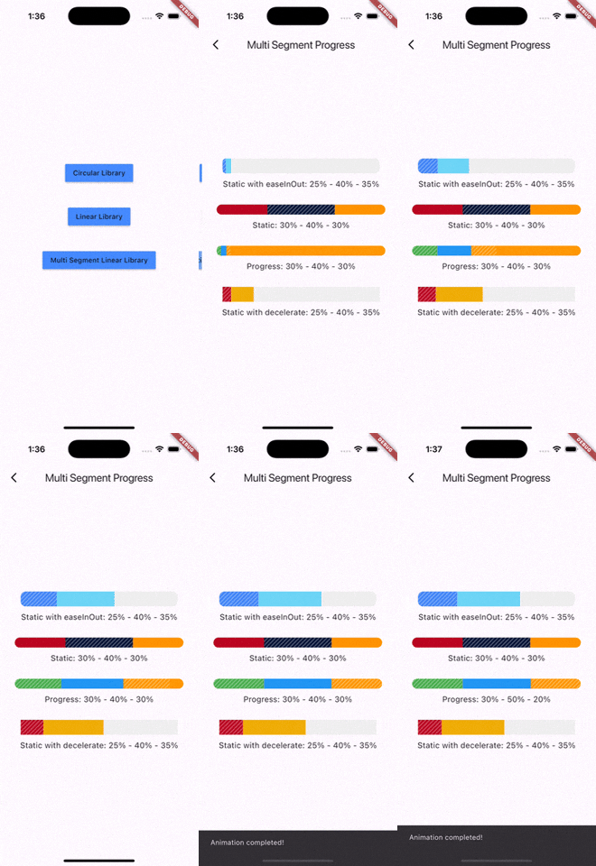
Multi-segment linear indicator
Basic Widget
new MultiSegmentLinearIndicator(
                width: MediaQuery.of(context).size.width - 64,
                lineHeight: 30.0,
                segments: [
                  SegmentLinearIndicator(
                    percent: 0.25,
                    color: Color(0xFF4285F4),
                    enableStripes: true,
                  ),
                  SegmentLinearIndicator(
                    percent: 0.4,
                    color: Color(0xFF6DD5F6),
                  ),
                  SegmentLinearIndicator(
                    percent: 0.35,
                    color: Color(0xFFEFEFEF),
                  ),
                ],
                barRadius: Radius.circular(10.0),
                animation: true,
                animationDuration: 1000,
                curve: Curves.easeInOut,
                animateFromLastPercent: true,
                onAnimationEnd: () {
                  ScaffoldMessenger.of(context).showSnackBar(
                    const SnackBar(
                      content: Text('Animation completed!'),
                      duration: Duration(seconds: 1),
                    ),
                  );
                },
              ),
Complete example
@override
  Widget build(BuildContext context) {
    return Scaffold(
      appBar: AppBar(
        title: Text('Multi Segment Progress'),
      ),
      body: Center(
        child: Padding(
          padding: const EdgeInsets.all(20.0),
          child: Column(
            mainAxisAlignment: MainAxisAlignment.center,
            children: [
              MultiSegmentLinearIndicator(
                width: MediaQuery.of(context).size.width - 64,
                lineHeight: 30.0,
                segments: [
                  SegmentLinearIndicator(
                    percent: 0.25,
                    color: Color(0xFF4285F4),
                    enableStripes: true,
                  ),
                  SegmentLinearIndicator(
                    percent: 0.4,
                    color: Color(0xFF6DD5F6),
                  ),
                  SegmentLinearIndicator(
                    percent: 0.35,
                    color: Color(0xFFEFEFEF),
                  ),
                ],
                barRadius: Radius.circular(10.0),
                animation: true,
                animationDuration: 1000,
                curve: Curves.easeInOut,
                animateFromLastPercent: true,
                onAnimationEnd: () {
                  ScaffoldMessenger.of(context).showSnackBar(
                    const SnackBar(
                      content: Text('Animation completed!'),
                      duration: Duration(seconds: 1),
                    ),
                  );
                },
              ),
              SizedBox(height: 10),
              Text(
                'Static with easeInOut: 25% - 40% - 35%',
                style: TextStyle(fontSize: 16),
              ),
              SizedBox(height: 30),
              MultiSegmentLinearIndicator(
                width: MediaQuery.of(context).size.width - 40,
                lineHeight: 20.0,
                segments: [
                  SegmentLinearIndicator(
                    percent: 0.3,
                    color: Color(0xFFBA0521),
                  ),
                  SegmentLinearIndicator(
                    percent: 0.4,
                    color: Color(0xFF071437),
                    enableStripes: true,
                  ),
                  SegmentLinearIndicator(
                    percent: 0.3,
                    color: Color(0xFFFF9205),
                  ),
                ],
                barRadius: Radius.circular(20),
              ),
              SizedBox(height: 10),
              Text(
                'Static: 30% - 40% - 30%',
                style: TextStyle(fontSize: 16),
              ),
              SizedBox(height: 30),
              MultiSegmentLinearIndicator(
                width: MediaQuery.of(context).size.width - 40,
                lineHeight: 20.0,
                segments: [
                  SegmentLinearIndicator(
                    percent: firstSegment,
                    color: Colors.green,
                    enableStripes: true,
                  ),
                  SegmentLinearIndicator(
                    percent: secondSegment,
                    color: Colors.blue,
                    enableStripes: true,
                  ),
                  SegmentLinearIndicator(
                    percent: thirdSegment,
                    color: Colors.orange,
                  ),
                ],
                animation: true,
                animateFromLastPercent: true,
                animationDuration: 1000,
                curve: Curves.easeInOut,
                barRadius: Radius.circular(10),
              ),
              SizedBox(height: 10),
              Text(
                'Progress: ${(firstSegment * 100).toInt()}% - ${(secondSegment * 100).toInt()}% - ${(thirdSegment * 100).toInt()}%',
                style: TextStyle(fontSize: 16),
              ),
              SizedBox(height: 30),
              MultiSegmentLinearIndicator(
                width: MediaQuery.of(context).size.width - 64,
                lineHeight: 30.0,
                segments: [
                  SegmentLinearIndicator(
                    percent: 0.15,
                    color: Color(0xFFBA0521),
                    enableStripes: true,
                  ),
                  SegmentLinearIndicator(
                      percent: 0.4, color: Color(0xFFAEFAB00)),
                  SegmentLinearIndicator(
                      percent: 0.45, color: Color(0xFFEFEFEF)),
                ],
                animation: true,
                animationDuration: 1000,
                curve: Curves.decelerate,
                animateFromLastPercent: true,
              ),
              SizedBox(height: 10),
              Text(
                'Static with decelerate: 25% - 40% - 35%',
                style: TextStyle(fontSize: 16),
              ),
              SizedBox(height: 30),
            ],
          ),
        ),
      ),
    );
  }
You can follow me on twitter @diegoveloper
依存関係一覧 2 件
{"sdk":"flutter"}{"sdk":"flutter"}用途で絞り込み、開発状況を比較し、採用前に元のリポジトリで要件を確認しましょう。
“A repository is the most basic element of GitHub.”
GitHub Docs — About repositories ↗