
 v1.1.1
smooth_corner
Figma からインスパイアされた、変化する滑らかさを持つ長方形の枠線。
61いいね 1.9万30日間ダウンロード160Pub ポイント
AndroidiOSWebmacOSWindowsLinux
iOSのスムーズコーナーのFlutter実装も、スクエアーサイクルと呼ばれます。

{"sdk":"flutter"}{"sdk":"flutter"}以下は英語原文のスナップショットです。最新版は GitHub をご覧ください。
Pub https://img.shields.io/badge/platform-flutter%7Cflutter--web-red?style=flat-square
Implement smooth iOS-style rounded corners in Flutter, mimicking Figma's "corner smoothing" feature. The algorithm is also inspired by Figma's blog post "Desperately seeking squircles".
The principle involves combining two Bezier curves and an arc to create smooth corners. Similar to Figma, the smoothness is adjustable. When the smoothness parameter is 0, it represents a normal rounded rectangle, and when the parameter is 1, the rounded corners are composed of only two Bezier curves, approaching a superellipse.
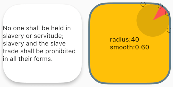
You can view the debug rounded corner components and image examples I wrote in the example project, adjusting their smoothness and corner size to observe the changes in the corner curves.
Example screen shotdependencies:
smooth_corner: ^1.1.1
This library provides several commonly used widgets that allow you to adjust smooth rounded corners.
All widgets provide three parameters: smoothness, side, and borderRadius, to control smooth corners and borders.
smoothness: Represents the smoothness, ranging from [0, 1.0]. According to Figma's standards, 0.6 is the closest to iOS's rounded corner curve.https://user-images.githubusercontent.com/17538852/148515898-79b29e88-c709-481c-b326-2ff92246cfa2.png
side: Type is BorderSide, used to set borders.
borderRadius: Used to set the corner radius. Note that if the x and y values of the radius are not equal, the smaller one will be chosen.
SmoothContainer includes all the parameters of Container.
SmoothContainer(
  width: 200,
  height: 200,
  smoothness: 0.6,
  side: BorderSide(color: Colors.cyan, width: 2),
  borderRadius: BorderRadius.circular(40),
  child: child,
  alignment: Alignment.center,
),
To enable images to have borders, SmoothClipRRect is provided.
SmoothClipRRect(
  smoothness: 0.6,
  side: BorderSide(color: Colors.deepOrange, width: 4),
  borderRadius: BorderRadius.circular(40),
  child: Image.network(
    url,
    fit: BoxFit.cover,
  ),
SmoothCard includes all parameters of Card.
SmoothCard(
  smoothness: 0.6,
  borderRadius: BorderRadius.circular(40),
  elevation: 6,
  child: child,
),
The smooth corner capabilities of the above widgets are implemented by SmoothRectangleBorder. You can use this ShapeBorder to freely customize your smooth corner components.
Container(
  width: 200,
  height: 200,
  alignment: Alignment.center,
  decoration: ShapeDecoration(
    shape: SmoothRectangleBorder(
      borderRadius: BorderRadius.circular(40),
      smoothness: 0.6,
    ),
    color: Colors.amber,
  ),
  child: Text(''),
),
Container(
  width: 200,
  height: 200,
  child: ClipPath(
    clipper: ShapeBorderClipper(
      shape: SmoothRectangleBorder(
        smoothness: 0.6,
        borderRadius:
            BorderRadius.circular(40),
      ),
    ),
    child: Image.network(url),
  ),
),