

 v2.0.0
crystal_navigation_bar
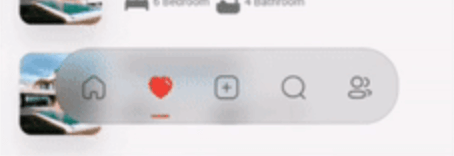
滑らかなクリスタルクリアなぼかし下部ナビゲーションバーと動的なインジケーターで、アプリのナビゲーションをスムーズに。
137いいね 252030日間ダウンロード160Pub ポイント
AndroidiOSWebmacOSWindowsLinux
クリスタルボトムナビゲーションバー

以下は英語原文のスナップショットです。最新版は GitHub をご覧ください。


A highly flexible bottom navigation bar that allows you to tailor it to your specific needs without any constraints. Elevate your UI/UX with seamless animations, customizable appearance—including the option to incorporate blur effects—and the ability to fully personalize the interface.
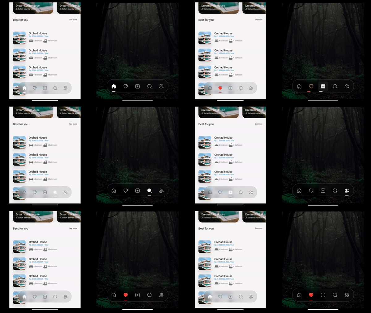

Simple BottomBar With Border |

Simple BottomBar With Badge |
CRYSTAL BOTTOM NAVIGATION BAR
To install, add it to your pubspec.yaml file:
dependencies:
    crystal_navigation_bar:
import 'package:crystal_navigation_bar/crystal_navigation_bar.dart';
Use CrystalNavigationBar constructor in Your app with in Scaffold's bottomNavigationBar:
extendBody: true,
if you do not want to make round navigation bar with show body behind the navbar you have to make that
extendBody: false,
Widget build(BuildContext context) {
  return Scaffold(
    body: Center(),
    extendBody: true,//<------like this
    bottomNavigationBar:  CrystalNavigationBar(
          currentIndex: _SelectedTab.values.indexOf(_selectedTab),
          onTap: _handleIndexChanged,
          indicatorColor: Colors.white,
          // enableFloatingNavBar: false
          items: [


          ],
        ),
  );
}
Widget build(BuildContext context) {
    return Scaffold(
      extendBody: true,
      body: SizedBox(
        height: MediaQuery.of(context).size.height,
        child: Image.network(
          "https://images.pexels.com/photos/1671325/pexels-photo-1671325.jpeg?auto=compress&cs=tinysrgb&w=1260&h=750&dpr=2",
          fit: BoxFit.fitHeight,
        ),
      ),
      bottomNavigationBar: Padding(
        padding: const EdgeInsets.only(bottom: 10),
        child: CrystalNavigationBar(
          currentIndex: _SelectedTab.values.indexOf(_selectedTab),
          // indicatorColor: Colors.white,
          unselectedItemColor: Colors.white70,
          backgroundColor: Colors.black.withOpacity(0.1),
          // outlineBorderColor: Colors.black.withOpacity(0.1),
          borderWidth: 2,
          outlineBorderColor: Colors.white,
          onTap: _handleIndexChanged,
          items: [
            /// Home
            CrystalNavigationBarItem(
              icon: IconlyBold.home,
              unselectedIcon: IconlyLight.home,
              selectedColor: Colors.white,
              badge: Badge(
                label: Text(
                  "9+",
                  style: TextStyle(color: Colors.white),
                ),
              ),
            ),

            /// Favourite
            CrystalNavigationBarItem(
              icon: IconlyBold.heart,
              unselectedIcon: IconlyLight.heart,
              selectedColor: Colors.red,
            ),

            /// Add
            CrystalNavigationBarItem(
              icon: IconlyBold.plus,
              unselectedIcon: IconlyLight.plus,
              selectedColor: Colors.white,
            ),

            /// Search
            CrystalNavigationBarItem(
                icon: IconlyBold.search,
                unselectedIcon: IconlyLight.search,
                selectedColor: Colors.white),

            /// Profile
            CrystalNavigationBarItem(
              icon: IconlyBold.user_2,
              unselectedIcon: IconlyLight.user,
              selectedColor: Colors.white,
            ),
          ],
        ),
      ),
    );
  }
The constructor has 19 attributes related to the Widget:
items: A list of tabs to display, example Home, Profile,Search, etcheight: The height of CrystalNavigationBar, [Default] & [Minimum] height is 105,currentIndex: The tab to display.onTap:Returns the index of the tab that was tapped.outlineBorderColor : Border Color of the Bottom bar.borderWidth : Border Width of the Bottom bar.badge : Badge to display. (to display notification count etc).selectedItemColor:The color of the icon and text when the item is selected.unselectedItemColor: The color of the icon and text when the item is not selected.margin:A convenience field for the margin surrounding the entire widget.itemPadding:The padding of each item.duration: The transition duration.curve: The transition curve.indicatorColor:The color of the tab indicator.marginR:margin for the bar to give some radius .paddingR:padding for the bar to give some radius.borderRadius:border radius for nav bar.backgroundColor:background colors for the nav bar.boxShadow: floating nav bar shadow ,it takes List of BoxShadowenableFloatingNavBar: make Floating nav bar enabled.enablePaddingAnimation: enable the animation on item during item change.splashColor: Color of the item's Splash Color. To disable, use Colors.transparent.iconly package is used for Icons in the demo/example
See Example Code for more info.
Every pull request is welcome.
Imtiaz Ahmad


依存関係一覧 4 件
{"sdk":"flutter"}^2.2.3{"sdk":"flutter"}^5.0.0用途で絞り込み、開発状況を比較し、採用前に元のリポジトリで要件を確認しましょう。
“A repository is the most basic element of GitHub.”
GitHub Docs — About repositories ↗