
 v0.5.0
expandable_datatable
展開可能な行を持つテーブルビューでデータを表示および編集するためのFlutterパッケージ。
48いいね 56730日間ダウンロード150Pub ポイント
AndroidiOSWebmacOSWindowsLinux
組み込みの行拡張および編集機能を備えた動的なFlutterデータテーブルで、複雑または詳細なデータビューに最適です。

{"sdk":"flutter"}{"sdk":"flutter"}^6.0.0^6.0.0以下は英語原文のスナップショットです。最新版は GitHub をご覧ください。
pub.dev codecov License: MIT Flutter
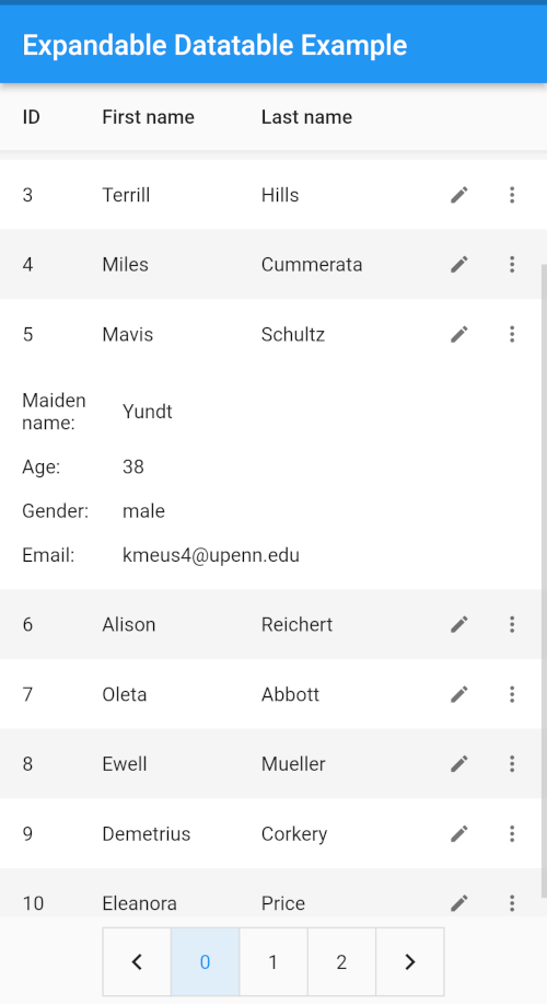
A Flutter package for displaying and editing tabular data with expandable rows. Overflow columns collapse into a tappable expansion panel, keeping the table clean on any screen size.
expandable_datatable renders a data table where you control how many columns are visible. Columns that exceed visibleColumnCount are hidden from the row and instead displayed inside a collapsible expansion panel. This lets you show a clean, narrow table on phones while surfacing all data on demand - without writing custom layout code.
Use ExpandableDataTable whenever you need a data table that:
visibleColumnCount from LayoutBuilder to adapt automatically to screen widthrenderEditDialogCellType<T> adapters (ImageCellType, custom DateTime, etc.) to encapsulate rendering, sorting, and editingcellBuilder on ExpandableColumnExpandableColumns as isEditable: false to make them read-only inside the dialogrenderExpansionContentmultipleExpansionExpandableTheme / ExpandableThemeData| Sorting | Expansion |
|---|---|
| Sorting | Expansion |
| Editing | Styling |
|---|---|
| Editing | Styling |
Add expandable_datatable as a dependency in your pubspec.yaml file. See the pub.dev install tab for details.
Below is a minimal working snippet. See example/lib/main.dart for a complete runnable app.
import 'package:expandable_datatable/expandable_datatable.dart';
import 'package:flutter/material.dart';

class UsersTable extends StatelessWidget {
  const UsersTable({super.key});

  @override
  Widget build(BuildContext context) {
    // 1. Define columns (headers).
    final headers = [
      ExpandableColumn<int>(columnTitle: 'ID', columnFlex: 1),
      ExpandableColumn<String>(columnTitle: 'First name', columnFlex: 2),
      ExpandableColumn<String>(columnTitle: 'Last name', columnFlex: 2),
      ExpandableColumn<int>(columnTitle: 'Age', columnFlex: 1),
      ExpandableColumn<String>(columnTitle: 'Email', columnFlex: 4),
    ];

    // 2. Map your data to ExpandableRow / ExpandableCell.
    //    columnTitle in each cell MUST match the corresponding header.
    final rows = [
      ExpandableRow(cells: [
        ExpandableCell<int>(columnTitle: 'ID', value: 1),
        ExpandableCell<String>(columnTitle: 'First name', value: 'Jane'),
        ExpandableCell<String>(columnTitle: 'Last name', value: 'Doe'),
        ExpandableCell<int>(columnTitle: 'Age', value: 30),
        ExpandableCell<String>(
            columnTitle: 'Email', value: 'jane@example.com'),
      ]),
    ];

    // 3. Wrap with ExpandableTheme (optional but recommended),
    //    then place ExpandableDataTable.
    return Scaffold(
      body: ExpandableTheme(
        data: const ExpandableThemeData(
          contentPadding: EdgeInsets.all(10),
          headerColor: Colors.amber,
        ),
        child: LayoutBuilder(
          builder: (context, constraints) {
            // 4. Adjust visibleColumnCount to screen width.
            final visibleCount = constraints.maxWidth < 600 ? 3 : 5;

            return ExpandableDataTable(
              headers: headers,
              rows: rows,
              visibleColumnCount: visibleCount, // required
            );
          },
        ),
      ),
    );
  }
}
Tip:
ExpandableColumnis generic — pass the Dart type of the data (int,String, etc.) so the library can handle sorting and editing correctly.
TL;DR - use
ExpandableDataTable(...)as your main table widget; see the quick example above for setup and theming.
ExpandableDataTable?ExpandableDataTable is the main widget of this library. It renders the full table UI including the header row, data rows, expansion panels, sort indicators, pagination, and (optionally) the edit dialog. Everything else in the library - ExpandableColumn, ExpandableRow, ExpandableCell, ExpandableTheme - exists to configure and feed data into this widget.
ExpandableDataTable| Property | Description |
|---|---|
headers (required) |
Column definitions (title, flex, editability). Must align with the row cell list. |
rows (required) |
The data. Each ExpandableRow holds one ExpandableCell per header. |
visibleColumnCount (required) |
Number of columns shown in the row; the rest go into the expansion panel. |
pageSize |
Number of rows per page. Defaults to 10. |
expansionIconAffinity |
Where the expansion icon appears (leading or trailing). Defaults to trailing. |
multipleExpansion |
Whether multiple rows can be expanded at the same time. |
isEditable |
Flag indicating whether rows are editable. Requires onRowChanged. |
onRowChanged |
Called when a row is edited; originalIndex is the row's index in your rows list. |
onPageChanged |
Called when the current page changes. |
editDialogTitle |
Title text of the built-in edit dialog. Defaults to 'Edit Details'. |
editSaveLabel |
Label of the save button in the built-in edit dialog. Defaults to 'SAVE'. |
editCancelLabel |
Label of the cancel button in the built-in edit dialog. Defaults to 'CANCEL'. |
nullValuePlaceholder |
Text shown when a cell's value is null. Defaults to an empty string. |
renderEditDialog |
Replaces the built-in edit dialog. Use onSuccess(newRow) to commit. |
renderCustomPagination |
Replaces the built-in pagination widget. |
renderExpansionContent |
Replaces the default expansion panel content for each row. |
ExpandableThemeWrap ExpandableDataTable with ExpandableTheme anywhere in the tree above the table. The table reads it automatically via ExpandableTheme.of(context). If no ExpandableTheme is present, sensible defaults from ExpandableThemeData() are used.
ExpandableTheme(
  data: ExpandableThemeData(
    // ── Header ──────────────────────────────────────────────────────────
    headerColor: Colors.amber[400],
    headerSortIconColor: Colors.deepPurple,
    headerBorder: const BorderSide(color: Colors.black, width: 1),
    headerTextMaxLines: 2,

    // ── Rows ────────────────────────────────────────────────────────────
    evenRowColor: Colors.white,
    oddRowColor: Colors.amber[200],
    expandedBackgroundColor: Colors.deepPurple.withOpacity(0.15),
    rowTextMaxLines: 2,
    rowTextOverflow: TextOverflow.ellipsis,
    shape: const RoundedRectangleBorder(
      side: BorderSide(color: Colors.transparent),
    ),
    expandedShape: const RoundedRectangleBorder(
      side: BorderSide(color: Colors.amber),
    ),

    // ── Animation ───────────────────────────────────────────────────────
    expansionAnimationStyle: AnimationStyle(
      curve: Curves.easeInOut,
      duration: const Duration(milliseconds: 300),
    ),

    // ── Pagination ──────────────────────────────────────────────────────
    paginationSize: 48,
    paginationSelectedFillColor: Colors.deepPurple,
    paginationSelectedTextColor: Colors.white,

    // ── Edit dialog ─────────────────────────────────────────────────────
    editDialogShape: RoundedRectangleBorder(
      borderRadius: BorderRadius.circular(12),
    ),
    editInputDecoration: const InputDecoration(
      border: OutlineInputBorder(),
    ),
    editCancelButtonTextStyle: const TextStyle(
      color: Colors.red,
      fontWeight: FontWeight.bold,
    ),
  ),
  child: ExpandableDataTable(
    headers: headers,
    rows: rows,
    visibleColumnCount: 3,
    pageSize: 8,
  ),
)
ExpandableThemeDataProperties are grouped by the part of the table they affect.
| Property | Description |
|---|---|
headerColor |
Header row background color. |
headerTextStyle |
Text style for header cells. |
headerTextMaxLines |
Max lines before clipping in a header cell. |
headerSortIconColor |
Color of the sort arrow icon. |
headerHeight |
Fixed height for the header row. |
headerBorder |
Border drawn below the header row. |
| Property | Description |
|---|---|
contentPadding |
Padding inside every header and data row cell. |
rowColor |
Background for all rows. Ignored when both evenRowColor and oddRowColor are set. |
evenRowColor |
Background for even-indexed rows. Both evenRowColor and oddRowColor must be set. |
oddRowColor |
Background for odd-indexed rows. Both evenRowColor and oddRowColor must be set. |
expandedBackgroundColor |
Background applied to a row when its expansion panel is open. |
rowTextStyle |
Text style for data row cells. |
rowTextMaxLines |
Max lines before clipping/ellipsis in a data cell. |
rowTextOverflow |
Overflow behavior for data cell text. |
rowHeight |
Fixed height for data rows. |
shape |
Border shape of a collapsed row. |
expandedShape |
Border shape of an expanded row. |
| Property | Description |
|---|---|
expansionIcon |
Icon on each row that toggles the expansion panel. |
editIcon |
Edit icon shown on each row when isEditable is true. |
iconColor |
Icon color when the row is collapsed. |
expandedIconColor |
Icon color when the row is expanded. |
expandedTextStyle |
Text style used inside the expansion panel. |
expansionAnimationStyle |
Duration and curve of the open/close animation. |
expansionChildrenPadding |
Padding that wraps the expansion panel child widget. |
expansionCellPadding |
Padding around each key-value cell inside the expansion panel. |
| Property | Description |
|---|---|
editDialogTitleStyle |
Text style for the dialog title. |
editDialogBackgroundColor |
Edit dialog background color. |
editDialogShape |
Shape (e.g. rounded corners) of the edit dialog. |
editSaveButtonTextStyle |
Text style for the SAVE button. |
editCancelButtonTextStyle |
Text style for the CANCEL button. |
editInputDecoration |
Base InputDecoration for all text fields. Per-column hintText takes precedence. |
| Property | Description |
|---|---|
imageColumnHeightTitle |
Height of image cells in the header row. |
imageColumnHeightExpansion |
Height of image cells in the expansion panel and edit dialog. |
| Property | Description |
|---|---|
paginationSize |
Size of the page number buttons. Defaults to 48. |
paginationTextStyle |
Text style for page numbers (selected and unselected). |
paginationSelectedFillColor |
Fill color of the active page button. |
paginationSelectedTextColor |
Text color of the active page number. |
paginationUnselectedTextColor |
Text color of inactive page numbers. |
paginationBorderColor |
Border color applied to page buttons. |
paginationBorderRadius |
Corner radius of page buttons. |
paginationBorderWidth |
Border width of page buttons. |
By default the expansion panel lists every hidden column and its value. Replace it with renderExpansionContent to build any custom widget:
ExpandableDataTable(
  headers: headers,
  rows: rows,
  visibleColumnCount: 3,
  renderExpansionContent: (row) {
    // row.cells contains ALL cells, including visible ones.
    final ageCell = row.cells.firstWhere(
      (cell) => cell.columnTitle == 'Age',
    );
    final emailCell = row.cells.firstWhere(
      (cell) => cell.columnTitle == 'Email',
    );
    return Padding(
      padding: const EdgeInsets.all(12),
      child: Column(
        crossAxisAlignment: CrossAxisAlignment.start,
        children: [
          Text('Age: ${ageCell.value}'),
          Text('Email: ${emailCell.value}'),
        ],
      ),
    );
  },
)
Allow only one row open at a time:
ExpandableDataTable(
  ...
  multipleExpansion: false,
)
By default each cell renders its value as Text(value.toString()) — except ImageProvider columns, which render an Image widget. To take full control of how a column's cells look, set cellBuilder on the ExpandableColumn:
ExpandableColumn<String>(
  columnTitle: 'Status',
  columnFlex: 2,
  cellBuilder: (context, value) {
    final color = value == 'Active' ? Colors.green : Colors.red;
    return Container(
      padding: const EdgeInsets.symmetric(horizontal: 8, vertical: 4),
      decoration: BoxDecoration(
        color: color.withValues(alpha: 0.15),
        borderRadius: BorderRadius.circular(12),
      ),
      child: Text(
        value.toString(),
        style: TextStyle(color: color, fontWeight: FontWeight.bold),
      ),
    );
  },
),
cellBuilder receives (BuildContext context, dynamic value) and must return a Widget. It applies everywhere the column appears — both in the visible row and in the expansion panel.
ExpandableColumn<ImageProvider>(
  columnTitle: 'Picture',
  columnFlex: 2,
  isEditable: false,
  cellBuilder: (context, value) {
    return Container(
      decoration: BoxDecoration(
        shape: BoxShape.circle,
        color: Colors.purple[300],
      ),
      height: 48,
      width: 48,
      child: Padding(
        padding: const EdgeInsets.all(8.0),
        child: ClipOval(
          child: Image(
            image: value as ImageProvider,
            fit: BoxFit.cover,
            errorBuilder: (context, error, stackTrace) =>
                const Icon(Icons.broken_image),
          ),
        ),
      ),
    );
  },
),
Tip: When a column has a
cellBuilder, the default rendering (plain text or image) is completely bypassed. You are responsible for handlingnullvalues if your data can contain them.
CellType<T>)Instead of writing one-off callbacks or handling branching across multiple files, you can provide a CellType<T> adapter to ExpandableColumn to encapsulate rendering, sorting, editing, and string formatting in one reusable object.
ImageCellTypeDeclaratively configure image height, fit, alignment, and border radius without writing a custom builder:
ExpandableColumn<ImageProvider>(
  columnTitle: 'Avatar',
  columnFlex: 2,
  cellType: ImageCellType(
    height: 60,
    fit: BoxFit.cover,
    alignment: Alignment.center,
    borderRadius: BorderRadius.circular(12),
  ),
)
CellType<T> (e.g. DateTime)Implement CellType<T> to add first-class support for any data type with custom sorting, editing, and formatting:
class DateTimeCellType extends CellType<DateTime> {
  const DateTimeCellType();

  @override
  Widget buildTitleCell(BuildContext context, DateTime? value, TextStyle? textStyle) {
    return Text(toDisplayString(value, '-'), style: textStyle);
  }

  @override
  Widget buildExpansionCell(BuildContext context, DateTime? value, TextStyle? textStyle) {
    return Text(toDisplayString(value, '-'), style: textStyle);
  }

  @override
  int compare(DateTime? a, DateTime? b) {
    if (a == null && b == null) return 0;
    if (a == null) return -1;
    if (b == null) return 1;
    return a.compareTo(b);
  }

  @override
  Widget? buildEditField(
    BuildContext context,
    DateTime? value,
    ValueChanged<DateTime?> onChanged, {
    bool isEditable = true,
    String? hintText,
    InputDecoration? baseDecoration,
  }) {
    return TextButton(
      onPressed: isEditable
          ? () async {
              final picked = await showDatePicker(
                context: context,
                initialDate: value ?? DateTime.now(),
                firstDate: DateTime(2000),
                lastDate: DateTime(2100),
              );
              if (picked != null) onChanged(picked);
            }
          : null,
      child: Text(toDisplayString(value, 'Select date')),
    );
  }

  @override
  String toDisplayString(DateTime? value, String placeholder) {
    if (value == null) return placeholder;
    return '${value.year}-${value.month.toString().padLeft(2, '0')}-${value.day.toString().padLeft(2, '0')}';
  }
}
ExpandableColumn<DateTime>(
  columnTitle: 'Created At',
  columnFlex: 2,
  cellType: const DateTimeCellType(),
)
When rendering cells in both the visible row and expansion panel, the table evaluates:
ExpandableColumn.cellBuilder (highest priority)ExpandableColumn.cellTypeSet isEditable: true to show an edit icon on every row. The built-in dialog pre-fills each field from the current cell values. You must provide onRowChanged when editing is enabled:
ExpandableDataTable(
  headers: headers,
  rows: rows,
  visibleColumnCount: 3,
  isEditable: true,
  editDialogTitle: 'Edit User',
  editSaveLabel: 'Save',
  editCancelLabel: 'Cancel',
  onRowChanged: (newRow, originalIndex) {
    // Update your external state here.
    setState(() => myRows[originalIndex] = newRow);
  },
)
Mark a column read-only inside the dialog:
ExpandableColumn<int>(
  columnTitle: 'ID',
  columnFlex: 1,
  isEditable: false, // shown in dialog but cannot be edited
)
Add a per-column hint text for the input field:
ExpandableColumn<String>(
  columnTitle: 'First name',
  columnFlex: 2,
  hintText: 'Enter first name',
)
Provide a fully custom edit dialog:
ExpandableDataTable(
  ...
  renderEditDialog: (row, onSuccess) {
    return AlertDialog(
      title: const Text('Custom edit'),
      content: TextButton(
        child: const Text('Apply change'),
        onPressed: () {
          row.cells[1].value = 'Updated name';
          onSuccess(row); // commits changes and triggers onRowChanged
        },
      ),
    );
  },
)
Replace the built-in pagination widget with renderCustomPagination:
ExpandableDataTable(
  ...
  renderCustomPagination: (count, page, onChange) {
    return Row(
      mainAxisAlignment: MainAxisAlignment.spaceAround,
      children: [
        TextButton(
          onPressed: page > 0 ? () => onChange(page - 1) : null,
          child: const Text('Previous'),
        ),
        Text('Page ${page + 1} of $count'),
        TextButton(
          onPressed: page < count - 1 ? () => onChange(page + 1) : null,
          child: const Text('Next'),
        ),
      ],
    );
  },
)
Full API documentation — all classes, properties and their signatures — is available on pub.dev:
https://pub.dev/documentation/expandable_datatable/latest/
Found a bug or want a new feature? Open an issue on GitHub:
https://github.com/ismailyegnr/expandable_datatable/issues
Contributions are welcome! Please open a pull request on GitHub. A CONTRIBUTING.md with branch naming and testing guidelines does not yet exist — feel free to propose one.
MIT © ismailyegnr