
 v0.0.5
glossy
Glossy:洗練されたガラスモーフィックUIエフェクトを作成するためのFlutterパッケージで、現代的なアプリデザインやスタイリッシュなユーザーインターフェースに最適です。
115いいね 159030日間ダウンロード140Pub ポイント
AndroidiOSWebmacOSWindowsLinux
これは、ガラスモーフィックUIコンポーネントを構築するために私が作成したFlutterパッケージです。このパッケージを依存関係として追加するには、`flutter pub add glossy` を実行してください。詳細については、ReadMeファイルをご覧ください。

{"sdk":"flutter"}{"sdk":"flutter"}^2.0.0以下は英語原文のスナップショットです。最新版は GitHub をご覧ください。
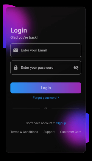
App Screenshot
This Flutter package allows you to easily create glass morphism effects in your Flutter applications. Glass morphism is a design trend that involves using blurred, semi-transparent elements to create a frosted glass-like effect.
To use this package, add glossy as a dependency in your pubspec.yaml file:
dependencies:
  flutter:
    sdk: flutter
  glossy: ^0.0.5
Open your termilar in the project level and run this command.
flutter pub add glossy
You can use the GlossyContainer widget provided by this package to create glass morphism effects. Here's a basic example:
import 'package:flutter/material.dart';
import 'package:glossy/glossy.dart';

void main() {
  runApp(const MyApp());
}

class MyApp extends StatelessWidget {
  const MyApp({super.key});

  @override
  Widget build(BuildContext context) {
    return MaterialApp(
      home: Scaffold(
        backgroundColor: Colors.black,
        appBar: AppBar(
          title: const Text('Glass Morphism Example'),
        ),
        body: Center(
          child: SizedBox(
            width: 300,
            height: 300,
            child: Stack(
              children: [
                Container(
                  height: 140,
                  width: 140,
                  decoration: (BoxDecoration(
                      color: Colors.purple,
                      borderRadius: BorderRadius.circular(70))),
                ),
                Align(
                  alignment: Alignment.bottomRight,
                  child: Container(
                    height: 140,
                    width: 140,
                    decoration: (BoxDecoration(
                        color: Colors.purple,
                        borderRadius: BorderRadius.circular(70))),
                  ),
                ),
                Align(
                  alignment: Alignment.center,
                  child: GlossyContainer(
                    width: 200,
                    height: 200,
                    borderRadius: BorderRadius.circular(12),
                    child: const Center(
                      child: Text(
                        'Glass Morphism',
                        style: TextStyle(
                          fontSize: 20,
                          fontWeight: FontWeight.bold,
                          color: Colors.white,
                        ),
                      ),
                    ),
                  ),
                ),
              ],
            ),
          ),
        ),
      ),
    );
  }
}
width: The width of the container required.height: The height of the container required.borderRadius: The border radius of the container.blur: The amount of blur to apply to the container.child: The widget placed inside the glass container.color: Background color of the container.opacity: Opacity of the container.strengthX: Strength of blur in the horizontal direction.strengthY: Strength of blur in the vertical direction.border: Border of the container.blendMode: Blend mode for applying filter.gradient: Gradient of the container.boxShadow: Box shadows for the container.image: Background image of the container.imageOpacity: Opacity of the background image.If you find this project helpful and would like to support its development, you can connect with me on social media:
Your support and feedback are greatly appreciated and will help in further improving this project.