
 v2.3.0
custom_radio_grouped_button
カスタムラジオボタンとグループ化されたチェックボックスボタン
156いいね 130030日間ダウンロード140Pub ポイント
AndroidiOSWebmacOSWindowsLinux
チェックボックスとラジオボタンをはるかにきれいで使いやすくするカスタムFlutterウィジェット。

{"sdk":"flutter"}{"sdk":"flutter"}以下は英語原文のスナップショットです。最新版は GitHub をご覧ください。
Custom Radio Buttons and Grouped Check Box Button
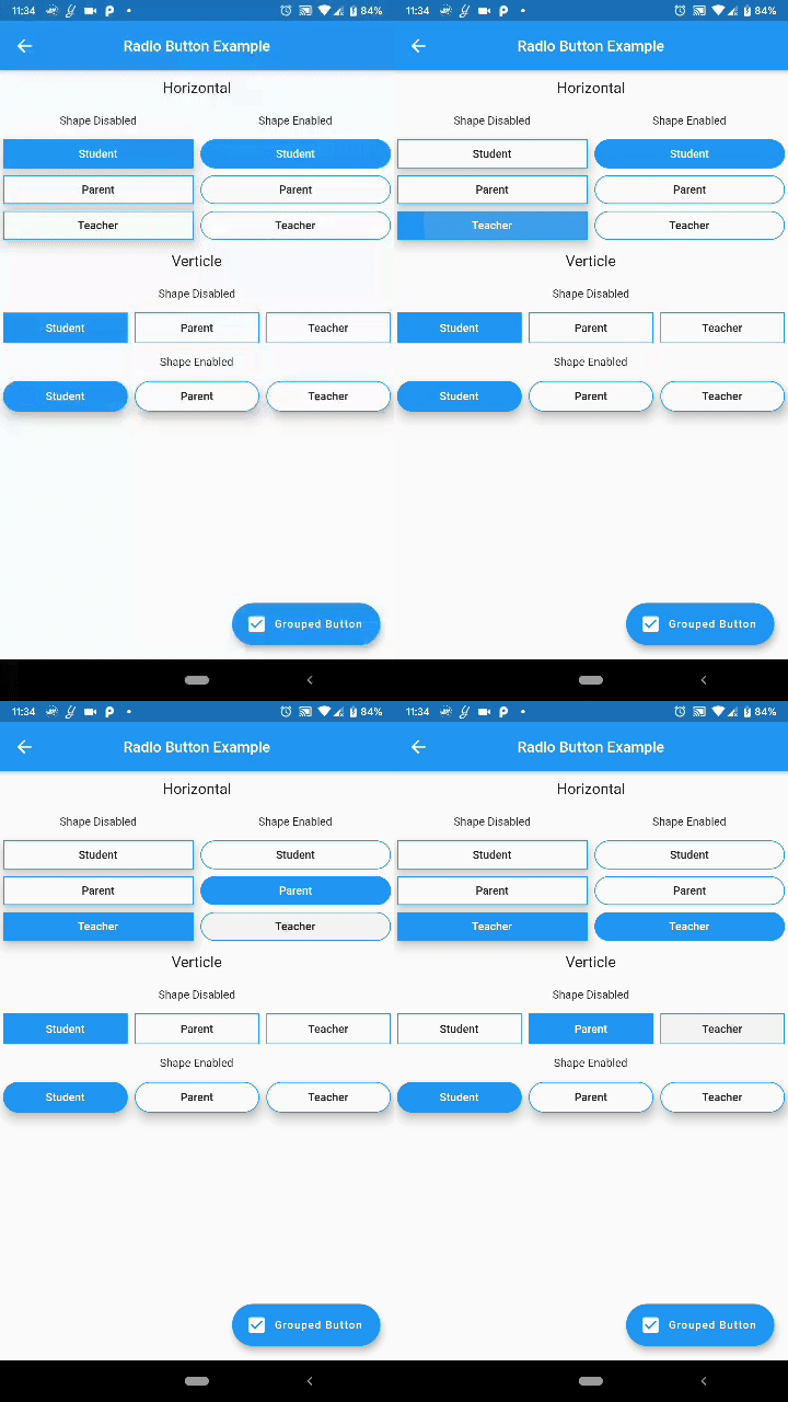
Custom Flutter widgets that makes Checkbox and Radio Buttons much cleaner and easier
Add the following to your pubspec.yaml file:
dependencies:
  custom_radio_grouped_button: any
CustomRadioButton(
  elevation: 0,
  absoluteZeroSpacing: true,
  unSelectedColor: Theme.of(context).canvasColor,
  buttonLables: [
    'Student',
    'Parent',
    'Teacher',
  ],
  buttonValues: [
    "STUDENT",
    "PARENT",
    "TEACHER",
  ],
  buttonTextStyle: ButtonTextStyle(
      selectedColor: Colors.white,
      unSelectedColor: Colors.black,
      textStyle: TextStyle(fontSize: 16)),
  radioButtonValue: (value) {
    print(value);
  },
  selectedColor: Theme.of(context).accentColor,
),
CustomCheckBoxGroup(
  buttonTextStyle: ButtonTextStyle(
    selectedColor: Colors.red,
    unSelectedColor: Colors.orange,
    textStyle: TextStyle(
      fontSize: 16,
    ),
    selectedTextStyle: TextStyle(
      fontSize: 20,
      fontWeight: FontWeight.w700,
    ),
  ),
  unSelectedColor: Theme.of(context).canvasColor,
  buttonLables: [
    "M",
    "T",
    "W",
    "T",
    "F",
    "S",
    "S",
  ],
  buttonValuesList: [
    "Monday",
    "Tuesday",
    "Wednesday",
    "Thursday",
    "Friday",
    "Saturday",
    "Sunday",
  ],
  checkBoxButtonValues: (values) {
    print(values);
  },
  spacing: 0,
  defaultSelected: "Monday",
  horizontal: false,
  enableButtonWrap: false,
  width: 40,
  absoluteZeroSpacing: false,
  selectedColor: Theme.of(context).accentColor,
  padding: 10,
);
You can acces the widget's state using Key now
Example: Create a key for the CustomRadioButton widget
final key = new GlobalKey<CustomRadioButtonState<T>>();
now to change the value of the widget pass the value to the selectButton method
key.currentState.selectButton(<value>);
Similarly for the CustomCheckBoxGroup widget
final key = new GlobalKey<CustomCheckBoxGroupState<T>>();

key.currentState.selectButton(<value>);