
checkbox_formfield
Flutterパッケージ

- スター
- 3
- フォーク
- 9
- 最終プッシュ(UTC)
- 2024/05/30
- プロジェクト状態
- 公開中
元の README
以下は英語原文のスナップショットです。最新版は GitHub をご覧ください。
checkbox_formfield

A few kinds of checkbox that can be used as FormField
Getting Started
This library currently has two Widgets.
- CheckboxListTileFormField: Use CheckboxListTile in Form
- CheckboxIconFormField: Use two Icons as if they consist a checkbox and also in Form
Demo
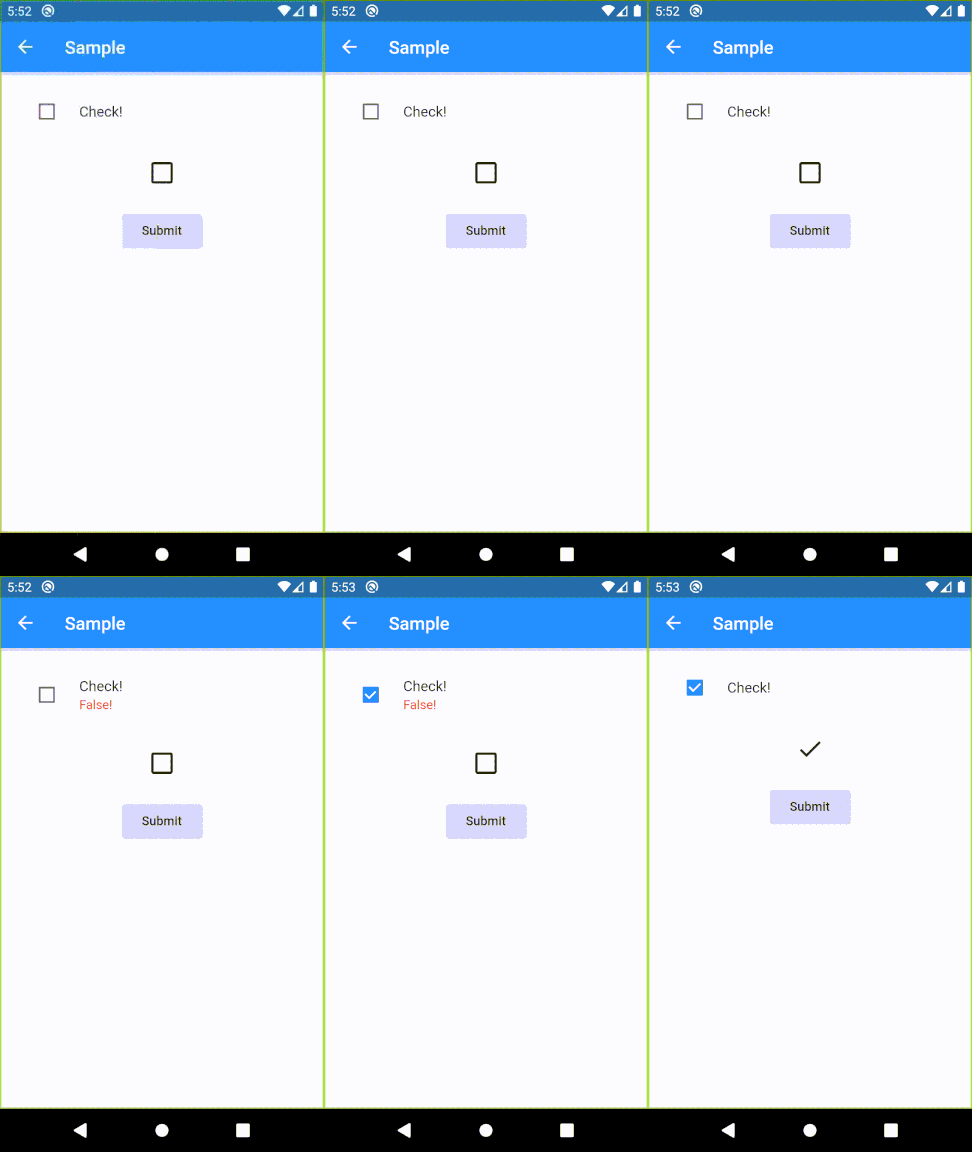
Usage sample
Please check example/lib in this library.
Specifications
CheckboxListTileFormField
| Parameter | Description |
|---|---|
| key | FormField.key |
| title | CheckboxListTile.title |
| context | Provide a default color to errorColor |
| onSaved | FormField.onSaved |
| validator | FormField.validator |
| initialValue | FormField.initialValue |
| autovalidateMode | FormField.autovalidateMode |
| enabled | Whether the checkbox is enabled |
| dense | CheckboxListTile.dense |
| errorColor | Color of error message Default: Theme.errorColor (context is given), Colors.red (otherwise) |
| activeColor | CheckboxListTile.activeColor |
| checkColor | CheckboxListTile.checkColor |
| controlAffinity | CheckboxListTile.controlAffinity |
| secondary | CheckboxListTile.secondary |
| contentPadding | CheckboxListTile.contentPadding |
| autofocus | CheckboxListTile.autofocus |
CheckboxIconFormField
| Parameter | Description |
|---|---|
| key | FormField.key |
| context | Provide a default color to errorColor |
| onSaved | FormField.onSaved |
| initialValue | FormField.initialValue |
| autovalidateMode | FormField.autovalidateMode |
| enabled | Whether the checkbox is enabled |
| trueIcon | IconData if true Default: Icons.check |
| falseIcon | IconData if false Default: Icons.check_box_outline_blank |
| trueIconColor | Color if true Default: Theme.colorScheme.secondary (if context is given), Theme.iconTheme.color (otherwise) |
| falseIconColor | Color if false Default: Theme.iconTheme.color |
| disabledColor | Color if disabled Default: Theme.disabledColor |
| padding | paddingDefault: 24.0 |
| iconSize | Icon.size |

GitHub 作者
K ↗
言語DartKotlinSwiftObjective-C
使用している依存関係
依存関係一覧 2 件
- flutter
{"sdk":"flutter"} - flutter_test開発用
{"sdk":"flutter"}
プロジェクトに合うリポジトリを選ぶには?
用途で絞り込み、開発状況を比較し、採用前に元のリポジトリで要件を確認しましょう。
- 名前・作者・説明で検索し、技術トピックで絞り込みます。
- スター、フォーク、最近のプッシュを比較します。スターは関心の目安であり、品質の保証ではありません。
- 利用前に GitHub で README、ライセンス、Issues を確認します。
情報源と管理
“A repository is the most basic element of GitHub.”
GitHub Docs — About repositories ↗