
 v0.0.2
icons_animate
このパッケージを使用して、2つの静的アイコンの間でアニメーションを実行し、アニメーション付きアイコンを得ます。
27いいね 11630日間ダウンロード145Pub ポイント
AndroidiOSWebmacOSWindowsLinux
これは2つのアイコンからカスタムのAnimatedIconを作成するためのFlutterパッケージです。このパッケージは、いくつかのデフォルトのアイコンに限定されず、任意のアイコンに対してAnimatedIconsを簡単に利用可能にするために生まれました。

{"sdk":"flutter"}{"sdk":"flutter"}^2.0.0以下は英語原文のスナップショットです。最新版は GitHub をご覧ください。
This is a Flutter package to make a custom AnimatedIcon from two Icons.
This package is born to make AnimatedIcons easily available for any Icon and not only the few default ones
GitHub branch checks state
GitHub release (latest by date)
Pub Version
Pub Points
GitHub license
GitHub last commit
GitHub issues
GitHub closed issues
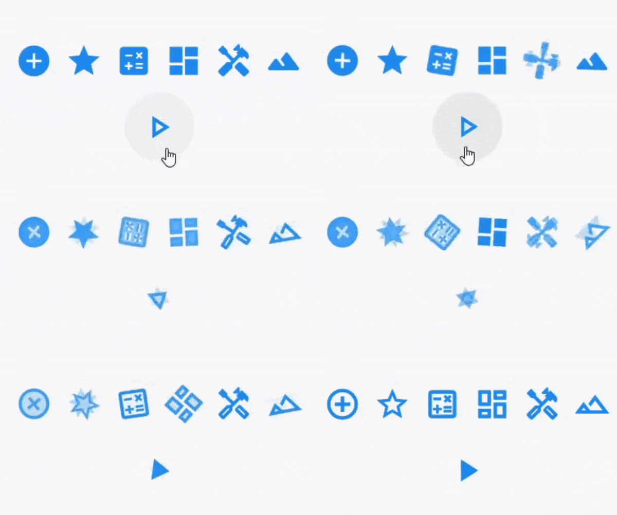
Here are some examples of animated icons.
Note that you can provide any Icon that is of type
IconDatato the animator
example gif
You can see an example of some icons being animated in the Sample Project
To install the package just do:
flutter pub add icons_animate
flutter pub get
OR add the dependency manually to your pubspec.yaml file:
dependencies:
  icons_animate: ^0.0.2
Then depend on it in your class:
import 'package:icons_animate/icons_animate.dart';
Here is a simple implementation:
AnimateIcons(
    startIcon: Icons.add_circle,
    endIcon: Icons.add_circle_outline,
    size: 100.0,
    controller: controller,
    startTooltip: 'Icons.add_circle',
    endTooltip: 'Icons.add_circle_outline',
    // add this for splashColor, default is Colors.transparent means no click effect
    splashColor: Colors.blueAccent.shade100.withAlpha(50),
    // add this to specify a custom splashRadius
    // default is Material.defaultSplashRadius (35)
    splashRadius: 24,
    onStartIconPress: () {
        print("Clicked on Add Icon");
        return true;
    },
    onEndIconPress: () {
        print("Clicked on Close Icon");
        return true;
    },
    duration: Duration(milliseconds: 500),
    startIconColor: Colors.deepPurple,
    endIconColor: Colors.deepOrange,
    clockwise: false,
),
See Example Code for more info.
Please file an issue to send feedback or report a bug, If you want to ask a question or suggest an idea then you can open an discussion. Thank you!
Every PR is welcome.