
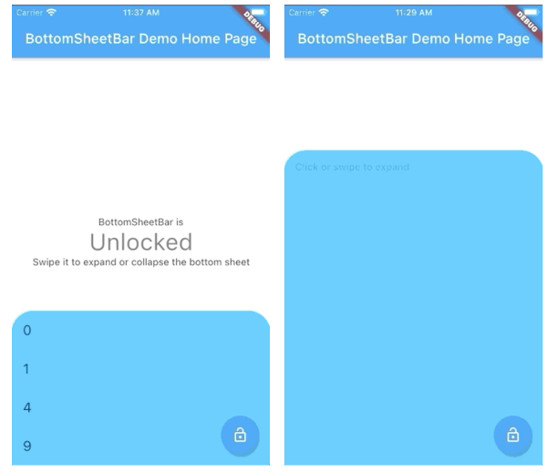
 v2.3.11
bottom_sheet_bar
ウィジェットの下部に配置され、ボトムシートに拡張されるツールバー。
80いいね 239030日間ダウンロード140Pub ポイント
AndroidiOSWebmacOSWindowsLinux
ツールバーがボトムシートに拡張される

{"sdk":"flutter"}^4.0.0{"sdk":"flutter"}^2.0.1以下は英語原文のスナップショットです。最新版は GitHub をご覧ください。
A toolbar that aligns to the bottom of a widget and expands into a bottom sheet.
| Short content | Long content | Scrollable content |
|---|---|---|
| https://raw.githubusercontent.com/mhrst/bottom_sheet_bar/HEAD/swipe_short.gif | https://raw.githubusercontent.com/mhrst/bottom_sheet_bar/HEAD/swipe_up.gif | https://raw.githubusercontent.com/mhrst/bottom_sheet_bar/HEAD/scroll.gif |
import 'package:bottom_sheet_bar/bottom_sheet_bar.dart';

BottomSheetBar(
    expandedBuilder: (scrollController) => ListView.builder(
        controller: scrollController,
        itemBuilder: (context, index) => ListTile(title: index.toString()),
        itemCount: 50,
    ),
    collapsed: Text('Collapsed toolbar widget'),
    body: Text('Content overlayed by toolbar and bottom sheet'),
);
BottomSheetBarWidget body - The toolbar will be aligned to the bottom of the body Widget. Padding equal to height is added to the bottom of this widget.Function(ScrollController) expandedBuilder - A function to build the widget displayed when the bottom sheet is expanded. If the expanded content is scrollable, pass the provided ScrollController to the scrollable widget.Widget collapsed - A Widget to be displayed on the toolbar in its collapsed stateBottomSheetBarController controller - A controller can be used to listen to events, and expand and collapse the bottom sheet.Color color - The background color of the toolbar and bottom sheet. Defaults to Colors.whiteColor backdropColor - The backdrop color that overlays the [body] widget when the bottom sheet is expanded. Defaults to Colors.transparent (no backdrop)BorderRadius borderRadius - Provide a border-radius to adjust the shape of the toolbarBorderRadius borderRadiusExpanded - Provide a border-radius to adjust the shape of the bottom-sheet when expandedList<BoxShadow> boxShadows - Provide shadow decoration to the bottom sheetdouble height - The height of the collapsed toolbar. Default to kToolbarHeight (56.0)bool isDismissable - If true, the bottom sheet can be dismissed by tapping elsewhere. Defaults to truebool locked - If true, the bottom sheet cannot be opened or closed with a swipe gesture. Defaults to truebool willPopScope - If true, the bottom sheet widget will be wrapped in a WillPopScope widget to handle back-gestures. Defaults to falsebool backButtonListener - If true, the bottom sheet widget will be wrapped in a BackButtonListener widget to handle back-gestures. Defaults to falseBottomSheetBarControllerA controller used to expand or collapse the bottom sheet of a BottomSheetBar. Listeners can be added to respond to expand and collapse events. The expanded or collapsed state can also be determined through this controller.
bool get isCollapsed - Only returns [true] if the bottom sheet if fully collapsedbool get isExpanded - Only returns [true] if the bottom sheet if fully expandedTickerFuture collapse() - Collapse the bottom sheet built by BottomSheetBar.expandedBuilderTickerFuture expand() - Expand the bottom sheet built by BottomSheetBar.expandedBuildervoid addListener(Function listener) - Adds a function to be called on every animation framevoid removeListener(Function listener) - Removes a previously added listenervoid dispose() - Removes all previously added listenersvoid attach(AnimationController animationController) - Used internally to assign the AnimationController created by BottomSheetBar to the controller. Unless you're using advanced animation techniques, you probably won't ever need to use this method.A quick demonstration can be found in the example directory. To run the example:
flutter run example/main.dart