
 v6.2.1
responsive_navigation_bar
応答性のあるボトムナビゲーションバー。初心者にも非常に親しみやすいです。ぜひ貢献してください。
83いいね 76530日間ダウンロード160Pub ポイント
AndroidiOSWebmacOSWindowsLinux
nohli/responsive_navigation_bar open-source repository details.
以下は英語原文のスナップショットです。最新版は GitHub をご覧ください。
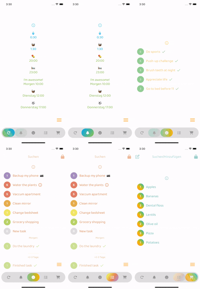
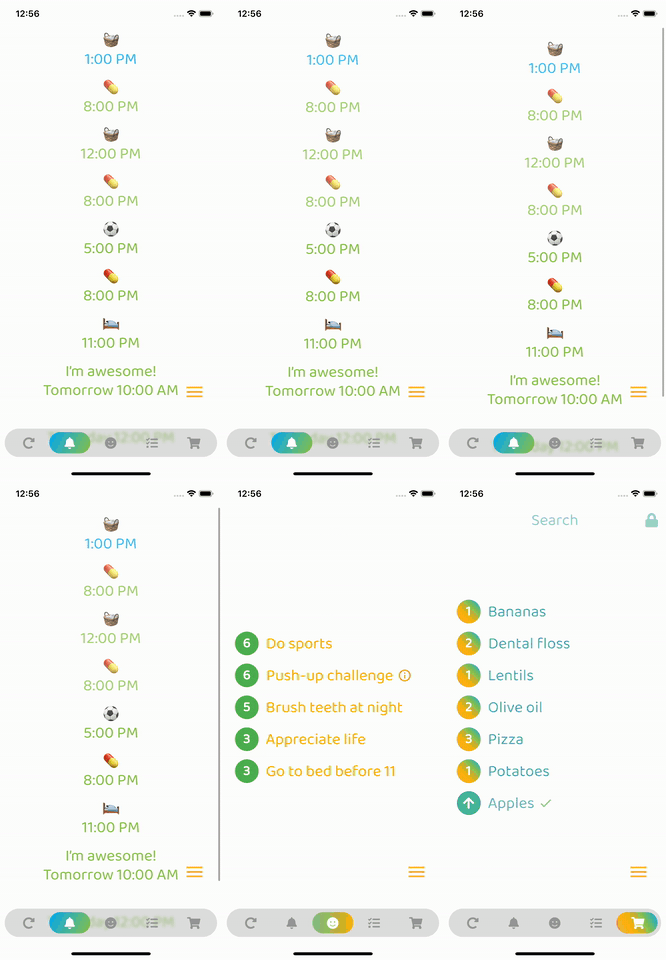
Very easy to set up, beginner friendly
Everything is documented + you will be asked to add required values - the rest is optional (with sound null safety)
By default, fontSize, iconSize and padding are responsive (change size with screen size)
Set iconSize to control icon size independently (defaults to fontSize if not specified)
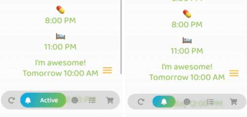
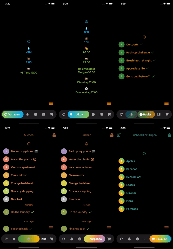
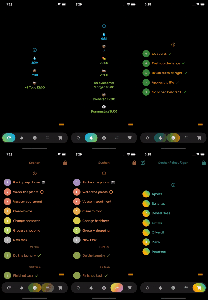
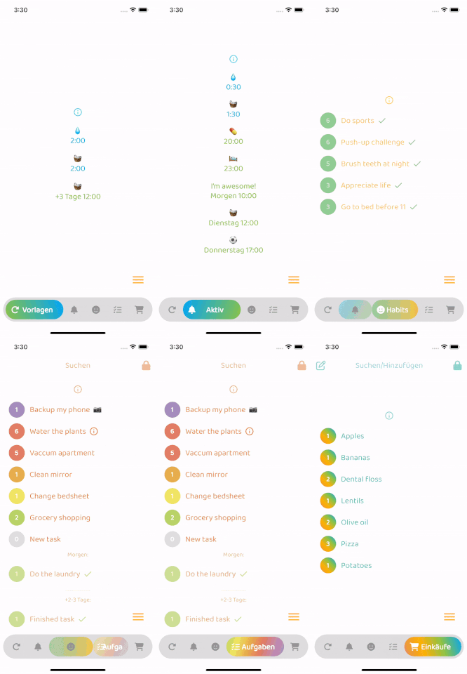
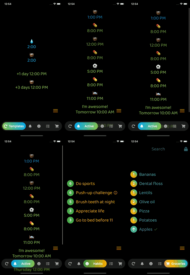
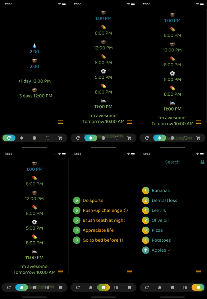
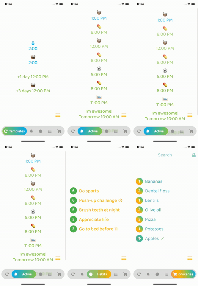
Optional: Beautiful gradient (backgroundGradient) for navigation bar and/or buttons (or solid colors)
Optional: Colored borders (border) for navigation bar and/or buttons
Optional: Change the opacity (backgroundOpacity) of the menu bar
Optional: Blurred background (backgroundBlur) from the top of the navigation bar to the bottom of the screen
Optional: Separate border radius controls (borderRadius, buttonBorderRadius)
Optional: Control button spacing (buttonSpacing)
By default shows text on selected button, optionally show on inactive buttons too (showInactiveButtonText)
Only StatelessWidgets
How to make the bottomNavigationBar float above the Scaffold's body:
Scaffold(
  extendBody: true,
  body: SafeArea(bottom: false, ...),
  bottomNavigationBar: ...
  ...
)
backgroundColor:
    Theme.of(context).brightness == Brightness.dark
        ? const Color(0xff3c3c3c)
        : const Color(0xffbebebe),
inactiveIconColor:
    Theme.of(context).brightness == Brightness.dark
        ? const Color(0xffaaaaaa)
        : const Color(0xff969696),

依存関係一覧 3 件
{"sdk":"flutter"}^6.0.0{"sdk":"flutter"}用途で絞り込み、開発状況を比較し、採用前に元のリポジトリで要件を確認しましょう。
“A repository is the most basic element of GitHub.”
GitHub Docs — About repositories ↗