
 v4.1.0
titled_navigation_bar
クリック時にスムーズなアニメーションを備えた、美しい、清潔でシンプルなボトムナビゲーションバーです。このパッケージは非常にカスタマイズ可能で、詳細については以下をご覧ください。
142いいね 8030日間ダウンロード40Pub ポイント
プラットフォーム情報なし
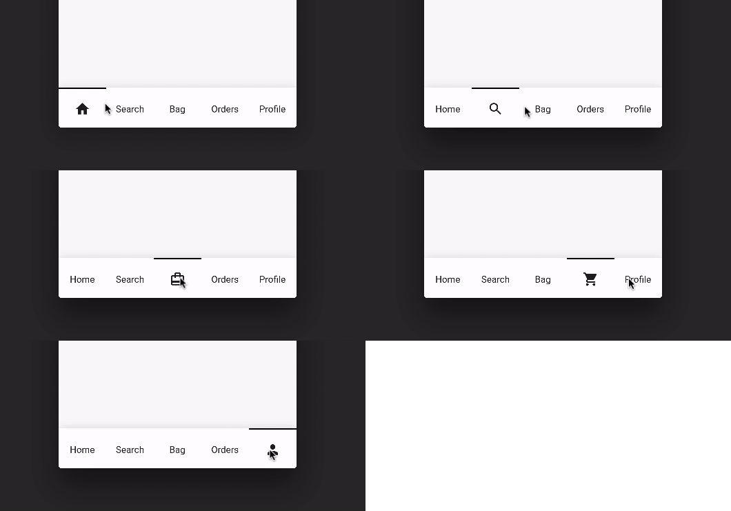
選択されたアイテムを切り替えるときに滑らかなアニメーションを提供する、美しいシンプルなボトムナビゲーションバーです。

{"sdk":"flutter"}{"sdk":"flutter"}以下は英語原文のスナップショットです。最新版は GitHub をご覧ください。
Pub Awesome Flutter
A beautiful, clean and simple bottom navigation bar with smooth animation on click. This package is high customizable, read more bellow for more details.
You can see the source code of this lib inside the /lib folder.
Default Mode Gif
Reversed Mode Gif
Follow these steps to use this library
dependencies:
  ...
  titled_navigation_bar: ^5.0.0-nullsafety.0
import 'package:titled_navigation_bar/titled_navigation_bar.dart';
bottomNavigationBar: TitledBottomNavigationBar(
  currentIndex: 2, // Use this to update the Bar giving a position
  onTap: (index){
    print("Selected Index: $index");
  },
  items: [
      TitledNavigationBarItem(title: Text('Home'), icon: Icons.home),
      TitledNavigationBarItem(title: Text('Search'), icon: Icons.search),
      TitledNavigationBarItem(title: Text('Bag'), icon: Icons.card_travel),
      TitledNavigationBarItem(title: Text('Orders'), icon: Icons.shopping_cart),
      TitledNavigationBarItem(title: Text('Profile'), icon: Icons.person_outline),
  ]
)
onTap - Use this to get notified when an item is clicked, you can retrieve the current item's index on this function. Should not be null!
items - The items of your bottom navigation bar. Use the TitledNavigationBarItem class to add items. Should not be null!
curve - Use this to define your custom curve animation. Should not be null!
reverse - If true, the visible widget of the selected item will be the Text (with the title of the item). If false, the visible widget of the selected item will be the icon. Default to false
activeColor - The active Text/Icon color. The default color is the indicatorColor of your app Theme.
inactiveColor - The inactive Text/Icon color. The default is the black color.
indicatorColor - The indicator color. The default color is the indicatorColor of your app Theme.
currentIndex - Use this to update the Bar giving a position.
enableShadow - Use this to remove the NavigationBar's shadow
icon -The icon of this item. This will be used as default state if reverse mode is disabled
title - The title of this item. This will be used as default state if reverse mode is enabled