
flutter
Flutter用の柔軟なアイコンファミリー

- スター
- 152
- フォーク
- 58
- 最終プッシュ(UTC)
- 2026/01/06
- プロジェクト状態
- 公開中
元の README
以下は英語原文のスナップショットです。最新版は GitHub をご覧ください。
phosphor-flutter

Phosphor is a flexible icon family for interfaces, diagrams, presentations — whatever, really. Explore all our icons at phosphoricons.com.


ScreenShots
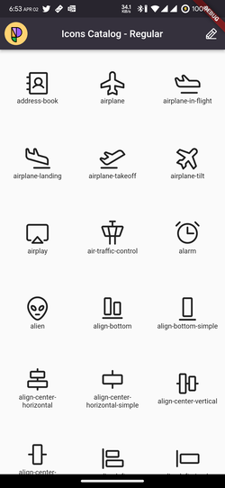
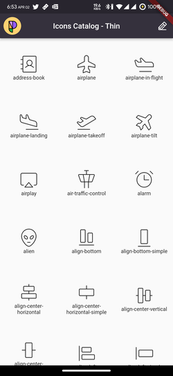
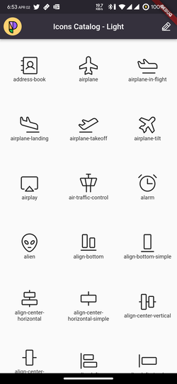
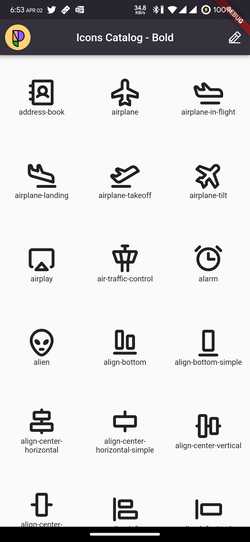
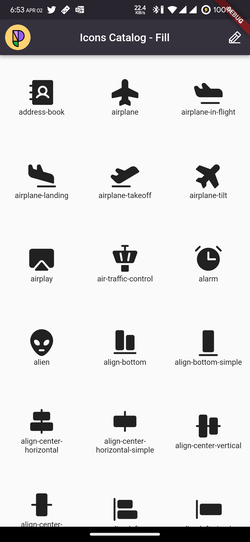
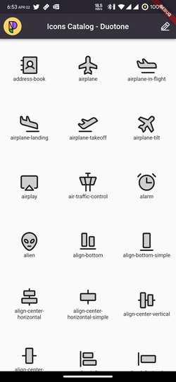
Installation
Add this to your pubspec.yaml
dependencies:
  phosphor_flutter: ^any
Then run the pub get command
flutter pub get
Usage
PhosphorIcon Widget
The easiest way to use all the Phosphor Icons in your app is to use the
PhosphorIcon widget with one of the style-specific icon classes and pass any of our PhosphorIcons to it.
Available Styles:
PhosphorIconsRegularPhosphorIconsThinPhosphorIconsLightPhosphorIconsBoldPhosphorIconsFillPhosphorIconsDuotone
[!TIP] Use the style classes for smaller font file size. The alternative syntax
PhosphorIcons.pencil(PhosphorIconsStyle.fill)is not recommended as it prevents tree shaking.
// import the package
import 'package:phosphor_flutter/phosphor_flutter.dart';

// This will show the [Note Pencil] icon in its fill version
// with a size of 30.0, green color and a semantic label for
// screen readers.
PhosphorIcon(
  PhosphorIconsFill.notePencil,
  color: Colors.green,
  size: 30.0,
  semanticLabel: 'New Note',
),
you could also use the duotone style like this
// import the package
import 'package:phosphor_flutter/phosphor_flutter.dart';

// This will show the [Note Pencil] icon in it's duotone version
PhosphorIcon(
  PhosphorIconsDuotone.notePencil,
  color: Colors.green,
),
by default the secondary color will be the same as the one passed here but with
a 20% of opacity, but you can easily override that behavior with the
duotoneSecondaryOpacity and duotoneSecondaryColor properties
// import the package
import 'package:phosphor_flutter/phosphor_flutter.dart';

// This will show the [Note Pencil] icon in it's duotone version where the
// foreground color will be green and the background color will be yellow
// with an opacity of 50%
PhosphorIcon(
  PhosphorIconsDuotone.notePencil,
  color: Colors.green,
  duotoneSecondaryOpacity: 0.50,
  duotoneSecondaryColor: Colors.yellow,
),
you can even make the opacity 100% to have a real duocolor icon.
Flutter Icon Widget
You can use the native flutter Icon() widget passing any PhosphorIcon value
like any Material Icon
NOTE: Due some limitations with the flutter
Iconwidget when you pass a duotone icon it will render it as a simple icon, for this case prefer to use our customPhosphorIconwidget that works the same asIconbut support our duotone style
// With Material Icons
Icon(
  Icons.edit, // Pencil icon
),

// With Phosphor Icons
Icon(
  PhosphorIconsRegular.pencil, // Pencil Icon
),
You could use any property of the Icon widget to personalize the icon.
// This will show the [Note Pencil] icon in it's fill version
// with a size of 30.0, green color and a semantic label for
// screen readers.
Icon(
  PhosphorIconsFill.notePencil,
  color: Colors.green,
  size: 30.0,
  semanticLabel: 'New Note',
),
All the icons has their thin, light, regular, bold and fill versions.
Migration Guide
To migrate from v1.0.0 to 2.1.0 you just need to change all your
PhosphorIcons.iconStyle to the new syntax.
For example:
// previous
Icon(
  PhosphorIcons.pencilFill, // Pencil Fill Icon
)

// new
Icon(
  PhosphorIconsFill.pencil, // Pencil Fill Icon
)

// new and suggested
PhosphorIcon(
  PhosphorIconsFill.pencil, // Pencil Fill Icon
)
Also, we encourage you to use our new PhosphorIcon widget to have support for
duotone icons.
Example App
You could see all the icons within the example app.
Just clone the repository and run the next commands
cd phosphor_flutter/example
flutter pub get
flutter run
Our Projects
- @phosphor-icons/homepage ▲ Phosphor homepage and general info
- @phosphor-icons/core ▲ Phosphor icon assets and catalog
- @phosphor-icons/elm ▲ Phosphor icons for Elm
- @phosphor-icons/figma ▲ Phosphor icons Figma plugin
- @phosphor-icons/flutter ▲ Phosphor IconData library for Flutter
- @phosphor-icons/pack ▲ Phosphor web font stripper to generate minimal icon bundles
- @phosphor-icons/penpot ▲ Phosphor icons Penpot plugin
- @phosphor-icons/react ▲ Phosphor icon component library for React
- @phosphor-icons/sketch ▲ Phosphor icons Sketch plugin
- @phosphor-icons/swift ▲ Phosphor icon component library for SwiftUI
- @phosphor-icons/theme ▲ A VS Code (and other IDE) theme with the Phosphor color palette
- @phosphor-icons/unplugin ▲ A multi-framework bundler plugin for generating Phosphor sprite sheets
- @phosphor-icons/vue ▲ Phosphor icon component library for Vue
- @phosphor-icons/web ▲ Phosphor icons for Vanilla JS
- @phosphor-icons/webcomponents ▲ Phosphor icons as Web Components
Community Projects
- adamglin0/compose-phosphor-icons ▲ Phosphor icons for Compose Multiplatform
- altdsoy/phosphor_icons ▲ Phosphor icons for Phoenix and TailwindCSS
- amPerl/egui-phosphor ▲ Phosphor icons for egui apps (Rust)
- babakfp/phosphor-icons-svelte ▲ Phosphor icons for Svelte apps
- brettkolodny/phosphor-lustre ▲ Phosphor icons for Lustre
- cellularmitosis/phosphor-uikit ▲ XCode asset catalog generator for Phosphor icons (Swift/UIKit)
- cjohansen/phosphor-clj ▲ Phosphor icons as Hiccup for Clojure and ClojureScript
- codeat3/blade-phosphor-icons ▲ Phosphor icons in your Laravel Blade views
- dennym/phosphor_icons_ex ▲ Phosphor icons for Elixir, Phoenix and Ash
- dreamRs/phosphor-r ▲ Phosphor icon wrapper for R documents and applications
- duongdev/phosphor-react-native ▲ Phosphor icon component library for React Native
- haruaki07/phosphor-svelte ▲ Phosphor icons for Svelte apps
- IgnaceMaes/ember-phosphor-icons ▲ Phosphor icons for Ember apps
- iota-uz/icons ▲ Phosphor icons as Templ components (Go)
- jajuma/phosphorhyva ▲ Phosphor icons for Magento 2 & Mage-OS with Hyvä Theme
- Kitten ▲ Phosphor icons integrated by default in Kitten
- lucagoslar/phosphor-css ▲ CSS wrapper for Phosphor SVG icons
- maful/ruby-phosphor-icons ▲ Phosphor icons for Ruby and Rails applications
- meadowsys/phosphor-svgs ▲ Phosphor icons as Rust string constants
- mwood/tamagui-phosphor-icons ▲ Phosphor icons for Tamagui
- noozo/phosphoricons_elixir ▲ Phosphor icons as SVG strings for Elixir/Phoenix
- oyedejioyewole/nuxt-phosphor-icons ▲ Phosphor icons integration for Nuxt
- pepaslabs/phosphor-uikit ▲ Xcode asset catalog generator for Swift/UIKit
- raycast/phosphor-icons ▲ Phosphor icons Raycast extension
- reatlat/eleventy-plugin-phosphoricons ▲ An Eleventy shortcode plugin to embed icons as inline SVGs
- robruiz/wordpress-phosphor-icons-block ▲ Phosphor icon block for use in WordPress v5.8+
- sachaw/solid-phosphor ▲ Phosphor icons for SolidJS
- SeanMcP/phosphor-astro ▲ Phosphor icons as Astro components
- SorenHolstHansen/phosphor-leptos ▲ Phosphor icon component library for Leptos apps (Rust)
- vnphanquang/phosphor-icons-tailwindcss ▲ TailwindCSS plugin for Phosphor icons
- wireui/phosphoricons ▲ Phosphor icons for Laravel
If you've made a port of Phosphor and you want to see it here, just open a PR here!
License
MIT © Phosphor Icons

Phosphor Icons ↗
カテゴリー
使用している依存関係
依存関係一覧 2 件
- flutter
{"sdk":"flutter"} - flutter_test開発用
{"sdk":"flutter"}
プロジェクトに合うリポジトリを選ぶには?
用途で絞り込み、開発状況を比較し、採用前に元のリポジトリで要件を確認しましょう。
- 名前・作者・説明で検索し、技術トピックで絞り込みます。
- スター、フォーク、最近のプッシュを比較します。スターは関心の目安であり、品質の保証ではありません。
- 利用前に GitHub で README、ライセンス、Issues を確認します。
情報源と管理
“A repository is the most basic element of GitHub.”
GitHub Docs — About repositories ↗