
 v1.0.3
day_month_picker
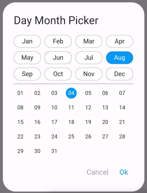
このパッケージを使えば、簡単に希望の月と日を選べます!ピッカーから簡単な日付選択プロセスを選択するだけで、年は必要ありません。楽しんでください!
29いいね 10330日間ダウンロード150Pub ポイント
AndroidiOSWebmacOSWindowsLinux
ダイアログから月とその月の日付を選択するのに役立つリポジトリです。ユーザーに年を表示したくない場合に最適です。
以下は英語原文のスナップショットです。最新版は GitHub をご覧ください。
The DayMonthPicker widget is a customizable Flutter component that allows users to select a specific day and month from a dialog interface. It is particularly useful in forms or applications where date input is needed without year.
Easy selection of months and days Customizable appearance Built-in support for existing day and month values Callback function to handle changes
const DayMonthPicker({
  Key? key,
  this.surfaceTintColor,
  this.titleTextStyle,
  this.selectedMonthBgColor = Colors.blue,
  this.unSelectedMonthBgColor = Colors.white,
  this.selectedDayBgColor = Colors.blue,
  this.unSelectedDayBgColor = Colors.white,
  this.title = "Date Month Picker",
  this.selectedMonthTextStyle = const TextStyle(color: Colors.white, fontSize: 14),
  this.unSelectedMonthTextStyle = const TextStyle(color: Colors.black, fontSize: 14),
  this.selectedDayTextStyle = const TextStyle(color: Colors.white, fontSize: 12),
  this.unSelectedDayTextStyle = const TextStyle(color: Colors.black, fontSize: 12),
  this.child = const Padding(
    padding: EdgeInsets.all(8.0),
    child: Text("Month Picker"),
  ),
  this.cancelTextStyle = const TextStyle(color: Colors.grey, fontSize: 16),
  this.okTextStyle = const TextStyle(color: Colors.blue, fontSize: 16),
  this.existingDay,
  this.existingMonth,
  required this.onChange,
});
Short and useful examples for package users.
DayMonthPicker(onChange: (DayMonth? dayMonth){
        if(dayMonth != null) {
          print("Day: ${dayMonth.day}");
          print("Month: ${dayMonth.month}");
        }
      }),
@override
Widget build(BuildContext context) {
  return Scaffold(
    appBar: AppBar(title: Text('Day Month Picker Example')),
    body: Center(
      child: DayMonthPicker(
        onChange: (dayMonth) {
          // Do something with the selected day and month
          print('Selected Day: ${dayMonth.day}, Month: ${dayMonth.month}');
        },
      ),
    ),
  );
}

依存関係一覧 3 件
{"sdk":"flutter"}{"sdk":"flutter"}^3.0.0用途で絞り込み、開発状況を比較し、採用前に元のリポジトリで要件を確認しましょう。
“A repository is the most basic element of GitHub.”
GitHub Docs — About repositories ↗