
 v3.0.4
drawerbehavior
Drawer behavior は、ドロワーのスライド中にビューを移動したり、ビューの高さを拡大・縮小するなどの追加動作を提供するライブラリです。
167いいね 25830日間ダウンロード150Pub ポイント
AndroidiOSWebmacOSWindowsLinux
Drawer behavior は、ドロワーのスライド中にビューを移動したり、ビューの高さを拡大・縮小するなどの追加動作を提供するライブラリです。

{"sdk":"flutter"}^5.0.0{"sdk":"flutter"}^1.10.0以下は英語原文のスナップショットです。最新版は GitHub をご覧ください。
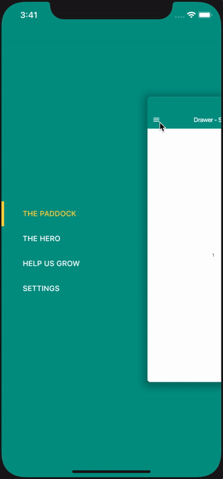
Drawer Behavior is a Flutter library that provides advanced effects and behaviors for the side navigation drawer. Unlike the standard Flutter drawer, this package allows you to create immersive interactions such as moving the view, scaling the view's height, or adding 3D effects while the drawer slides.
Alt Text
Scale Effect: smoothly scales down the main content as the drawer opens.
3D Effect: Adds a rotation depth effect to the main content.
Multi-Directional: Supports both Left and Right side drawers.
Peek Drawer: Keep a portion of the drawer visible even when closed.
Customization: Full control over headers, footers, item builders, and animations.
Null-Safety: Fully supports Dart null-safety.
Add this to your package's pubspec.yaml file:
dependencies:
  drawerbehavior: ^3.0.0 # Check pub.dev for the latest version
Install it via command line:
flutter pub get
import 'package:drawerbehavior/drawerbehavior.dart';
Replace your standard Scaffold with DrawerScaffold. Define your drawers using SideDrawer and your main content using the builder.
import 'package:flutter/material.dart';
import 'package:drawerbehavior/drawerbehavior.dart';

class MyHomePage extends StatefulWidget {
  @override
  _MyHomePageState createState() => _MyHomePageState();
}

class _MyHomePageState extends State<MyHomePage> {
  int selectedMenuItemId = 0;

  // Define your menu items
  final Menu menu = Menu(
    items: [
      MenuItem(id: 0, title: 'Home', icon: Icons.home),
      MenuItem(id: 1, title: 'Profile', icon: Icons.person),
      MenuItem(id: 2, title: 'Settings', icon: Icons.settings),
    ],
  );

  @override
  Widget build(BuildContext context) {
    return DrawerScaffold(
      // App Bar handles the menu button automatically
      appBar: AppBar(
        title: Text("Drawer Behavior"),
      ),

      // Define the drawer(s)
      drawers: [
        SideDrawer(
          percentage: 0.6, // Scale the main view down to 60%
          menu: menu,
          direction: Direction.left,
          animation: true,
          color: Theme.of(context).primaryColor,
          selectedItemId: selectedMenuItemId,
          onMenuItemSelected: (itemId) {
            setState(() {
              selectedMenuItemId = itemId;
            });
          },
        )
      ],

      // Build the main screen content based on selection
      builder: (context, id) => IndexedStack(
        index: selectedMenuItemId,
        children: [
          Center(child: Text("Home Page")),
          Center(child: Text("Profile Page")),
          Center(child: Text("Settings Page")),
        ],
      ),
    );
  }
}
You can fine-tune the look and feel using parameters in DrawerScaffold and SideDrawer.
| Parameter | Description |
|---|---|
drawers |
A list of SideDrawer widgets (e.g., left and right). |
builder |
Builder for the main content area. Use this to react to state changes. |
defaultDirection |
The default direction (left/right) controlled by the toggle button. |
cornerRadius |
Radius of the main content's corners when the drawer is open. |
contentShadow |
Shadow definition for the main content panel. |
enableGestures |
Boolean to enable/disable drag gestures. |
onSlide |
Callback triggered while the drawer is sliding. |
controller |
DrawerScaffoldController for programmatic control (open/close). |
| Parameter | Description |
|---|---|
percentage |
How much the main content scales down (e.g., 0.8) when open. |
degree |
The rotation degree for the 3D effect (between 15 and 45). |
slide |
If true, the main content slides horizontally with the drawer. |
peekMenu |
If true, a small part of the drawer remains visible when closed. |
peekSize |
The width of the drawer when peekMenu is active. |
direction |
Direction.left or Direction.right. |
headerView |
Widget to display at the top of the drawer. |
footerView |
Widget to display at the bottom of the drawer. |
itemBuilder |
Custom builder for menu items if you don't want the default look. |
color |
Background color of the drawer. |
background |
Background DecorationImage for the drawer. |
If you are upgrading from older versions, please note the following breaking changes:
DrawerScaffold:
mainDrawer property is now defaultDirection.
percentage property moved inside SideDrawer.
contentView is now builder.
SideDrawer:
menuView is now replaced by the drawers list containing SideDrawer.Example:
// OLD
DrawerScaffold(
  mainDrawer: Direction.left,
  contentView: Screen(...),
  percentage: 0.6,
  menuView: MenuView(...),
)

// NEW
DrawerScaffold(
  defaultDirection: Direction.left,
  builder: (context, id) => ...,
  drawers: [
    SideDrawer(
      percentage: 0.6,
      ...
    )
  ],
)
DrawerScaffold(
  drawers: [
    SideDrawer(
      percentage: 0.6,
      // ...
    )
  ],
  // ...
);
DrawerScaffold(
  drawers: [
    SideDrawer(
      direction: Direction.right,
      // ...
    )
  ],
  // ...
);
DrawerScaffold(
  drawers: [
    SideDrawer(
      degree: 45,
      // ...
    )
  ],
  // ...
);
### Drawer with Footer

<img src="https://github.com/shiburagi/Drawer-Behavior-Flutter/blob/preview/preview-ios-4.png?raw=true" width="200px"/>

```dart
DrawerScaffold(
  footerView: footerView(context),
  // ...
);
DrawerScaffold(
  headerView: headerView(context),
  drawers: [
    SideDrawer(
      itemBuilder: (BuildContext context, MenuItem menuItem, bool isSelected) {
        return Container(
          color: isSelected ? Theme.of(context).colorScheme.secondary.withOpacity(0.7) : Colors.transparent,
          padding: EdgeInsets.fromLTRB(24, 16, 24, 16),
          child: Text(
            menuItem.title,
            style: Theme.of(context).textTheme.subtitle1?.copyWith(
              color: isSelected ? Colors.black87 : Colors.white70),
          ),
        );
      }
    )
  ],
  // ...
);
DrawerScaffold(
  headerView: headerView(context),
  drawers: [
    SideDrawer(
      peekMenu: true,
      percentage: 1,
      menu: menuWithIcon,
      direction: Direction.left,
    )
  ],
  // ...
);
Contributions are welcome! Please feel free to submit a Pull Request.
This project is licensed under the MIT License - see the LICENSE file for details.
Based on the original work by shiburagi.
| trademunch trademunch 💻 |
anjarnaufals anjarnaufals 💻 |
Vladimir Vlach Vladimir Vlach 💻 |
Chris Hayen Chris Hayen 💻 |