
async_button_builder
Flutterでロードボタンを作成するためのヘルパー・ビルダー

- スター
- 31
- フォーク
- 14
- 最終プッシュ(UTC)
- 2023/02/13
- プロジェクト状態
- 公開中
元の README
以下は英語原文のスナップショットです。最新版は GitHub をご覧ください。
async_button_builder
AsyncButtonBuilder offers a simple way to extend any type of button with an asynchronous aspect. It allows adding loading, disabled, errored and completed states (with fluid animation between each) on top of buttons that perform asynchronous tasks.
Getting Started
Include the package:
async_button_builder: <latest_version>
Wrap the builder around a button, passing the onPressed and child element to builder instead of the button directly. These two are the only required fields.
AsyncButtonBuilder(
  child: Text('Click Me'),
  onPressed: () async {
    await Future.delayed(Duration(seconds: 1));
  },
  builder: (context, child, callback, _) {
    return TextButton(
      child: child,
      onPressed: callback,
    );
  },
),

The fourth value in the builder allows you listen to the loading state. This can be used to conditionally style the button. This package depends freezed in order to create a sealed union to better handle the possible states.
NOTE (Breaking change): As of v3.0.0, error now takes the error and stack trace as arguments.
AsyncButtonBuilder(
  child: Text('Click Me'),
  loadingWidget: Text('Loading...'),
  onPressed: () async {
    await Future.delayed(Duration(seconds: 1));

    // See the examples file for a way to handle timeouts
    throw 'yikes';
  },
  builder: (context, child, callback, buttonState) {
    final buttonColor = buttonState.when(
      idle: () => Colors.yellow[200],
      loading: () => Colors.grey,
      success: () => Colors.orangeAccent,
      error: (err, stack) => Colors.orange,
    );

    return OutlinedButton(
      child: child,
      onPressed: callback,
      style: OutlinedButton.styleFrom(
        primary: Colors.black,
        backgroundColor: buttonColor,
      ),
    );
  },
),
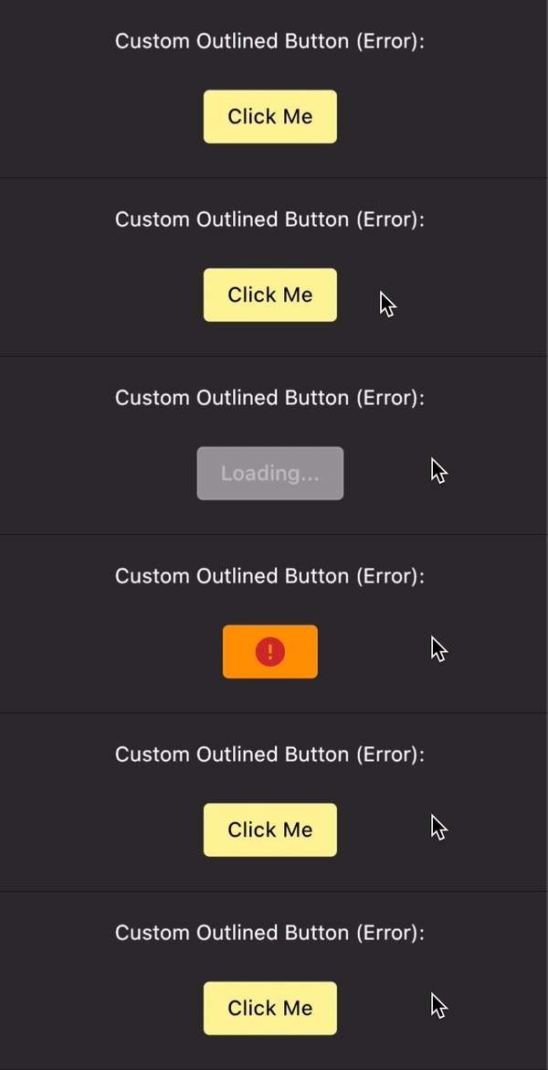
You can also drive the state of the button yourself using the buttonState field:
AsyncButtonBuilder(
  buttonState: ButtonState.completing(),
  // ...
),
Notifications
As of v3.0.0, you can now wrap a higher level parent to handle notifications that come from buttons. Why not use something like runZonedGuarded? Notification bubbling handles not only the error but the state of the button. If you'd like, for example, to trigger a circular spinner in the center of the app notifiying the user that something is happening, you can do so by listening to the AsyncButtonNotification and then using the buttonState to determine what to do.
It might also be a good idea to separate the errors that come from button presses and those that are not. An error wants to see why a button press silently failed but might not need to know why a background fetch failed.
MaterialApp(
  home: NotificationListener<AsyncButtonNotification>(
    onNotification: (notification) {
      notification.buttonState.when(
        idle: () => // nothing -> you could use a maybeWhen as well
        loading: () => // show circular loading widget?
        success: () => // show success snackbar?
        error: (_, __) => // show error snackbar?
      );

      // Tells the notification to stop bubbling
      return true;
    },
    // This async button can be nested arbitrarily deep*
    child: AsyncButtonBuilder(
      duration: duration,
      errorDuration: const Duration(milliseconds: 100),
      errorWidget: const Text('error'),
      onPressed: () async {
        throw ArgumentError();
      },
      builder: (context, child, callback, state) {
        return TextButton(onPressed: callback, child: child);
      },
      child: const Text('click me'),
    ),
  ),
)

// See NotificationListener for more information
To disable the notifications, you can pass false to notifications.
Customization
async_button_builder even works for custom buttons. You can define your own widgets for loading, error, and completion as well as define the transitions between them. This example is a little verbose but shows some of what's possible.
AsyncButtonBuilder(
  child: Padding(
    padding: const EdgeInsets.symmetric(
      horizontal: 16.0,
      vertical: 8.0,
    ),
    child: Text(
      'Click Me',
      style: TextStyle(color: Colors.white),
    ),
  ),
  loadingWidget: Padding(
    padding: const EdgeInsets.all(8.0),
    child: SizedBox(
      height: 16.0,
      width: 16.0,
      child: CircularProgressIndicator(
        valueColor: AlwaysStoppedAnimation<Color>(Colors.white),
      ),
    ),
  ),
  successWidget: Padding(
    padding: const EdgeInsets.all(4.0),
    child: Icon(
      Icons.check,
      color: Colors.purpleAccent,
    ),
  ),
  onPressed: () async {
    await Future.delayed(Duration(seconds: 2));
  },
  loadingSwitchInCurve: Curves.bounceInOut,
  loadingTransitionBuilder: (child, animation) {
    return SlideTransition(
      position: Tween<Offset>(
        begin: Offset(0, 1.0),
        end: Offset(0, 0),
      ).animate(animation),
      child: child,
    );
  },
  builder: (context, child, callback, state) {
    return Material(
      color: state.maybeWhen(
        success: () => Colors.purple[100],
        orElse: () => Colors.blue,
      ),
      // This prevents the loading indicator showing below the
      // button
      clipBehavior: Clip.hardEdge,
      shape: StadiumBorder(),
      child: InkWell(
        child: child,
        onTap: callback,
      ),
    );
  },
),
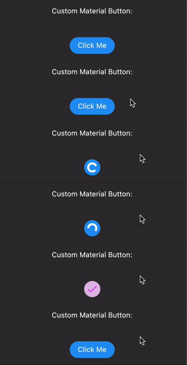
Issues and PR's welcome

Rex ↗
使用している依存関係
依存関係一覧 6 件
- flutter
{"sdk":"flutter"} - freezed_annotation
^2.2.0 - build_runner開発用
^2.3.3 - flutter_lints開発用
^2.0.1 - flutter_test開発用
{"sdk":"flutter"} - freezed開発用
^2.3.2
プロジェクトに合うリポジトリを選ぶには?
用途で絞り込み、開発状況を比較し、採用前に元のリポジトリで要件を確認しましょう。
- 名前・作者・説明で検索し、技術トピックで絞り込みます。
- スター、フォーク、最近のプッシュを比較します。スターは関心の目安であり、品質の保証ではありません。
- 利用前に GitHub で README、ライセンス、Issues を確認します。
情報源と管理
“A repository is the most basic element of GitHub.”
GitHub Docs — About repositories ↗