
折りたたみ可能な下部シート
torbenkeller/expandable_bottom_sheet open-source repository details.
GitHub で見る ↗アーカイブ済み
- スター
- 33
- フォーク
- 25
- 最終プッシュ(UTC)
- 2023/01/27
- プロジェクト状態
- アーカイブ済み
元の README
以下は英語原文のスナップショットです。最新版は GitHub をご覧ください。
ExpandableBottomSheet

This is a BottomSheet with a draggable height like the Google Maps App on Android.
If you have suggestions or find bugs please write an issue at github. PR's are welcome.
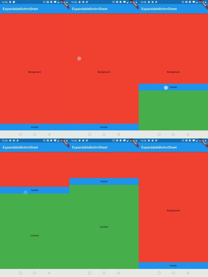 |
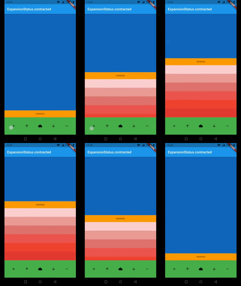 |
Arguments
| Argument | Description |
|---|---|
| expandableContent | This is the widget which you can hide and show by dragging. It has to be a widget with a constant height. |
| background | This is the widget behind the expandableContent which holds usually the content of your page. |
| persistentHeader | This is a Widget which is on top of the expandableContent and will never be hidden. It is made for a widget which indicates the user he can expand the content by dragging. |
| persistentFooter | This is a widget which is always shown at the bottom. The expandableContentis if it is expanded on top of it so you don't need margin to see all of your content. You can use it for example for navigation or a menu. |
| persistentContentHeight | This is the height of the content which will never been contracted. It only relates to expandableContent. persistentHeader and persistentFooter will not be affected by this. |
| animationDurationExtend | This is the duration for the animation if you stop dragging with high speed. |
| animationDurationContract | is the duration for the animation to bottom if you stop dragging with high speed. If it is null animationDurationExtend will be used. |
| animationCurveExpand | This is the curve of the animation for expanding the expandableContent if the drag ended with high speed. |
| animationCurveContract | This is the curve of the animation for contracting the expandableContent if the drag ended with high speed. |
| onIsExtendedCallback | This will be executed if the extend reaches its maximum. |
| onIsContractedCallback | This will be executed if the extend reaches its minimum. |
| enableToggle | This will enable tap to toggle option on header. |
| isDraggable | This will make the ExpandableBottomSheet draggable by the user or not. |
Examples
This are two examples how to use the ExpandableBottomSheet
Import Library
import 'package:expandable_bottom_sheet/expandable_bottom_sheet.dart';
Easy Example
ExpandableBottomSheet(
  background: Container(
    color: Colors.red,
    child: Center(
      child: Text('Background'),
    ),
  ),
  persistentHeader: Container(
    height: 40,
    color: Colors.blue,
    child: Center(
      child: Text('Header'),
    ),
  ),
  expandableContent: Container(
    height: 500,
    color: Colors.green,
    child: Center(
      child: Text('Content'),
    ),
  ),
);
Call expand, contract, or status programmatically
...
GlobalKey<ExpandableBottomSheetState> key = new GlobalKey();
...

@override
Widget build(BuildContext context) {
  return ExpandableBottomSheet(
    key: key
    ...
  );
}

void expand() => key.currentState.expand();

void contract() key.currentState.contract();

ExpansionStatus status() => key.currentState.expansionStatus;
Expert Example
class ExampleExpert extends StatefulWidget {
  @override
  _ExampleExpertState createState() => _ExampleExpertState();
}

class _ExampleExpertState extends State<ExampleExpert> {
  GlobalKey<ExpandableBottomSheetState> key = new GlobalKey();
  int _contentAmount = 0;
  ExpansionStatus _expansionStatus = ExpansionStatus.contracted;

  @override
  Widget build(BuildContext context) {
    return MaterialApp(
      home: Scaffold(
        appBar: AppBar(
          title: Text(_expansionStatus.toString()),
        ),
        body: ExpandableBottomSheet(
          //use the key to get access to expand(), contract() and expansionStatus
          key: key,

          //optional
          //callbacks (use it for example for an animation in your header)
          onIsContractedCallback: () => print('contracted'),
          onIsExtendedCallback: () => print('extended'),

          //optional; default: Duration(milliseconds: 250)
          //The durations of the animations.
          animationDurationExtend: Duration(milliseconds: 500),
          animationDurationContract: Duration(milliseconds: 250),

          //optional; default: Curves.ease
          //The curves of the animations.
          animationCurveExpand: Curves.bounceOut,
          animationCurveContract: Curves.ease,

          //optional
          //The content extend will be at least this height. If the content
          //height is smaller than the persistentContentHeight it will be
          //animated on a height change.
          //You can use it for example if you have no header.
          persistentContentHeight: 220,

          //required
          //This is the widget which will be overlapped by the bottom sheet.
          background: Container(
            color: Colors.blue[800],
          ),

          //optional
          //This widget is sticking above the content and will never be contracted.
          persistentHeader: Container(
            color: Colors.orange,
            constraints: BoxConstraints.expand(height: 40),
            child: Center(
              child: Container(
                height: 8.0,
                width: 50.0,
                color: Color.fromARGB((0.25 * 255).round(), 0, 0, 0),
              ),
            ),
          ),

          //required
          //This is the content of the bottom sheet which will be extendable by dragging.
          expandableContent: Container(
            constraints: BoxConstraints(maxHeight: 400),
            child: SingleChildScrollView(
              child: Column(
                mainAxisSize: MainAxisSize.min,
                children: <Widget>[
                  for (int i = 0; i < _contentAmount; i++)
                    Container(
                      height: 50,
                      color: Colors.red[((i % 8) + 1) * 100],
                    ),
                ],
              ),
            ),
          ),

          //optional
          //This is a widget aligned to the bottom of the screen and stays there.
          //You can use this for example for navigation.
          persistentFooter: Container(
            color: Colors.green,
            height: 100,
            child: Row(
              mainAxisSize: MainAxisSize.max,
              mainAxisAlignment: MainAxisAlignment.spaceEvenly,
              children: <Widget>[
                IconButton(
                  icon: Icon(Icons.add),
                  onPressed: () => setState(() {
                    _contentAmount++;
                  }),
                ),
                IconButton(
                  icon: Icon(Icons.arrow_upward),
                  onPressed: () => setState(() {
                    key.currentState!.expand();
                  }),
                ),
                IconButton(
                  icon: Icon(Icons.cloud),
                  onPressed: () => setState(() {
                    _expansionStatus = key.currentState!.expansionStatus;
                  }),
                ),
                IconButton(
                  icon: Icon(Icons.arrow_downward),
                  onPressed: () => setState(() {
                    key.currentState!.contract();
                  }),
                ),
                IconButton(
                  icon: Icon(Icons.remove),
                  onPressed: () => setState(() {
                    if (_contentAmount > 0) _contentAmount--;
                  }),
                ),
              ],
            ),
          ),
        ),
      ),
    );
  }
}

GitHub 作者
Torben Keller ↗
言語DartHTMLSwiftKotlinObjective-C
カテゴリー
使用している依存関係
依存関係一覧 3 件
- flutter
{"sdk":"flutter"} - flutter_test開発用
{"sdk":"flutter"} - very_good_analysis開発用
^2.3.0
プロジェクトに合うリポジトリを選ぶには?
用途で絞り込み、開発状況を比較し、採用前に元のリポジトリで要件を確認しましょう。
- 名前・作者・説明で検索し、技術トピックで絞り込みます。
- スター、フォーク、最近のプッシュを比較します。スターは関心の目安であり、品質の保証ではありません。
- 利用前に GitHub で README、ライセンス、Issues を確認します。
情報源と管理
“A repository is the most basic element of GitHub.”
GitHub Docs — About repositories ↗