
 v1.0.7
flutter_dropdown_alert
Flutter用のドロップダウンアラートパッケージで、API呼び出しが成功、失敗、または警告したときにプッシュ通知のようにユーザーにアラートを通知するのを支援します。
99いいね 126030日間ダウンロード140Pub ポイント
AndroidiOSWebmacOSWindowsLinux
Flutter ドロップダウンアラートは、成功、警告、エラーの際にユーザーに通知するのに役立ち、アプリ内プッシュ通知のように機能します。

{"sdk":"flutter"}{"sdk":"flutter"}以下は英語原文のスナップショットです。最新版は GitHub をご覧ください。
A dropdown alert package for flutter
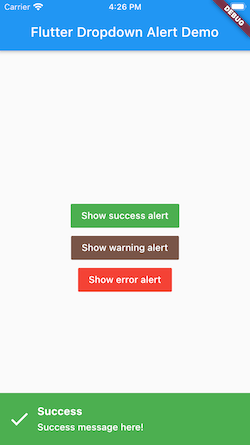
Dropdown alert will help to notify to user when you call api success, error or something like that, such as in app notification. It's will similar with push notification but you can custom more than that. You can show alert at anywhere without widget.
https://github.com/vantuan88291/flutter_dropdown_alert/raw/master/screenshot/dropdown.gif
https://github.com/vantuan88291/flutter_dropdown_alert/raw/master/screenshot/demo-2.png
# pubspec.yaml

dependencies:
  flutter:
    sdk: flutter
  flutter_dropdown_alert: <last-version>
Just create a Stack widget and add DropdownAlert() inside MaterialApp which should be in main.dart like this:
import 'package:flutter_dropdown_alert/dropdown_alert.dart';
 MaterialApp(
       title: 'Dropdown Alert Demo',
       theme: ThemeData(
         visualDensity: VisualDensity.adaptivePlatformDensity,
       ),
       builder: (context, child) => Stack(
         children: [
            child!,
            DropdownAlert()
         ],
       ),
       home: MyHomePage(title: 'Flutter Dropdown Alert Demo'),
     );
https://github.com/vantuan88291/flutter_bloc_modular
Next, import 'alert_controller.dart' into your dart code
import 'package:flutter_dropdown_alert/alert_controller.dart';
AlertController.show("Title", "message here!", TypeAlert.success, payload);
The payload param is Map<String, dynamic>, this param is optional, should use to give data into the alert and get it when click on alert.
The alert will automatically hide, but if you use delayDismiss: 0, it will freeze and not auto hide, you have to hide the alert by this code:
AlertController.hide();
There are 2 ways to do that:
initState() of widget: AlertController.onTabListener((Map<String, dynamic>? payload, TypeAlert type) {
print("$payload - $type");
});
onTap: DropdownAlert(onTap: (Map<String, dynamic> payload?, TypeAlert type) {
print("$payload - $type");
},)
| Type | description |
|---|---|
| TypeAlert.success | Type when action success, the background of alert will green |
| TypeAlert.warning | Type when action warning, the background of alert will brown |
| TypeAlert.error | Type when action error, the background of alert will red |
| parameter | description | default |
|---|---|---|
| onTap | Callback when tab to alert, will give: Function(Map<String, dynamic>, TypeAlert) | null |
| successImage | Image.asset() of success alert, uri of assets image | Icon widget |
| warningImage | Image.asset() of warning alert, uri of assets image | Icon widget |
| errorImage | Image.asset() of error alert, uri of assets image | Icon widget |
| closeImage | Image.asset() of close image, when showCloseButton is true | Icon widget |
| errorBackground | Color of background when error | Colors.red |
| successBackground | Colors.green | |
| warningBackground | 0xFFCE863D | |
| titleStyle | TextStyle of title | |
| contentStyle | TextStyle of content | |
| maxLinesTitle | null | |
| maxLinesContent | null | |
| duration | duration of animation | 300 |
| delayDismiss | delay time when alert auto dismiss, set to 0 if you want to freeze alert | 3000 |
| position | show the position of alert, include: AlertPosition.TOP, AlertPosition.BOTTOM | AlertPosition.TOP |
| showCloseButton | When close button is present, only can click on button close to hide the alert | false |
| avoidBottomInset | Add optional variable for inset overlap | false |
The ideal from react-native-dropdownalert