
 v0.4.0
pal_widgets
Flutter 애플리케이션용 놀라운 온보딩 위젯 세트입니다.
80좋아요 5030일 다운로드150Pub 점수
AndroidiOSWebmacOSWindowsLinux
Flutter 애플리케이션에서 놀라운 온보딩 경험을 만들기 위한 위젯 모음

^1.15.0{"sdk":"flutter"}^1.0.0{"sdk":"flutter"}아래는 영문 원문 스냅샷입니다. 최신 내용은 GitHub에서 확인하세요.
flutter anchored onboarding screen
build https://codecov.io/gh/Apparence-io/pal-widgets/branch/master/graph/badge.svg?token=M2CACTWTLM License: MIT Pal widgets pubdev
A flutter package for better onboarding.
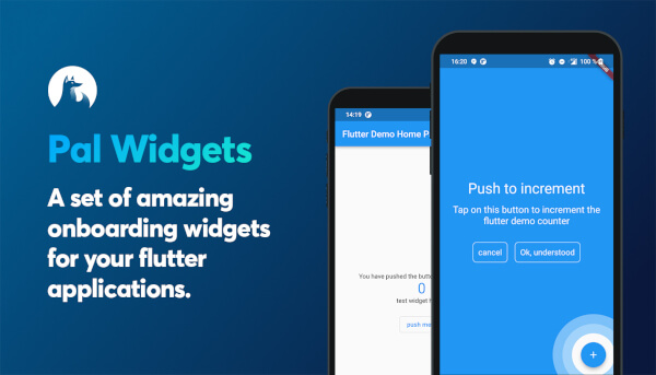
A set of amazing onboarding widgets for your flutter applications.
add in your pubspec.yaml dependencies
pal-widgets: 0.3.0
| Name | description | status |
|---|---|---|
| AnchoredHelper | An helper do describe another widget of your page. This creates an overlay above your page | :white_check_mark: |
This widgets is highly inspired by google onboardings. This shows a circle around any widgets you want and add an overlay were you can add a message.
First embbed you page or your app with a HelperOrchestrator widget.
HelperOrchestrator(
    child: Scaffold(
        appBar: AppBar(
            title: Text(widget.title),
        ),
        body: ...
    ),
)
You now have to get a key text1 for the widget you want to reference using
Text(
    '$_counter',
    key: HelperOrchestrator.of(context).generateKey('text1'),
),
You can now show an anchored helper using
final helper = AnchoredHelper(
    title: const Text('Title lorem pitume'),
    description: const Text('Lorem ipsum lorem ipsum lorem ipsum lorem ipsum lorem ipsum'),,
    bgColor: Colors.blue,
    leftBtnText: const Text('cancel'),
    rightBtnText: const Text('Ok, understood'),
    onError: () => print("widget not found"),
    positivBtnStyle: helperOutlineBtnStyle,
    negativeBtnStyle: helperOutlineBtnStyle,
    onLeftBtnTap: () => HelperOrchestrator.of(context).hideHelper(),
    onRightTap: () => HelperOrchestrator.of(context).hideHelper(),
    onTapAnchor: () => HelperOrchestrator.of(context).hideHelper(),
);

// this will show an overlayed anchored widget using the key text1
HelperOrchestrator.of(context).showAnchoredHelper('text1', helper);
| Property | description | Required |
|---|---|---|
| title | A Text widget to show as title | |
| description | A Text widget to show as description | |
| bgColor | A Color as Overlayed background | :white_check_mark: |
| leftBtnText | A [Text] widget to show within the left button | |
| rightBtnText | A [Text] widget to show within the right button | |
| onLeftBtnTap | Action on tap left button | |
| onRightTap | Action on tap right button | |
| onError | Functions to call when widgets encounters any errors | |
| leftBtnStyle | Material style to put on negativ button | |
| rightBtnStyle | Material style to put on positiv button | |
| onTapAnchor | Action to call when user tap on anchor | |
| widgetFactory | The Widget factory to create the anchored helper. Default to AnchoredCircleHoleHelper.anchorFactory which creates a full overlay with an animated hole |
There is two Hole Anchor widget factories :
AnchoredCircleHoleHelper.anchorFactory: creates a circle hole (default value)AnchoredRectHoleHelper.anchorFactory : creates a rectangle hole on strict widget boundsContact us on our twitter