
 v1.5.1
responsive_framework
간편하게 Flutter 앱을 반응형으로 만드세요. 다양한 화면 크기에 자동으로 UI를 적응시킵니다. 반응형을 간단히 구현하세요.
3.4천좋아요 14.5만30일 다운로드150Pub 점수
AndroidiOSWebmacOSWindowsLinux
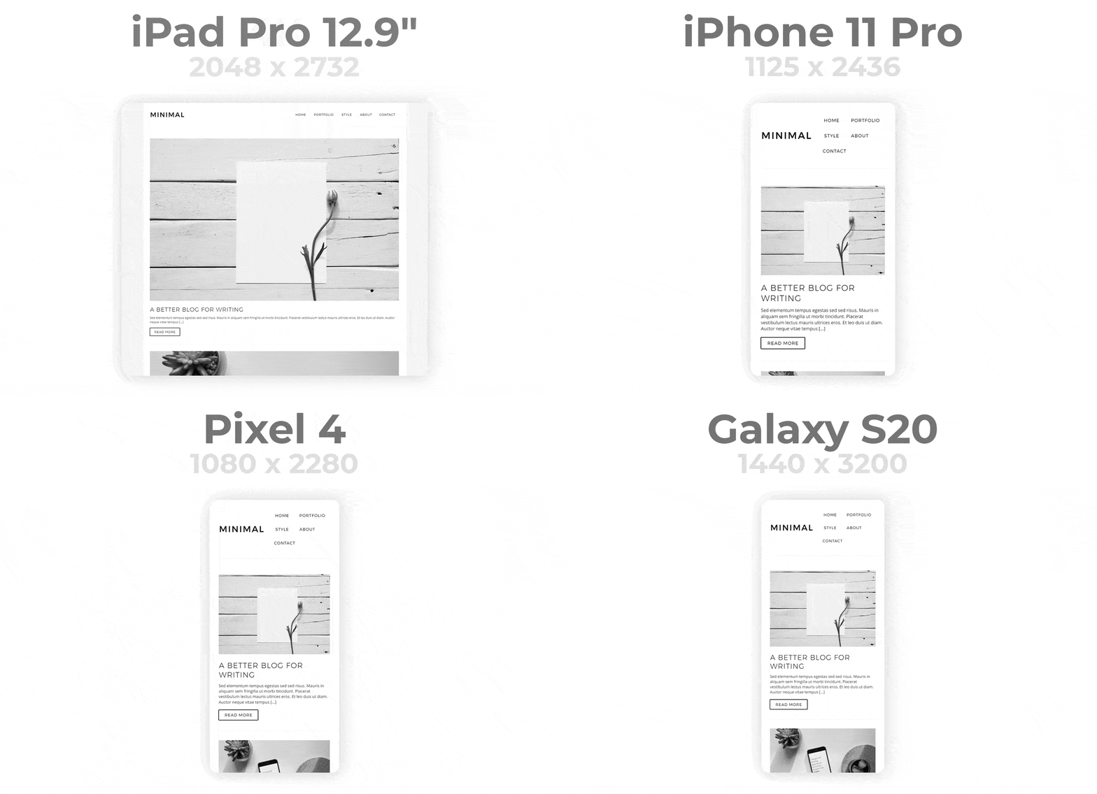
쉽게 Flutter 앱을 반응형으로 만들 수 있습니다. 다양한 화면 크기에 자동으로 UI를 적응시킵니다. 반응형을 간단하게. 데모: https://gallery.codelessly.com/flutterwebsites/minimal/

{"sdk":"flutter"}^1.16.0{"sdk":"flutter"}^4.0.0아래는 영문 원문 스냅샷입니다. 최신 내용은 GitHub에서 확인하세요.
Screenshots
Flutter Responsive Pub release GitHub Release Date GitHub issues GitHub top language GitHub code size in bytes Awesome Flutter Libraries.io for GitHub License
Screenshots
Responsiveness made simple
The Responsive Framework includes widgets that help developers build responsive apps for mobile, desktop, and website layouts.
A demo website built with the Responsive Framework. View Code
The flutter.dev website recreated in Flutter. View Code
The pub.dev website recreated in Flutter. View Code
Import this library into your project:
responsive_framework: ^latest_version
Add ResponsiveBreakpoints.builder to your MaterialApp or CupertinoApp. Define your own breakpoints and labels.
import 'package:responsive_framework/responsive_framework.dart';

class MyApp extends StatelessWidget {
  @override
  Widget build(BuildContext context) {
    return MaterialApp(
      builder: (context, child) => ResponsiveBreakpoints.builder(
        child: child!,
        breakpoints: [
          const Breakpoint(start: 0, end: 450, name: MOBILE),
          const Breakpoint(start: 451, end: 800, name: TABLET),
          const Breakpoint(start: 801, end: 1920, name: DESKTOP),
          const Breakpoint(start: 1921, end: double.infinity, name: '4K'),
        ],
      ),
      initialRoute: "/",
    );
  }
}
Use the labels you defined for layouts and values.
// Example: if the screen is bigger than the Mobile breakpoint, build full width AppBar icons and labels.
if (ResponsiveBreakpoints.of(context).largerThan(MOBILE))
    FullWidthAppBarItems()

// Booleans
ResponsiveBreakpoints.of(context).isDesktop;
ResponsiveBreakpoints.of(context).isTablet;
ResponsiveBreakpoints.of(context).isMobile;
ResponsiveBreakpoints.of(context).isPhone;

// Conditionals
ResponsiveBreakpoints.of(context).equals(DESKTOP)
ResponsiveBreakpoints.of(context).largerThan(MOBILE)
ResponsiveBreakpoints.of(context).smallerThan(TABLET)
ResponsiveBreakpoints.of(context).between(MOBILE, TABLET)
...
You can define your own breakpoint labels and use them in your conditionals.
For example, if you're building a Material 3 Navigation Rail and want to expand the menu to full width once there is enough room, you can add a custom EXPAND_SIDE_PANEL breakpoint.
breakpoints: [
  ...
  const Breakpoint(start: 801, end: 1920, name: DESKTOP),
  const Breakpoint(start: 900, end: 900, name: 'EXPAND_SIDE_PANEL') <- Custom label.
  const Breakpoint(start: 1921, end: double.infinity, name: '4K'),
  ...
]
Then, in your code, show the Rail based on the breakpoint condition.
expand: ResponsiveBreakpoints.of(context).largerThan('EXPAND_SIDE_PANEL')
The ResponsiveFramework includes a few custom widgets that supplement Flutter's responsive capabilities. Their usages are showcased in the demo projects.
Supporting multiple display sizes often means recreating the same layout multiple times. Under the traditional Bootstrap approach, building responsive UI is time consuming, frustrating and repetitive. Furthermore, getting everything pixel perfect is near impossible and simple edits take hours.
Screenshots
Use Responsive Framework to automatically scale your UI.
ResponsiveBreakpoint.autoScale(600);
Screenshots
AutoScale shrinks and expands your layout proportionally, preserving the exact look of your UI. This eliminates the need to manually adapt layouts to mobile, tablet, and desktop.
ResponsiveBreakpoint.autoScale(600);
Flutter's default behavior is resize which Responsive Framework respects. AutoScale is off by default and can be enabled at breakpoints by setting autoScale to true.
Screenshots
Breakpoints control responsive behavior at different screen sizes.
ResponsiveWrapper(
    child,
    breakpoints: [
        ResponsiveBreakpoint.resize(600, name: MOBILE),
        ResponsiveBreakpoint.autoScale(800, name: TABLET),
        ResponsiveBreakpoint.autoScale(1200, name: DESKTOP),
    ],
)
Breakpoints give you fine-grained control over how your UI displays.
These concepts helps you start using the Responsive Framework and build an responsive app quickly.
Flutter's default behavior is to resize your layout when the screen dimensions change. Resizing a layout stretches it in the direction of an unconstrained width or height. Any constrained dimension stays fixed which is why mobile app UIs look tiny on desktop. The following example illustrates the difference between resizing and scaling.
Screenshots
An AppBar widget looks correct on a phone. When viewed on a desktop however, the AppBar is too short and the title looks too small. Here is what happens under each behavior:
ResponsiveBreakpoint. As the width increases, the height increases proportionally.When scaled, the AppBar looks correct on desktop, up to a certain size. Once the screen becomes too wide, the AppBar starts to appear too large. This is where breakpoints come in.
To adapt to a wide variety of screen sizes, set breakpoints to control responsive behavior.
ResponsiveWrapper(
    child,
    maxWidth: 1200,
    minWidth: 480,
    defaultScale: true,
    breakpoints: [
        ResponsiveBreakpoint.resize(480, name: MOBILE),
        ResponsiveBreakpoint.autoScale(800, name: TABLET),
        ResponsiveBreakpoint.resize(1000, name: DESKTOP),
        ResponsiveBreakpoint.autoScale(2460, name: '4K'),
    ],
)
An arbitrary number of breakpoints can be set. Resizing/scaling behavior can be mixed and matched.
The wonderful people at Resocoder created a great tutorial video and article walking through the usage of the Responsive Framework at the link below.
View Responsive Framework Tutorial
No project wiki exists yet unfortunately. That means this is an opportunity for you to create and maintain the wiki for one of the most popular Flutter packages. This package needs your help with documentation!
Please reach out via the contact links below if you are interested.
Responsive Framework was created out of a desire for a better way to manage responsiveness. The ability to automatically adapt UI to different sizes opens up a world of possibilities. Here at Codelessly, we're building a Flutter app UI and website builder, development tools, and UI templates to increase productivity. If that sounds interesting, you'll want to subscribe to updates below 😎
Responsive Framework is licensed under Zero-Clause BSD and released as Emailware. If you like this project or it helped you, please subscribe to updates. Although it is not required, you might miss the goodies we share!
Now you can proudly display the time and headache saved by using Responsive Framework with a supporter's badge.
[](https://github.com/Codelessly/ResponsiveFramework)
<a href="https://github.com/Codelessly/ResponsiveFramework">
  <img alt="Built Responsive"
       src="https://raw.githubusercontent.com/Codelessly/ResponsiveFramework/master/packages/Built%20Responsive%20Badge.png"/>
</a>
<a href="https://github.com/Codelessly/ResponsiveFramework">
  <img alt="Built with Responsive Framework"
       src="https://raw.githubusercontent.com/Codelessly/ResponsiveFramework/master/packages/Built%20with%20Responsive%20Badge.png"/>
</a>
Design:
Development:
Sponsor: Codelessly - Flutter App UI and Website Builder
Codelessly Email Codelessly Website Codelessly Twitter Codelessly GitHubFlutter is a game-changing technology that will revolutionize not just development, but software itself. A big thank you to the Flutter team for building such an amazing platform 💙
FlutterBSD Zero Clause License
Copyright © 2024 Codelessly
Permission to use, copy, modify, and/or distribute this software for any
purpose with or without fee is hereby granted.
THE SOFTWARE IS PROVIDED "AS IS" AND THE AUTHOR DISCLAIMS ALL WARRANTIES WITH
REGARD TO THIS SOFTWARE INCLUDING ALL IMPLIED WARRANTIES OF MERCHANTABILITY
AND FITNESS. IN NO EVENT SHALL THE AUTHOR BE LIABLE FOR ANY SPECIAL, DIRECT,
INDIRECT, OR CONSEQUENTIAL DAMAGES OR ANY DAMAGES WHATSOEVER RESULTING FROM
LOSS OF USE, DATA OR PROFITS, WHETHER IN AN ACTION OF CONTRACT, NEGLIGENCE OR
OTHER TORTIOUS ACTION, ARISING OUT OF OR IN CONNECTION WITH THE USE OR
PERFORMANCE OF THIS SOFTWARE.