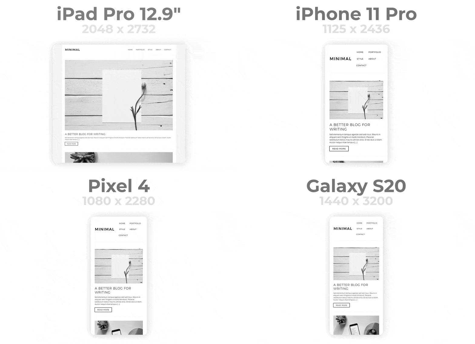
Responsive_Framework는 다양한 화면 크기와 플랫폼에서 반응형 사용자 인터페이스를 쉽게 만들 수 있도록 도와주는 Flutter 패키지입니다. 디바이스의 치수에 따라 레이아웃, 폰트 및 간격을 자동으로 조정할 수 있는 직관적인 도구를 제공합니다. 내장된 브레이크포인트와 유연한 디자인 패턴을 통해 복잡한 미디어 쿼리를 작성하지 않고도 Android, iOS, Web, macOS, Windows, Linux용 일관된 UI를 구축할 수 있습니다. 기존 프로젝트에 원활하게 통합되며 크로스플랫폼 호환성을 향상시킵니다.
사용 사례
일관된 레이아웃을 사용하여 크로스 플랫폼 앱 만들기
다른 화면 크기에 맞춰 UI 적응
모바일 및 웹을 위한 확장 가능한 디자인 만들기
반응형 타이포그래피 간소화
적응형 그리드 시스템 설계
장치 간 UI 일관성 보장
주요 기능
자동 레이아웃 적응
내장된 반응형 브레이크포인트
크로스 플랫폼 지원
기존 코드와의 간편한 통합
유연한 크기 및 간격 조절
모든 주요 플러터 플랫폼 지원
적합한 대상
반응형 UI를 찾는 플러터 개발자
다중 플랫폼 애플리케이션을 개발하는 팀
동적 레이아웃 조정을 필요로 하는 프로젝트
반복 코드를 줄이려는 개발자
다양한 화면 크기에 대응하는 앱
고려 사항
새 사용자에게는 초기 학습 곡선이 필요할 수 있습니다
브레이크포인트의 올바른 구성에 따라 달라집니다
예측 가능한 레이아웃 요구 사항을 가진 앱에 가장 적합
매우 복잡한 레이아웃에 대한 제한된 사용자 지정
정적이고 반응형이 아닌 디자인에는 적합하지 않습니다
원본 README
연결된 소스 저장소의 README 원문 스냅샷입니다. 최신 내용은 저장소에서 확인하세요.
Responsive Framework
Responsiveness made simple
The Responsive Framework includes widgets that help developers build responsive apps for mobile, desktop, and website layouts.
Use the labels you defined for layouts and values.
// Example: if the screen is bigger than the Mobile breakpoint, build full width AppBar icons and labels.if (ResponsiveBreakpoints.of(context).largerThan(MOBILE))
FullWidthAppBarItems()
// BooleansResponsiveBreakpoints.of(context).isDesktop;
ResponsiveBreakpoints.of(context).isTablet;
ResponsiveBreakpoints.of(context).isMobile;
ResponsiveBreakpoints.of(context).isPhone;
// ConditionalsResponsiveBreakpoints.of(context).equals(DESKTOP)
ResponsiveBreakpoints.of(context).largerThan(MOBILE)
ResponsiveBreakpoints.of(context).smallerThan(TABLET)
ResponsiveBreakpoints.of(context).between(MOBILE, TABLET)
...
Customization
You can define your own breakpoint labels and use them in your conditionals.
For example, if you're building a Material 3 Navigation Rail and want to expand the menu to full width once there is enough room, you can add a custom EXPAND_SIDE_PANEL breakpoint.
The ResponsiveFramework includes a few custom widgets that supplement Flutter's responsive capabilities. Their usages are showcased in the demo projects.
The remainder of the legacy ReadMe is preserved below as the concepts are still useful and used by the new widgets. ResponsiveWrapper has been deprecated and removed.
The Problem
Supporting multiple display sizes often means recreating the same layout multiple times. Under the traditional Bootstrap approach, building responsive UI is time consuming, frustrating and repetitive. Furthermore, getting everything pixel perfect is near impossible and simple edits take hours.
The Solution
Use Responsive Framework to automatically scale your UI.
ResponsiveBreakpoint.autoScale(600);
AutoScale
AutoScale shrinks and expands your layout proportionally, preserving the exact look of your UI.
This eliminates the need to manually adapt layouts to mobile, tablet, and desktop.
ResponsiveBreakpoint.autoScale(600);
Flutter's default behavior is resize which Responsive Framework respects. AutoScale is off by default and can be enabled at breakpoints by setting autoScale to true.
Breakpoints
Breakpoints control responsive behavior at different screen sizes.
Breakpoints give you fine-grained control over how your UI displays.
Introductory Concepts
These concepts helps you start using the Responsive Framework and build an responsive app quickly.
Scale vs Resize
Flutter's default behavior is to resize your layout when the screen dimensions change. Resizing a layout stretches it in the direction of an unconstrained width or height. Any constrained dimension stays fixed which is why mobile app UIs look tiny on desktop. The following example illustrates the difference between resizing and scaling.
An AppBar widget looks correct on a phone. When viewed on a desktop however, the AppBar is too short and the title looks too small.
Here is what happens under each behavior:
Resizing (default) - the AppBar's width is double.infinity so it stretches to fill the available width. The Toolbar height is fixed and stays 56dp.
Scaling - the AppBar's width stretches to fill the available width. The height scales proportionally using an aspect ratio automatically calculated from the nearest ResponsiveBreakpoint. As the width increases, the height increases proportionally.
When scaled, the AppBar looks correct on desktop, up to a certain size. Once the screen becomes too wide, the AppBar starts to appear too large. This is where breakpoints come in.
Breakpoint Configuration
To adapt to a wide variety of screen sizes, set breakpoints to control responsive behavior.
No project wiki exists yet unfortunately. That means this is an opportunity for you to create and maintain the wiki for one of the most popular Flutter packages. This package needs your help with documentation!
Please reach out via the contact links below if you are interested.
About
Responsive Framework was created out of a desire for a better way to manage responsiveness. The ability to automatically adapt UI to different sizes opens up a world of possibilities. Here at Codelessly, we're building a Flutter app UI and website builder, development tools, and UI templates to increase productivity. If that sounds interesting, you'll want to subscribe to updates below 😎
Responsive Framework is licensed under Zero-Clause BSD and released as Emailware. If you like this project or it helped you, please subscribe to updates. Although it is not required, you might miss the goodies we share!
Badges 🏆
Now you can proudly display the time and headache saved by using Responsive Framework with a supporter's badge.
<ahref="https://github.com/Codelessly/ResponsiveFramework"><imgalt="Built with Responsive Framework"src="https://raw.githubusercontent.com/Codelessly/ResponsiveFramework/master/packages/Built%20with%20Responsive%20Badge.png"/></a>
Flutter is a game-changing technology that will revolutionize not just development, but software itself. A big thank you to the Flutter team for building such an amazing platform 💙