
 v0.2.4
overlay_tooltip
온보딩을 위한 오버레이 툴팁 핸들러
240좋아요 3.5천30일 다운로드140Pub 점수
AndroidiOSWebmacOSWindowsLinux
온보딩을 위한 오버레이 툴팁 핸들러

{"sdk":"flutter"}{"sdk":"flutter"}아래는 영문 원문 스냅샷입니다. 최신 내용은 GitHub에서 확인하세요.
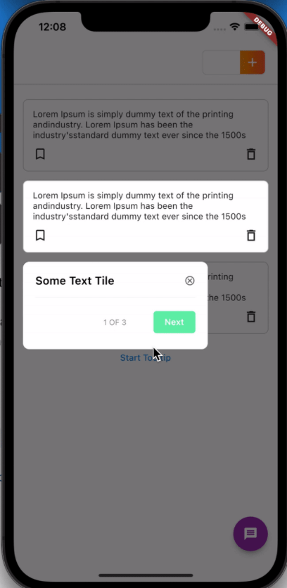
A Package that helps display tooltips for onboarding certain features in your app.
Due to the non-flexibility of some other tooltips packages, Overlay tooltip is designed to give you control over the nature of your tooltips widget, overlay colors, when to start/dismiss tooltips and moving between previous/next tooltips.
https://raw.githubusercontent.com/Deuque/overlay_tooltip/master/media/overlay_tooltip.gifTo use this package :
dependencies:
  flutter:
    sdk: flutter
  overlay_tooltip:
1. First of all, create a TooltipController. This should be created for every screen where tooltip is to be shown as it handles operations like starting, dismissing, moving to next/previous and pausing tooltips etc.
final TooltipController _controller = TooltipController();
This also provides ability to add an onDone method that runs when the tooltips for that controller is completed.
OverlayTooltipScaffold(
    overlayColor: Colors.red.withOpacity(.4),
    tooltipAnimationCurve: Curves.linear,
    tooltipAnimationDuration: const Duration(milliseconds: 1000),
    controller: controller,
    // if you need to have control over the background overlay for gestures
    preferredOverlay: GestureDetector(
      onTap: () {
        _controller.dismiss();
        //move the overlay forward or backwards, or dismiss the overlay
      },
      child: Container(
        height: double.infinity,
        width: double.infinity,
        color: Colors.blue.withOpacity(.2),
      ),
    ),
    child: Scaffold(),
  );
3. Wrap individual widgets to be displayed with an OverlayTooltipItem widget.
 OverlayTooltipItem(
    displayIndex: 0,
    tooltip: (controller) {
      return Padding(
        padding: const EdgeInsets.only(left: 15),
        child: MTooltip(title: 'Some Text Tile', controller: controller),
      );
    },
    child: _sampleWidget(),
  );
This widget can be instantiated with the following parameters:
ignorePointer (optional) - true by default. Controls whether the wrapped widget is clickable or not.
displayIndex - This ensures the order in which the tooltips are displayed
tooltip - This is a widget function that exposes the controller and can be used to create a custom widget to display as the tooltip.
tooltipVerticalPosition - The vertical positioning of the tooltip in relation to the main child widget, defaults to TooltipVerticalPosition.BOTTOM. Other options are TooltipVerticalPosition.TOP
tooltipHorizontalPosition - The horizontal positioning of the tooltip, defaults to TooltipHorizontalPosition.WITH_WIDGET and this aligns the tooltip with the child widget. Other options are TooltipHorizontalPosition.LEFT. TooltipHorizontalPosition.RIGHT or TooltipHorizontalPosition.CENTER
This can be done in three ways;
You can get access to the controller from sub widgets in the same context.
OverlayTooltipScaffold.of(context)?.controller;
Manually start the tooltips in any function by calling the start method, or pass a displayIndex to the start method indicating where to begin.
_controller.start(); // starts tooltip display from the beginning
_controller.start(1);// starts tooltip display from displayIndex of 1
Or Use the startWhen method to start the tooltips display automatically whenever a condition is met. This takes in a Future bool function with an initializedWidgetLength parameter denoting the length of tooltips widget that have been initialized.
_controller.startWhen( (initializedWidgetLength) async {
       //await any function and return a bool value when done.
     await Future.delayed(const Duration(milliseconds: 500));
     return initializedWidgetLength == 2 && !done;
   });
Or Add the startWhen parameter to the OverlayTooltipScaffold to also start the tooltips display automatically when a condition is met.
return OverlayTooltipScaffold(
    ...
     startWhen: (initializedWidgetLength) async{
        await Future.delayed(const Duration(milliseconds: 500));
        return initializedWidgetLength == 2 && !done;
      },
      ...
      child: Scaffold(
         ...
      )
    );
| Method | Type | Description |
|---|---|---|
| dismiss() | void | Dismiss overlay |
| next() | void | Moving to next tooltip |
| previous() | void | Moving to previous tooltip |
| pause() | void | Pause tooltip display without triggering onDone method |
| nextPlayIndex | int | Get index of current tooltip |
| playWidgetLength | int | Get total length of tooltips to be displayed |
This project is a starting point for a Dart package, a library module containing code that can be shared easily across multiple Flutter or Dart projects.
For help getting started with Flutter, view our online documentation, which offers tutorials, samples, guidance on mobile development, and a full API reference.