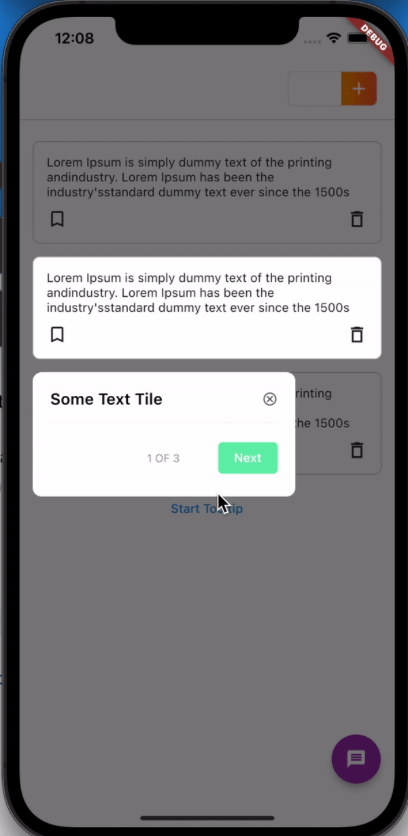
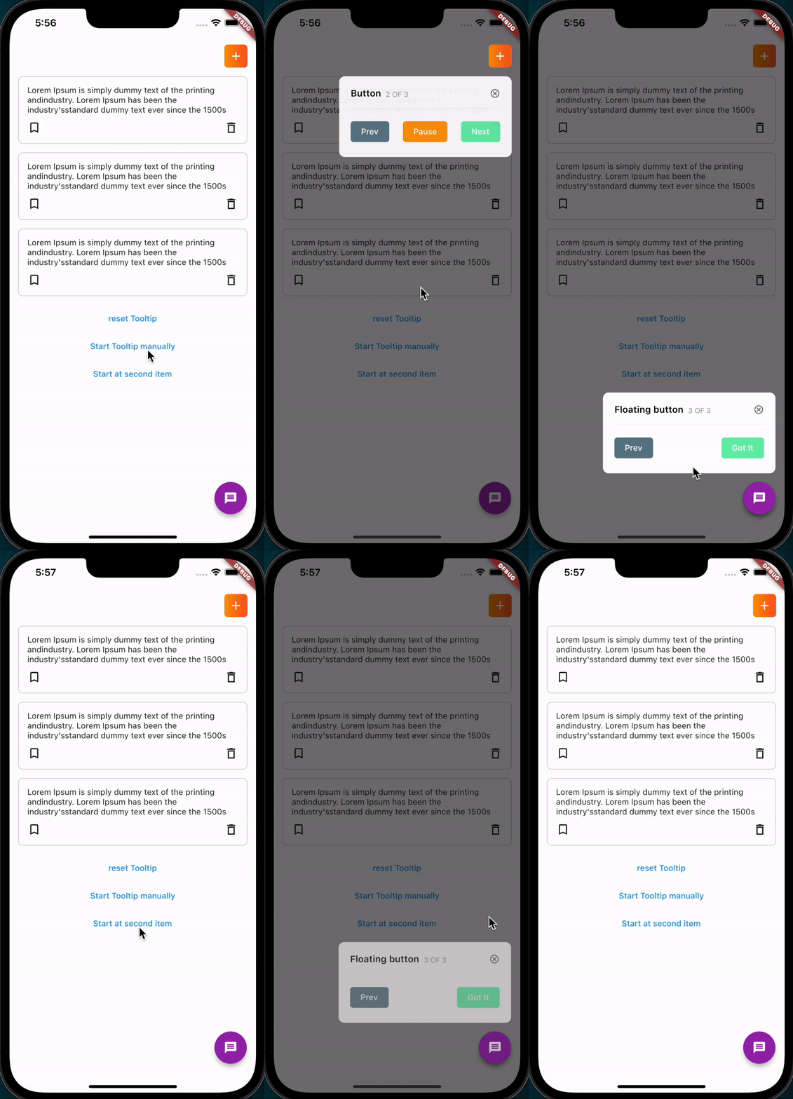
overlay_tooltip은 사용자 온보딩 경험을 위한 오버레이 툴팁을 생성하기 위해 설계된 Flutter 패키지입니다. 특정 UI 요소 위에 맥락 기반의 애니메이션 툴팁을 표시함으로써 개발자가 앱 기능을 안내할 수 있게 해줍니다. 기능 탐색 및 사용자 온보딩 흐름에 이상적이며, Android, iOS, Web, macOS, Windows, Linux 등 여러 플랫폼을 지원합니다. 기존의 Flutter 앱과 원활하게 통합되며, 위치, 스타일, 상호작용 처리를 사용자 정의할 수 있습니다. 시각적 신호가 중요한 튜토리얼이나 워크스루에서 특히 유용합니다.
사용 사례
신규 사용자 온보딩
앱 기능을 사용자에게 안내하기
튜토리얼 중 UI 요소 강조
인터랙티브 팁을 통한 사용자 참여도 향상
가이드付き 제품 투어 만들기
주요 기능
오버레이 기반의 툴팁 렌더링
사용자 정의 가능한 툴팁 표시
애니메이션 입구 및 출구 전환
다중 플랫폼 지원
기존 Flutter 위젯과의 간편한 통합
사용자 정의 가능한 대상 요소 정렬
적합한 대상
앱 온보딩 화면
사용자 교육 도구
기능 안내
모바일 및 웹 애플리케이션
경량 코치 마크를 찾는 개발자
고려 사항
중복된 콘텐츠를 피하기 위해 정확한 위치 조정이 필요합니다
복잡한 탐색 흐름을 위해 추가 로직이 필요할 수 있습니다
제한된 내장 애니메이션 프리셋
간단하고 선형적인 온보딩 시퀀스에 가장 적합
지속적인 UI 안내에 적합하지 않음
원본 README
연결된 소스 저장소의 README 원문 스냅샷입니다. 최신 내용은 저장소에서 확인하세요.
Overlay_tooltip
A Package that helps display tooltips for onboarding certain features in your app.
Motivation
Due to the non-flexibility of some other tooltips packages, Overlay tooltip is designed to give you control over the nature of your tooltips widget, overlay colors, when to start/dismiss tooltips and moving between previous/next tooltips.
Usage
To use this package :
add the dependency to your pubspec.yaml file.
dependencies:flutter:sdk:flutteroverlay_tooltip:
Setup
1. First of all, create a TooltipController. This should be created for every screen where tooltip is to be shown as it handles operations like starting, dismissing, moving to next/previous and pausing tooltips etc.
This also provides ability to add an onDone method that runs when the tooltips for that controller is completed.
OverlayTooltipScaffold(
overlayColor: Colors.red.withOpacity(.4),
tooltipAnimationCurve: Curves.linear,
tooltipAnimationDuration: constDuration(milliseconds: 1000),
controller: controller,
// if you need to have control over the background overlay for gestures
preferredOverlay: GestureDetector(
onTap: () {
_controller.dismiss();
//move the overlay forward or backwards, or dismiss the overlay
},
child: Container(
height: double.infinity,
width: double.infinity,
color: Colors.blue.withOpacity(.2),
),
),
child: Scaffold(),
);
3. Wrap individual widgets to be displayed with an OverlayTooltipItem widget.
This widget can be instantiated with the following parameters:
ignorePointer (optional) - true by default. Controls whether the wrapped widget is clickable or not.
displayIndex - This ensures the order in which the tooltips are displayed
tooltip - This is a widget function that exposes the controller and can be used to create a custom widget to display as the tooltip.
tooltipVerticalPosition - The vertical positioning of the tooltip in relation to the main child widget, defaults to TooltipVerticalPosition.BOTTOM. Other options are TooltipVerticalPosition.TOP
tooltipHorizontalPosition - The horizontal positioning of the tooltip, defaults to TooltipHorizontalPosition.WITH_WIDGET and this aligns the tooltip with the child widget. Other options are TooltipHorizontalPosition.LEFT. TooltipHorizontalPosition.RIGHT or TooltipHorizontalPosition.CENTER
Displaying Tooltips
This can be done in three ways;
You can get access to the controller from sub widgets in the same context.
OverlayTooltipScaffold.of(context)?.controller;
Manually start the tooltips in any function by calling the start method, or pass a displayIndex to the start method indicating where to begin.
_controller.start(); // starts tooltip display from the beginning
_controller.start(1);// starts tooltip display from displayIndex of 1
Or Use the startWhen method to start the tooltips display automatically whenever a condition is met. This takes in a Future bool function with an initializedWidgetLength parameter denoting the length of tooltips widget that have been initialized.
_controller.startWhen( (initializedWidgetLength) async {
//await any function and return a bool value when done.awaitFuture.delayed(constDuration(milliseconds: 500));
return initializedWidgetLength == 2 && !done;
});
Or Add the startWhen parameter to the OverlayTooltipScaffold to also start the tooltips display automatically when a condition is met.
Pause tooltip display without triggering onDone method
nextPlayIndex
int
Get index of current tooltip
playWidgetLength
int
Get total length of tooltips to be displayed
Check example project for usage and/or clarifications.
Getting Started
This project is a starting point for a Dart
package,
a library module containing code that can be shared easily across
multiple Flutter or Dart projects.
For help getting started with Flutter, view our
online documentation, which offers tutorials,
samples, guidance on mobile development, and a full API reference.