
 v1.2.1
chiclet
Chiclet은 인기 있는 언어 학습 앱인 Duolingo와 Figma 강의에서 볼 수 있는 고도로 사용자 정의 가능한 섬 스타일 버튼을 제공합니다.
49좋아요 64830일 다운로드140Pub 점수
AndroidiOSWebmacOSWindowsLinux
고도로 사용자 정의 가능한 섬 스타일 버튼인 Chiclet을 포함한 Flutter 패키지입니다.

{"sdk":"flutter"}{"sdk":"flutter"}^6.0.0아래는 영문 원문 스냅샷입니다. 최신 내용은 GitHub에서 확인하세요.
Highly customizable island-style buttons known as Chiclet.
If you find this project useful and would like to support its development, you can donate using the following cryptocurrencies. We work on this project in our spare time alongside our full-time jobs, and even a small donation — as little as $1 — goes a long way in Iran and helps us dedicate more time to improving and maintaining it.
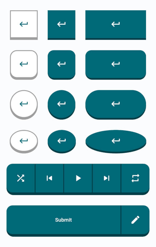
bc1qkxcvlvkrslx33g2kql45au438ua3qrvanangw20x575ef94aea4aa5bdf5c74c6b47311768118ad7c7TRXMXafCkQ1sND7f9rfUNVDWazR866GHwFTRXMXafCkQ1sND7f9rfUNVDWazR866GHwFUQBcgZhcrJ-Qd-MUol1SvCLSqZCWZ01efrJJh4SUsoBpGtJwChiclet provides you with highly customizable island-style buttons similar to those found in the popular language learning app Duolingo and Figma courses.
Chiclet
In the dependencies: section of your pubspec.yaml, add the following line:
dependencies:
  chiclet: <latest_version>
Chiclet in your main.dart.import 'package:chiclet/chiclet.dart';
ChicletOutlinedAnimatedButton(
onPressed: () {},
child: const Icon(Icons.download_rounded),
),
Chiclet
ChicletButtonTypes.roundedRectangle in front of the buttonType property. In either case, the result will be the same. Example:ChicletOutlinedAnimatedButton(
onPressed: () {},
child: const Icon(Icons.download_rounded),
),
ChicletOutlinedAnimatedButton(
  onPressed: () {},
  buttonType: ChicletButtonTypes.roundedRectangle,
  child: const Icon(Icons.download_rounded),
),
Chiclet
ChicletButtonTypes.circle in front of the buttonType property. Example:ChicletOutlinedAnimatedButton(
onPressed: () {},
buttonType: ChicletButtonTypes.circle,
child: const Icon(Icons.download_rounded),
),
Chiclet
ChicletButtonTypes.circle in front of the buttonType property. Example:ChicletOutlinedAnimatedButton(
onPressed: () {},
width: 65,
buttonType: ChicletButtonTypes.oval,
child: const Icon(Icons.download_rounded),
),
Chiclet
You can find more examples in the /example/lib/main.dart directory.
Chiclet
height),height),shade.900 of ThemeData's primarySwatch, unless you provide the backgroundColor property, then it will be shade.900 of the backgroundColor property),Colors.white),ThemeData's primarySwatch),NoSplash.splashFactory),ChicletButtonTypes.roundedRectangle),height),height),Colors.grey),Colors.grey),ThemeData's primarySwatch),Colors.white),Theme.colorScheme.onSurface(0.12)),NoSplash.splashFactory),ChicletButtonTypes.roundedRectangle),height),Colors.grey),ThemeData's primarySwatch),Colors.white),NoSplash.splashFactory),ChicletButtonTypes.roundedRectangle),Colors.grey),ThemeData's primarySwatch),Colors.white),[!NOTE] When using Material 3, providing the
primarySwatchdoesn't affect the color properties. You should consider providing eithercolorSchemeorColorSchemeSeed.
Suggestions, recommendations, bug reports, and issues: DevRedStone