
 v1.0.0+1
flutter_inner_drawer
내부 드로어는 리스트 메뉴나 기타 항목을 삽입할 수 있는 내부 측면 섹션(좌/우)을 쉽게 만들 수 있는 방법입니다.
482좋아요 5030일 다운로드70Pub 점수
플랫폼 정보 없음
내부 드로어는 리스트 메뉴 또는 기타 항목을 삽입할 수 있는 내부 측면 섹션(좌/우)을 쉽게 만들 수 있는 방법입니다.

{"sdk":"flutter"}{"sdk":"flutter"}아래는 영문 원문 스냅샷입니다. 최신 내용은 GitHub에서 확인하세요.
pub package Awesome Flutter Donate
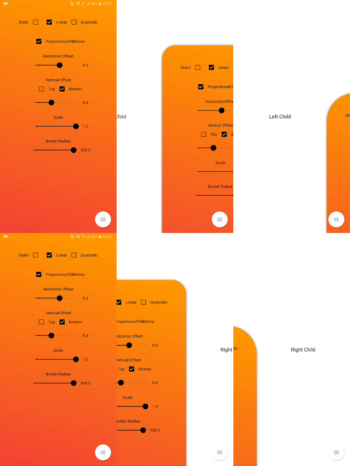
Inner Drawer is an easy way to create an internal side section (left/right) where you can insert a list menu or other.
Add this to your package's pubspec.yaml file:
dependencies:
  flutter_inner_drawer: "^1.0.0+1"
| https://github.com/Dn-a/flutter_inner_drawer/raw/master/assets/img/example5.1.gif? | https://github.com/Dn-a/flutter_inner_drawer/raw/master/assets/img/example5.3.gif? |
import 'package:flutter_inner_drawer/inner_drawer.dart';
.
.
.

    @override
    Widget build(BuildContext context)
    {
        return InnerDrawer(
            key: _innerDrawerKey,
            onTapClose: true, // default false
            swipe: true, // default true
            colorTransitionChild: Color.red, // default Color.black54
            colorTransitionScaffold: Color.black54, // default Color.black54

            //When setting the vertical offset, be sure to use only top or bottom
            offset: IDOffset.only(bottom: 0.05, right: 0.0, left: 0.0),

            scale: IDOffset.horizontal( 0.8 ), // set the offset in both directions

            proportionalChildArea : true, // default true
            borderRadius: 50, // default 0
            leftAnimationType: InnerDrawerAnimation.static, // default static
            rightAnimationType: InnerDrawerAnimation.quadratic,
            backgroundDecoration: BoxDecoration(color: Colors.red ), // default  Theme.of(context).backgroundColor

            //when a pointer that is in contact with the screen and moves to the right or left
            onDragUpdate: (double val, InnerDrawerDirection direction) {
                // return values between 1 and 0
                print(val);
                // check if the swipe is to the right or to the left
                print(direction==InnerDrawerDirection.start);
            },

            innerDrawerCallback: (a) => print(a), // return  true (open) or false (close)
            leftChild: Container(), // required if rightChild is not set
            rightChild: Container(), // required if leftChild is not set

            //  A Scaffold is generally used but you are free to use other widgets
            // Note: use "automaticallyImplyLeading: false" if you do not personalize "leading" of Bar
            scaffold: Scaffold(
                appBar: AppBar(
                    automaticallyImplyLeading: false
                ),
            )
            /* OR
            CupertinoPageScaffold(
                navigationBar: CupertinoNavigationBar(
                    automaticallyImplyLeading: false
                ),
            ),
            */
        )
    }

    //  Current State of InnerDrawerState
    final GlobalKey<InnerDrawerState> _innerDrawerKey = GlobalKey<InnerDrawerState>();

    void _toggle()
    {
       _innerDrawerKey.currentState.toggle(
       // direction is optional
       // if not set, the last direction will be used
       //InnerDrawerDirection.start OR InnerDrawerDirection.end
        direction: InnerDrawerDirection.end
       );
    }
| PropName | Description | default value |
|---|---|---|
scaffold |
A Scaffold is generally used but you are free to use other widgets | required |
leftChild |
Inner Widget | required if rightChild is not set |
rightChild |
Inner Widget | required if leftChild is not set |
leftOffset(deprecated) |
Offset drawer width | 0.4 |
rightOffset(deprecated) |
Offset drawer width | 0.4 |
leftScale(deprecated) |
Left scaffold scaling | 1 |
rightScale(deprecated) |
Right scaffold scaling | 1 |
offset |
Offset InnerDrawer width | IDOffset.horizontal(0.4) |
scale |
Scaffold scaling | IDOffset.horizontal(1) |
proportionalChildArea |
If true, dynamically sets the width based on the selected offset, otherwise it leaves the width at 100% of the screen. | true |
borderRadius |
For scaffold border | 0 |
onTapClose |
Tap on the Scaffold closes it | false |
swipe |
activate or deactivate the swipe | true |
swipeChild |
activate or deactivate the swipeChild | false |
duration |
Animation Controller duration | Duration(milliseconds: 246) |
velocity |
Allows you to set the opening and closing velocity when using the open/close methods | 1 |
tapScaffoldEnabled |
Possibility to tap the scaffold even when open | false |
boxShadow |
BoxShadow of scaffold opened | [BoxShadow(color: Colors.black.withOpacity(0.5),blurRadius: 5)] |
colorTransitionChild |
Change background color while swiping | Colors.black54 |
colorTransitionScaffold |
Change background color while swiping | Colors.black54 |
leftAnimationType |
static / linear / quadratic | static |
rightAnimationType |
static / linear / quadratic | static |
backgroundDecoration |
possibility to manage the main background Decoration | BoxDecoration(color: Theme.of(context).backgroundColor) |
innerDrawerCallback |
Optional callback that is called when a InnerDrawer is opened or closed | |
onDragUpdate |
When a pointer that is in contact with the screen and moves to the right or left | |
_innerDrawerKey.currentState.open |
Current State of GlobalKey(check example) - OPEN | |
_innerDrawerKey.currentState.close |
Current State of GlobalKey(check example) - CLOSE | |
_innerDrawerKey.currentState.toggle |
Current State of GlobalKey(check example) - OPEN or CLOSE |
It takes time to carry on this project. If you found it useful or learned something from the source code please consider the idea of donating 5, 20, 50 € or whatever you can to support the project.
If you encounter problems, open an issue. Pull request are also welcome.