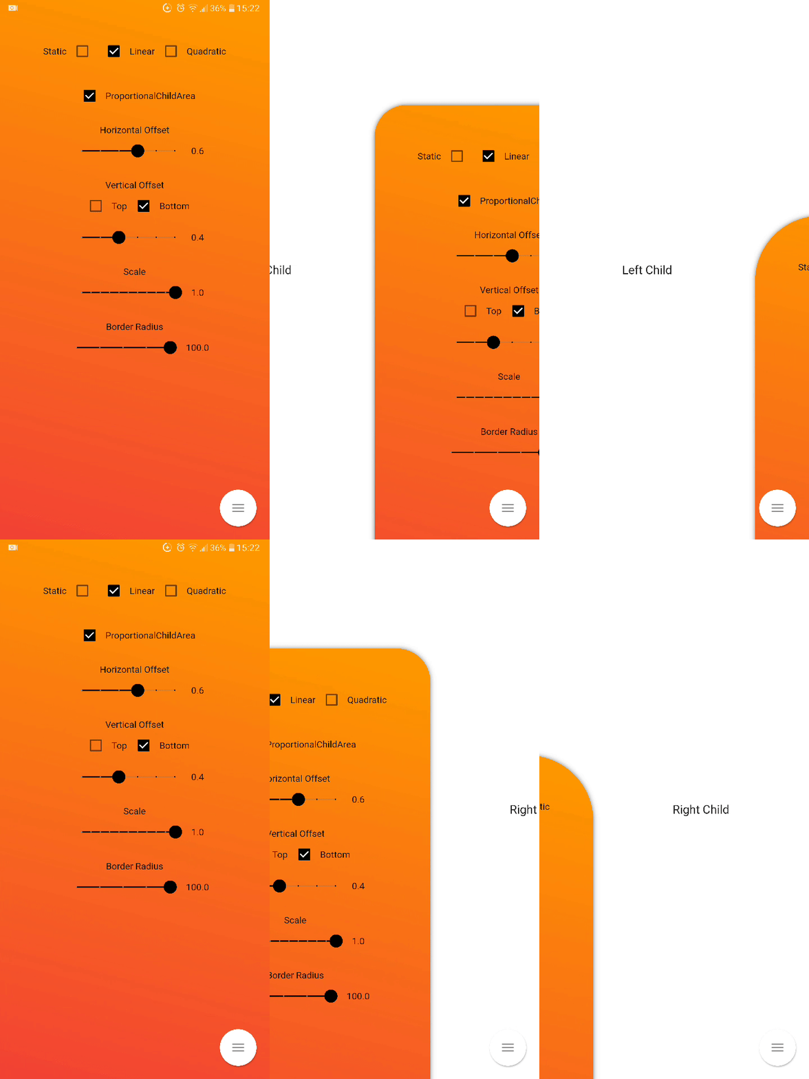
Flutter Inner Drawer는 Flutter 앱 내부에 내부 사이드 드로어(왼쪽 또는 오른쪽)를 구현할 수 있도록 해주는 가벼운 패키지입니다. 메인 UI 흐름을 방해하지 않고 네비게이션 메뉴나 추가 콘텐츠 영역을 간단하고 사용자 정의 가능한 방식으로 추가할 수 있습니다. 드로어는 화면 가장자리에서 슬라이드되어 깔끔하고 현대적인 사용자 경험을 제공합니다. 열기 및 닫기 위해 수평 및 수직 제스처를 지원하며 기존 위젯과 원활하게 통합됩니다. 컴팩트하고 접근성이 뛰어난 네비게이션 패널이 필요한 앱에 이상적입니다.
사용 사례
접을 수 있는 탐색 메뉴 추가
컨텍스트 작업 패널 만들기
측면 기반 필터 또는 설정 구현
숨겨진 콘텐츠로 모바일 앱 레이아웃 개선
중첩된 서랍을 사용한 반응형 인터페이스 설계
주요 기능
기존 위젯과의 간편한 통합
좌우 드로워 위치를 지원합니다
제스처 기반 열기/닫기 상호작용
사용자 정의 가능한 애니메이션 및 스타일링
가볍고 성능이 뛰어남
사용자 지정 가능한 서랍 너비 및 정렬
적합한 대상
직관적인 탐색을 원하는 모바일 앱 개발자
슬림한 측면 패널을 원하는 디자이너
최소한의 기능적 UI가 필요한 앱
마테리얼 디자인 원칙을 사용하는 프로젝트
부드럽고 제스처 기반의 상호작용을 목표로 하는 개발자
고려 사항
중첩된 콘텐츠를 주의 깊게 처리해야 할 수 있습니다
복잡한 중첩 서랍에 대한 제한된 내장 지원
전체 화면 오버레이 시나리오에 적합하지 않습니다
터치 제스처의 접근성에 주의가 필요합니다
단일 레벨 탐색 구조에 가장 적합
원본 README
연결된 소스 저장소의 README 원문 스냅샷입니다. 최신 내용은 저장소에서 확인하세요.
flutter_inner_drawer
Inner Drawer is an easy way to create an internal side section (left/right) where you can insert a list menu or other.
Installing
Add this to your package's pubspec.yaml file:
dependencies:
  flutter_inner_drawer: "^1.0.0+1"
Demo
Simple usage
import'package:flutter_inner_drawer/inner_drawer.dart';
.
.
.
@overrideWidgetbuild(BuildContext context)
{
returnInnerDrawer(
key: _innerDrawerKey,
onTapClose: true, // default false
swipe: true, // default true
colorTransitionChild: Color.red, // default Color.black54
colorTransitionScaffold: Color.black54, // default Color.black54//When setting the vertical offset, be sure to use only top or bottom
offset: IDOffset.only(bottom: 0.05, right: 0.0, left: 0.0),
scale: IDOffset.horizontal( 0.8 ), // set the offset in both directions
proportionalChildArea : true, // default true
borderRadius: 50, // default 0
leftAnimationType: InnerDrawerAnimation.static, // default static
rightAnimationType: InnerDrawerAnimation.quadratic,
backgroundDecoration: BoxDecoration(color: Colors.red ), // default Theme.of(context).backgroundColor//when a pointer that is in contact with the screen and moves to the right or left
onDragUpdate: (double val, InnerDrawerDirection direction) {
// return values between 1 and 0print(val);
// check if the swipe is to the right or to the leftprint(direction==InnerDrawerDirection.start);
},
innerDrawerCallback: (a) => print(a), // return true (open) or false (close)
leftChild: Container(), // required if rightChild is not set
rightChild: Container(), // required if leftChild is not set// A Scaffold is generally used but you are free to use other widgets// Note: use "automaticallyImplyLeading: false" if you do not personalize "leading" of Bar
scaffold: Scaffold(
appBar: AppBar(
automaticallyImplyLeading: false
),
)
/* OR
CupertinoPageScaffold(
navigationBar: CupertinoNavigationBar(
automaticallyImplyLeading: false
),
),
*/
)
}
// Current State of InnerDrawerStatefinalGlobalKey<InnerDrawerState> _innerDrawerKey = GlobalKey<InnerDrawerState>();
void_toggle()
{
_innerDrawerKey.currentState.toggle(
// direction is optional // if not set, the last direction will be used//InnerDrawerDirection.start OR InnerDrawerDirection.end
direction: InnerDrawerDirection.end
);
}
InnerDrawer Parameters
PropName
Description
default value
scaffold
A Scaffold is generally used but you are free to use other widgets
required
leftChild
Inner Widget
required if rightChild is not set
rightChild
Inner Widget
required if leftChild is not set
leftOffset(deprecated)
Offset drawer width
0.4
rightOffset(deprecated)
Offset drawer width
0.4
leftScale(deprecated)
Left scaffold scaling
1
rightScale(deprecated)
Right scaffold scaling
1
offset
Offset InnerDrawer width
IDOffset.horizontal(0.4)
scale
Scaffold scaling
IDOffset.horizontal(1)
proportionalChildArea
If true, dynamically sets the width based on the selected offset, otherwise it leaves the width at 100% of the screen.
true
borderRadius
For scaffold border
0
onTapClose
Tap on the Scaffold closes it
false
swipe
activate or deactivate the swipe
true
swipeChild
activate or deactivate the swipeChild
false
duration
Animation Controller duration
Duration(milliseconds: 246)
velocity
Allows you to set the opening and closing velocity when using the open/close methods
Optional callback that is called when a InnerDrawer is opened or closed
onDragUpdate
When a pointer that is in contact with the screen and moves to the right or left
_innerDrawerKey.currentState.open
Current State of GlobalKey(check example) - OPEN
_innerDrawerKey.currentState.close
Current State of GlobalKey(check example) - CLOSE
_innerDrawerKey.currentState.toggle
Current State of GlobalKey(check example) - OPEN or CLOSE
Donate
It takes time to carry on this project. If you found it useful or learned something from the source code please consider the idea of donating 5, 20, 50 € or whatever you can to support the project.
Issues
If you encounter problems, open an issue. Pull request are also welcome.