

 v0.3.1
animated_button
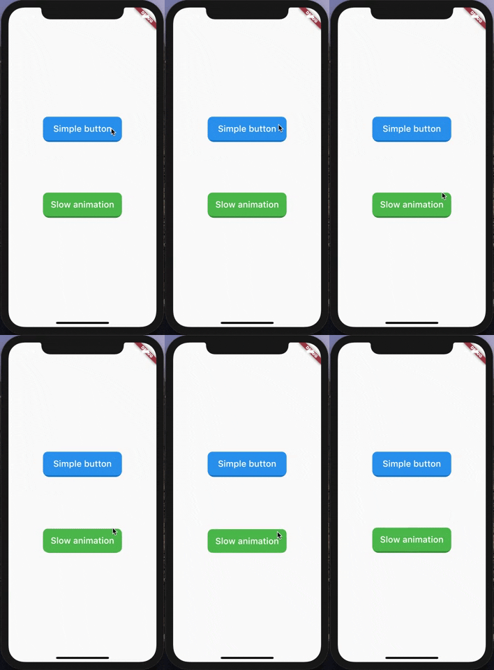
3D 효과를 가진 간단하고 매우 사용자 정의 가능한 애니메이션 버튼입니다.
169좋아요 1천30일 다운로드140Pub 점수
AndroidiOSWebmacOSWindowsLinux
매우 간단하고 사용자 정의 가능한 애니메이션 버튼입니다.

아래는 영문 원문 스냅샷입니다. 최신 내용은 GitHub에서 확인하세요.
A very simple and customizable animated button. Providing simple animation, and many customizable attributes such height, width, child, ... etc.
Nothing difficult here, yet!

import 'package:animated_button/animated_button.dart';
import 'package:flutter/material.dart';

void main() => runApp(MyApp());

class MyApp extends StatelessWidget {
  @override
  Widget build(BuildContext context) {
    return MaterialApp(
      title: 'Animated Button Demo',
      theme: ThemeData(
        primarySwatch: Colors.blue,
      ),
      home: Demo(),
    );
  }
}

class Demo extends StatelessWidget {
  @override
  Widget build(BuildContext context) {
    return Scaffold(
      body: Center(
        child:             AnimatedButton(
          onPressed: () {},
          color: Colors.blue,
          enabled: true,
          disabledColor: Colors.grey,
          shadowDegree: ShadowDegree.light,
          borderRadius: 8,
          duration: 85,
          height: 40,
          width: 140,
          child: Text(
            'Animated button',
            style: TextStyle(
              fontSize: 14,
              color: Colors.white,
              fontWeight: FontWeight.w500,
            ),
          ),
        ),
      ),
    );
  }
}
AnimatedButton(
child: ...,			    // Child widget, Row, Text, Column,...etc.
onPressed: () {},  	// Callback for onTap event
duration: 70,  		  // Animaton duration, default is 70 Milliseconds
height: 100,  		  // Button Height, default is 64
width: 200,  			  // Button width, default is 200
enabled: true,  		// When disabled, onTap won't be called
shadowDegree: ShadowDegree.dark, // Shadow color is generated from button color,
color: Colors.blue,
disabledColor: Colors.grey,
borderRadius: 8,
)
MIT License.
의존성 목록 2 개
{"sdk":"flutter"}{"sdk":"flutter"}사용 목적에 따라 검색하고 개발 활동을 비교한 뒤 원본 저장소에서 요구 사항을 확인하세요.
“A repository is the most basic element of GitHub.”
GitHub Docs — About repositories ↗