
 v0.3.3
animated_stack
사용자 정의 애니메이션 스택 페이지를 사용하여 사용자 정의 가능한 사이드 메뉴 버튼을 만듭니다.
252좋아요 10330일 다운로드150Pub 점수
AndroidiOSWebmacOSWindowsLinux
사용자 정의 애니메이션 스택 페이지를 사용하여 사용자 정의 가능한 사이드 메뉴 버튼을 만듭니다.

{"sdk":"flutter"}{"sdk":"flutter"}아래는 영문 원문 스냅샷입니다. 최신 내용은 GitHub에서 확인하세요.
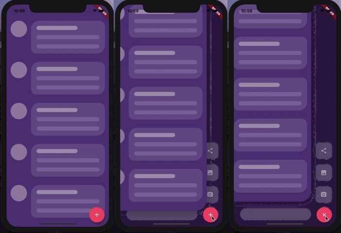
Custom animated stacked pages, to create customisable side menu buttons. Providing simple menu for sharing buttons, side menu, message sending, about page, ... etc.
https://raw.githubusercontent.com/Emadeddin-eibo/animated_stack/master/example1.gif https://raw.githubusercontent.com/Emadeddin-eibo/animated_stack/master/example2.gif
At first, you have to create Foreground and Background Widgets.
Here is a simple example to meet minimum requirements.
class MyApp extends StatelessWidget {
  @override
  Widget build(BuildContext context) {
    return MaterialApp(
      title: 'Animated Stack Demo',
      theme: ThemeData(
        splashColor: Colors.transparent,
        highlightColor: Colors.transparent,
      ),
      home: AnimatedStack(
        backgroundColor: Colors.white,
        fabBackgroundColor: Colors.black,
        foregroundWidget: ..., // Main page
        columnWidget: ..., // Right widget, preferably Column
        bottomWidget: ...,// Right widget, preferably Row
      ),
    );
  }
}
Here's all what you can customize in this widget!
AnimatedStack(
backgroundColor: ...,     // Background Container color
foregroundWidget: ...,    // Foreground Container color

columnWidget: ...,        // Right Widget, (use Column for best results)
bottomWidget: ...,        // Bottom Widget, (use Row for best results)

scaleHeight: 100,         // Sliding animation height, default is 60
scaleWidth: 100,          // Sliding animation width, default is 60


buttonIcon: ...,          // FAB icon (IconData)
fabIconColor: ...,        // FAB icon color
animateButton: false,     // Sometimes, we don't want to animate the button!
fabBackgroundColor: ...,  // FAB background color

slideAnimationDuration: ..., // Animation Duration, default is 800 Milliseconds
buttonAnimationDuration: ...,// Animation Duration, default is 240 Milliseconds

openAnimationCurve: ...,    // Animation Curve, default is ElasticOutCurve(0.9)
closeAnimationCurve: ...,   // Animation Curve, default is ElasticInCurve(0.9)
enableClickToDismiss: true, // Enable Click on Main Widget to close
preventForegroundInteractions: true, // Prevent Clicks on Main Widget
onForegroundCallback: () => print('on Close Callback'), // On Close Callback
);
MIT License.