패키지, 저장소 및 앱 카테고리 검색

animated_stack 표지
패키지 상세v0.3.3

animated_stack

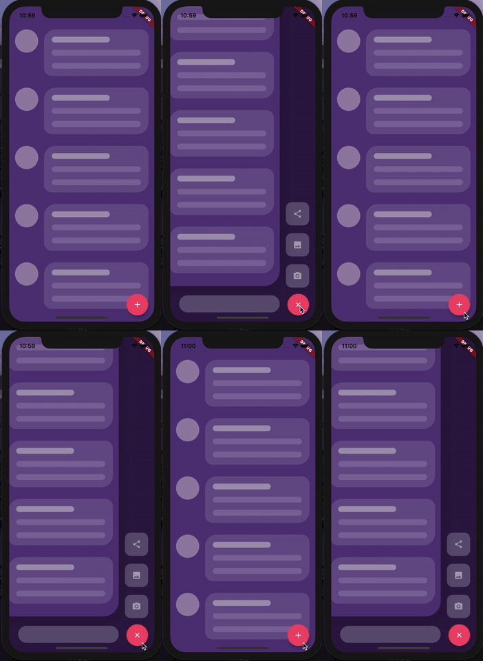
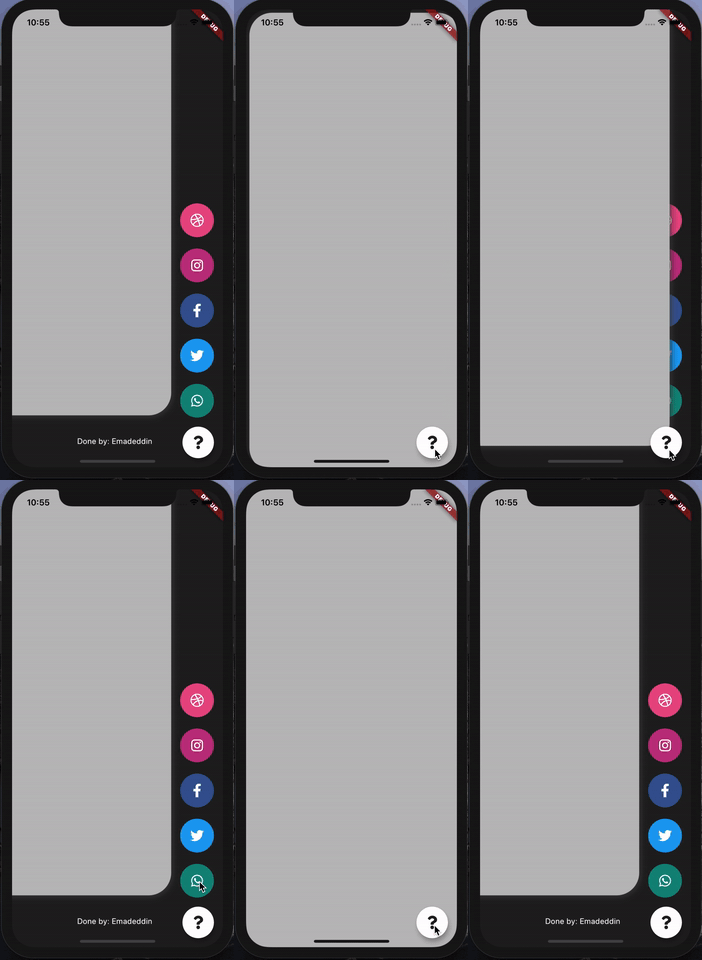
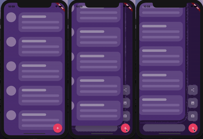
사용자 정의 애니메이션 스택 페이지를 사용하여 사용자 정의 가능한 사이드 메뉴 버튼을 만듭니다.

AndroidiOSWebmacOSWindowsLinux
30일 다운로드
214
좋아요
252
Pub 점수
150

패키지 설치

flutter pub add animated_stack

패키지 개요

공개 정보를 바탕으로 생성한 선택 가이드입니다.

AnimatedStack은 Flutter 패키지로, 부드러운 전환 효과를 갖춘 상호작용식 사이드 메뉴 버튼을 디자인하는 데 이상적인 사용자 정의 애니메이션 스택 페이지를 생성할 수 있도록 해줍니다. 개발자가 위젯을 겹쳐서 가시성과 위치를 애니메이션화할 수 있는 유연한 기반을 제공합니다. Android, iOS, Web, macOS, Windows, Linux 등 여러 플랫폼을 지원하여 크로스플랫폼 애플리케이션에 적합합니다. 직관적인 구성 옵션을 통해 부드러운 애니메이션과 반응형 디자인으로 사용자 경험을 향상시킵니다. 경량 구조로 다양한 장치에서 효율적인 성능을 보장합니다.

사용 사례

  • 사용자 정의 사이드 메뉴 구현
  • 인터랙티브 탐색 인터페이스
  • 애니메이션 페이지 전환
  • 플로팅 액션 버튼 개선
  • 크로스 플랫폼 UI 컴포넌트

주요 기능

  • 부드러운 애니메이션 스택
  • 사용자 정의 페이지 전환
  • 다중 플랫폼 지원
  • 가볍고 성능이 뛰어남
  • 기존 UI와의 간편한 통합
  • 유연한 위젯 레이어링

적합한 대상

  • 사용자 정의 네비게이션 드로어를 구축하는 개발자
  • 애니메이션된 인터랙션을 찾는 UI 디자이너
  • 크로스 플랫폼 앱 제작자
  • 동적 레이아웃 변경을 필요로 하는 앱
  • 사용자 경험을 완성도 있게 다루는 팀

고려 사항

  • 복잡한 레이아웃을 위해 추가 스타일링이 필요할 수 있습니다
  • 성능은 애니메이션의 복잡성에 따라 달라집니다
  • 기본 사용법을 넘어서는 문서가 제한적
  • 매우 큰 스택에 최적화되지 않음
  • 중간 애니메이션 강도에 가장 적합

원본 README

연결된 소스 저장소의 README 원문 스냅샷입니다. 최신 내용은 저장소에서 확인하세요.

Animated Stack

Custom animated stacked pages, to create customisable side menu buttons. Providing simple menu for sharing buttons, side menu, message sending, about page, ... etc.


Getting Started

At first, you have to create Foreground and Background Widgets.

Here is a simple example to meet minimum requirements.

class MyApp extends StatelessWidget {
  @override
  Widget build(BuildContext context) {
    return MaterialApp(
      title: 'Animated Stack Demo',
      theme: ThemeData(
        splashColor: Colors.transparent,
        highlightColor: Colors.transparent,
      ),
      home: AnimatedStack(
        backgroundColor: Colors.white,
        fabBackgroundColor: Colors.black,
        foregroundWidget: ..., // Main page
        columnWidget: ..., // Right widget, preferably Column
        bottomWidget: ...,// Right widget, preferably Row
      ),
    );
  }
}

Complete Features

Here's all what you can customize in this widget!

Stack attributes

AnimatedStack(
backgroundColor: ...,     // Background Container color
foregroundWidget: ...,    // Foreground Container color

columnWidget: ...,        // Right Widget, (use Column for best results)
bottomWidget: ...,        // Bottom Widget, (use Row for best results)

scaleHeight: 100,         // Sliding animation height, default is 60
scaleWidth: 100,          // Sliding animation width, default is 60


buttonIcon: ...,          // FAB icon (IconData)
fabIconColor: ...,        // FAB icon color
animateButton: false,     // Sometimes, we don't want to animate the button!
fabBackgroundColor: ...,  // FAB background color

slideAnimationDuration: ..., // Animation Duration, default is 800 Milliseconds
buttonAnimationDuration: ...,// Animation Duration, default is 240 Milliseconds

openAnimationCurve: ...,    // Animation Curve, default is ElasticOutCurve(0.9)
closeAnimationCurve: ...,   // Animation Curve, default is ElasticInCurve(0.9)
enableClickToDismiss: true, // Enable Click on Main Widget to close
preventForegroundInteractions: true, // Prevent Clicks on Main Widget
onForegroundCallback: () => print('on Close Callback'), // On Close Callback
);
For complete examples, check example folder

License

MIT License.

카테고리

소스 저장소

이 패키지를 사용하는 프로젝트