
 v2.0.2
flutter_progress_hud
페이드 애니메이션을 갖춘 고도로 사용자 정의 가능한 모달 진행 표시기입니다.
131좋아요 1.2만30일 다운로드150Pub 점수
AndroidiOSWebmacOSWindowsLinux
FlorinMihalache/flutter_progress_hud open-source repository details.

{"sdk":"flutter"}{"sdk":"flutter"}아래는 영문 원문 스냅샷입니다. 최신 내용은 GitHub에서 확인하세요.
Highly customizable modal progress indicator with fade animation.
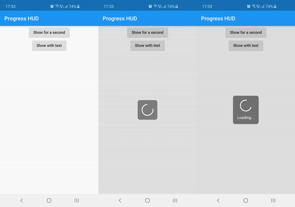
https://raw.githubusercontent.com/FlorinMihalache/flutter_progress_hud/HEAD/images/demo.gif
Wrap with ProgressHUD the widget on top of which you want to show the modal indicator.
ProgressHUD(
  child: HomePage(),
)
Get a reference of ProgressHUD
final progress = ProgressHUD.of(context);
Show indeterminate progress
progress.show();
Or a progress with text
progress.showWithText('Loading...');
Then dismiss
progress.dismiss();
ProgressHUD(
        child: Builder(
          builder: (context) => Center(
                child: Column(
                  children: <Widget>[
                    RaisedButton(
                      child: Text('Show for a second'),
                      onPressed: () {
                        final progress = ProgressHUD.of(context);
                        progress.show();
                        Future.delayed(Duration(seconds: 1), () {
                          progress.dismiss();
                        });
                      },
                    ),
                    RaisedButton(
                      child: Text('Show with text'),
                      onPressed: () {
                        final progress = ProgressHUD.of(context);
                        progress.showWithText('Loading...');
                        Future.delayed(Duration(seconds: 1), () {
                          progress.dismiss();
                        });
                      },
                    ),
                  ],
                ),
              ),
        ),
      ),
| Attribute Name | Default Value | Description |
|---|---|---|
| indicatorColor | Colors.white | When using the default indicator widget, this is how you set its color |
| indicatorWidget | A basic CircularProgressIndicator | Custom indicator widget |
| backgroundColor | Colors.black54 | Indicator background color |
| backgroundRadius | Radius.circular(8.0) | Indicator background radius |
| borderColor | Colors.white | Indicator background border color |
| borderWidth | 0.0 | Indicator background border width |
| barrierEnabled | true | You can disable the modal barrier if you want to allow touches while the progress is shown |
| barrierColor | Colors.black12 | Color of the Barrier displayed behind the indicator |
| textStyle | TextStyle(color: Colors.white, fontSize: 14.0) | TextStyle for the Text displayed below the indicator |
| padding | EdgeInsets.all(16.0)} | Indicator content padding |