패키지, 저장소 및 앱 카테고리 검색

flutter_progress_hud 표지
패키지 상세v2.0.2

flutter_progress_hud

페이드 애니메이션을 갖춘 고도로 사용자 정의 가능한 모달 진행 표시기입니다.

AndroidiOSWebmacOSWindowsLinux
30일 다운로드
2.9만
좋아요
131
Pub 점수
150

패키지 설치

flutter pub add flutter_progress_hud

패키지 개요

공개 정보를 바탕으로 생성한 선택 가이드입니다.

Flutter용으로 매우 사용자 정의가 가능한 모달 진행률 표시기로 부드러운 페이드 애니메이션을 가진 로딩 오버레이를 표시합니다. 비동기 작업 중에 로딩 상태를 쉽게 표시하고 숨길 수 있으며, 진행 중인 프로세스를 나타내어 사용자 경험을 향상시킵니다. 메시지, 색상, 형태 등을 사용자 정의할 수 있으며, 모바일, 웹, 데스크톱 등 다양한 플랫폼을 지원합니다. 폼, API 호출 또는 시각적 피드백이 필요한 모든 작업에 적합합니다.

사용 사례

  • API 요청 중 로딩 상태 표시
  • 양식 제출 진행 상황 표시
  • 데이터 가져오기 중 사용자 경험 향상
  • 백그라운드 작업 중 피드백 제공
  • 긴 실행 시간 작업에서 처리 상태 표시

주요 기능

  • 페이드 인 및 페이드 아웃 애니메이션
  • 사용자 정의 가능한 메시지 및 외관
  • 여러 플랫폼을 지원합니다
  • 간편한 표시/숨기기 메서드
  • 사용자 지정 가능한 오버레이 색상 및 투명도
  • 장치 간 반응형 디자인

적합한 대상

  • 자주 비동기 작업을 사용하는 앱을 개발하는 개발자
  • 사용자 경험을 우선시하는 팀
  • 일관된 로딩 표시기가 필요한 프로젝트
  • 다중 플랫폼을 대상으로 하는 앱
  • 정교한 피드백이 필요한 UI 중심 애플리케이션

고려 사항

  • 다른 UI 요소와 겹치는 것을 방지하기 위해 신중한 관리가 필요할 수 있습니다
  • 사용자 정의 옵션은 간단한 사용 사례에 복잡성을 증가시킬 수 있습니다
  • 매우 빈번한 표시/숨김 사이클에 대한 성능 영향
  • 비모달 로딩 시나리오에 적합하지 않습니다
  • 타사 대안에 비해 내장 테마가 제한적입니다

원본 README

연결된 소스 저장소의 README 원문 스냅샷입니다. 최신 내용은 저장소에서 확인하세요.

pub package

Flutter Progress HUD

Highly customizable modal progress indicator with fade animation.

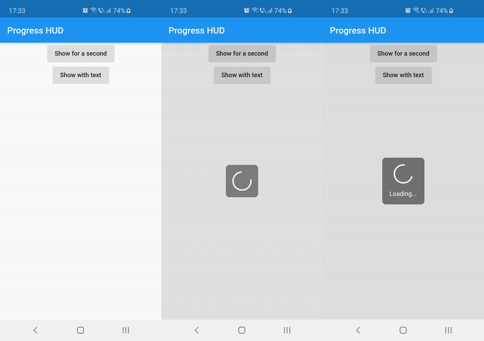
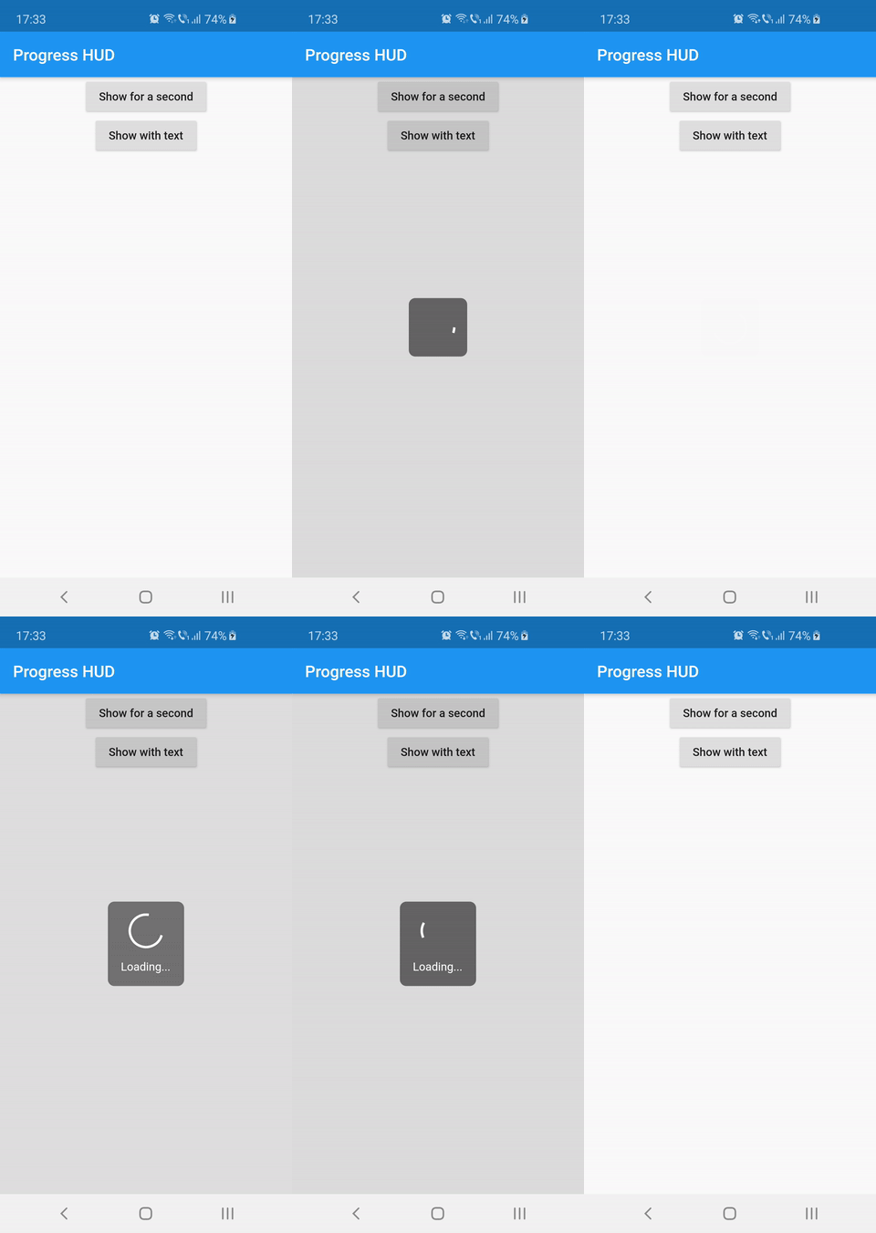
Preview

Usage

Wrap with ProgressHUD the widget on top of which you want to show the modal indicator.

ProgressHUD(
  child: HomePage(),
)

Get a reference of ProgressHUD

final progress = ProgressHUD.of(context);

Show indeterminate progress

progress.show();

Or a progress with text

progress.showWithText('Loading...');

Then dismiss

progress.dismiss();

Example (full)

ProgressHUD(
        child: Builder(
          builder: (context) => Center(
                child: Column(
                  children: <Widget>[
                    RaisedButton(
                      child: Text('Show for a second'),
                      onPressed: () {
                        final progress = ProgressHUD.of(context);
                        progress.show();
                        Future.delayed(Duration(seconds: 1), () {
                          progress.dismiss();
                        });
                      },
                    ),
                    RaisedButton(
                      child: Text('Show with text'),
                      onPressed: () {
                        final progress = ProgressHUD.of(context);
                        progress.showWithText('Loading...');
                        Future.delayed(Duration(seconds: 1), () {
                          progress.dismiss();
                        });
                      },
                    ),
                  ],
                ),
              ),
        ),
      ),

Customization

Attribute Name Default Value Description
indicatorColor Colors.white When using the default indicator widget, this is how you set its color
indicatorWidget A basic CircularProgressIndicator Custom indicator widget
backgroundColor Colors.black54 Indicator background color
backgroundRadius Radius.circular(8.0) Indicator background radius
borderColor Colors.white Indicator background border color
borderWidth 0.0 Indicator background border width
barrierEnabled true You can disable the modal barrier if you want to allow touches while the progress is shown
barrierColor Colors.black12 Color of the Barrier displayed behind the indicator
textStyle TextStyle(color: Colors.white, fontSize: 14.0) TextStyle for the Text displayed below the indicator
padding EdgeInsets.all(16.0)} Indicator content padding

카테고리

소스 저장소

이 패키지를 사용하는 프로젝트