
 v2.0.1
msh_checkbox
iOS용 BEMCheckbox를 영감으로 삼은 애니메이션 체크박스로, 플러터 자체의 체크박스와 유사한 API를 사용합니다.
57좋아요 2천30일 다운로드150Pub 점수
AndroidiOSWebmacOSWindowsLinux
체크하거나 체크를 해제할 때 애니메이션을 재생하는 사용자 지정 가능한 원형 체크박스입니다.

{"sdk":"flutter"}{"sdk":"flutter"}^2.0.0아래는 영문 원문 스냅샷입니다. 최신 내용은 GitHub에서 확인하세요.
pub package pub points popularity likes
A customizable circular checkbox which plays an animation when checked or unchecked. Inspired by BEMCheckbox for iOS.
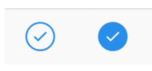
Checkbox Examples
Choose from 4 animation/visual styles (stroke, scale in checkmark, scale in background, fade in).
Customize colors for active, inactive and disabled states.
Customize the animation duration.
Install the package:
flutter pub add msh_checkbox
class Example extends StatefulWidget {
  Example({Key? key}): super(key: key);

  @override
  State<Example> createState() => _ExampleState();
}

class _ExampleState extends State<Example> {
  bool isChecked = false;

  @override
  Widget build(BuildContext context) {
    return Center(
      child: MSHCheckbox(
        size: 60,
        value: isChecked,
        colorConfig: MSHColorConfig.fromCheckedUncheckedDisabled(
          checkedColor: Colors.blue,
        ),
        style: MSHCheckboxStyle.stroke,
        onChanged: (selected) {
          setState(() {
            isChecked = selected;
          });
        },
      ),
    );
  }
}
I know it's a small and simple widget, but if you'd like to support it is certainly appreciated!