
 v1.0.0
animated_button_bar
선택된 항목에 애니메이션이 있는 매우 사용자 정의 가능한 버튼 바.
82좋아요 26430일 다운로드150Pub 점수
AndroidiOSWebmacOSWindowsLinux
애니메이션을 갖춘 사용자 정의 가능한 버튼 바

{"sdk":"flutter"}^6.0.5{"sdk":"flutter"}아래는 영문 원문 스냅샷입니다. 최신 내용은 GitHub에서 확인하세요.
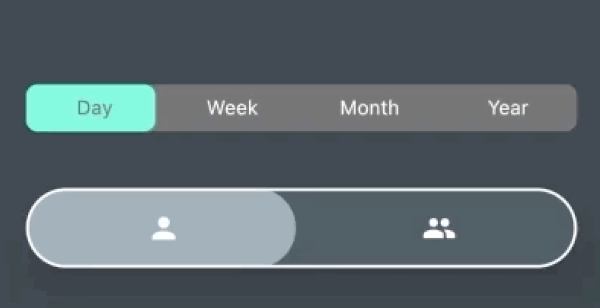
AnimatedButtonBar is a flutter library that allows you to create a row of buttons with an animation on selection.
Add this to your app's pubspec.yaml file:
dependencies:
  animated_button_bar: ^0.0.2
Then you have to import the package with:
import 'package:animated_button_bar/animated_button_bar.dart';
And use an AnimatedBarButton like this:
  Column(
          mainAxisAlignment: MainAxisAlignment.center,
          children: [
            //inverted selection button bar
            AnimatedButtonBar(
              radius: 8.0,
              padding: const EdgeInsets.all(16.0),
              invertedSelection: true,
              children: [
                ButtonBarEntry(onTap: () => print('First item tapped'), child: Text('Day')),
                ButtonBarEntry(onTap: () => print('Second item tapped'), child: Text('Week')),
                ButtonBarEntry(onTap: () => print('Third item tapped'), child: Text('Month')),
                ButtonBarEntry(onTap: () => print('Fourth item tapped'), child: Text('Year'))
              ],
            ),
            //You can populate it with different types of widgets like Icon
            AnimatedButtonBar(
              radius: 32.0,
              padding: const EdgeInsets.all(16.0),
              backgroundColor: Colors.blueGrey.shade800,
              foregroundColor: Colors.blueGrey.shade300,
              elevation: 24,
              borderColor: Colors.white,
              borderWidth: 2,
              innerVerticalPadding: 16,
              children: [
                ButtonBarEntry(onTap: () => print('First item tapped'), child: Icon(Icons.person)),
                ButtonBarEntry(onTap: () => print('Second item tapped'), child: Icon(Icons.people)),
              ],
            ),
          ],
        ),
https://raw.githubusercontent.com/JorisObert/animated_button_bar/HEAD/example2.gif
| parameter | description | default |
|---|---|---|
| animationDuration | animation duration when tap | const Duration(milliseconds: 200) |
| backgroundColor | main color of the widget | Theme.of(context).backgroundColor |
| borderColor | color of the border | null |
| borderWidth | width of the border | borderColor != null ? 1.0 : 0.0; |
| children | A list of ButtonBarEntry to display | required |
| curve | the curve for the animation | Curves.fastOutSlowIn |
| elevation | double | 0 |
| foregroundColor | color for the selection | Theme.of(context).accentColor |
| invertedSelection | bool | false |
| radius | double | 0.0 |
| verticalPadding | double | 8.0 |