

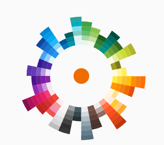
 v0.0.1
flutter_color_picker_wheel
전체적으로 다트로 작성된 휠 모양의 색상 선택기
40좋아요 12030일 다운로드120Pub 점수
AndroidiOSWebmacOSWindowsLinux
Flutter용으로 작성된 Concepts 앱의 색상 선택기에서 영감을 받은 색상 선택기

아래는 영문 원문 스냅샷입니다. 최신 내용은 GitHub에서 확인하세요.
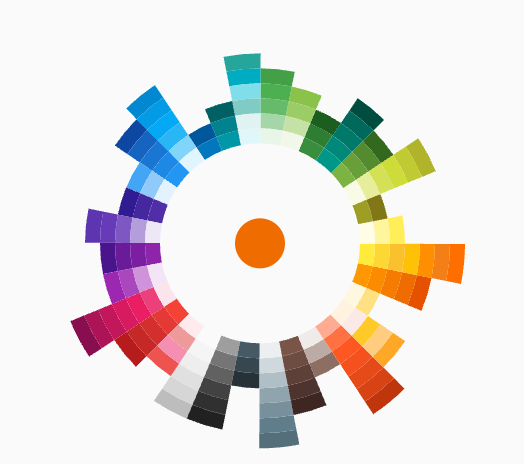
Flutter Color Picker Wheel is an easy-to-use widget that can be heavily customized.
Add the dependency to your pubspec.yaml
flutter_color_picker_wheel: ^0.0.1
Currently this Storybook only works well on Web
TODO: [ ] Use another storybook to provide better preview for both web and phone
https://flutter-color-picker-wheel.kexinlu.com
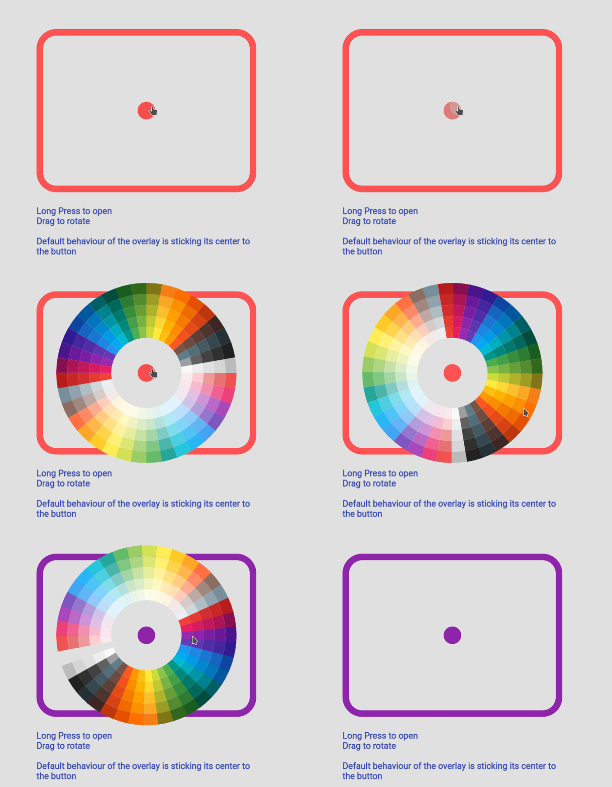 Fan Default Preset |
 Fan Simple Preset |
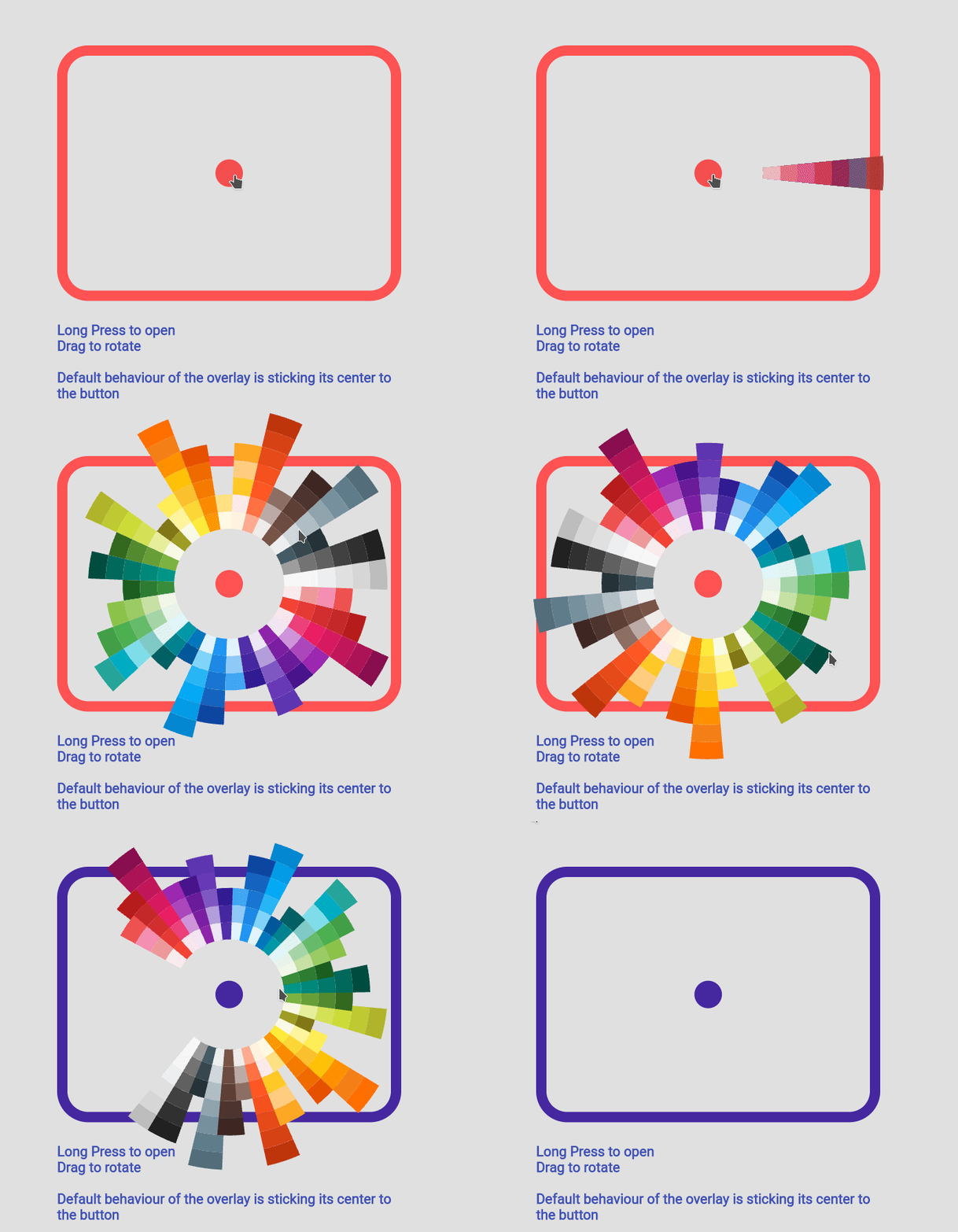
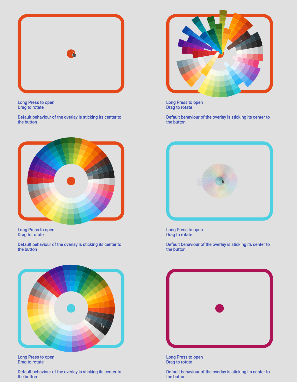 Sun Ray Default |
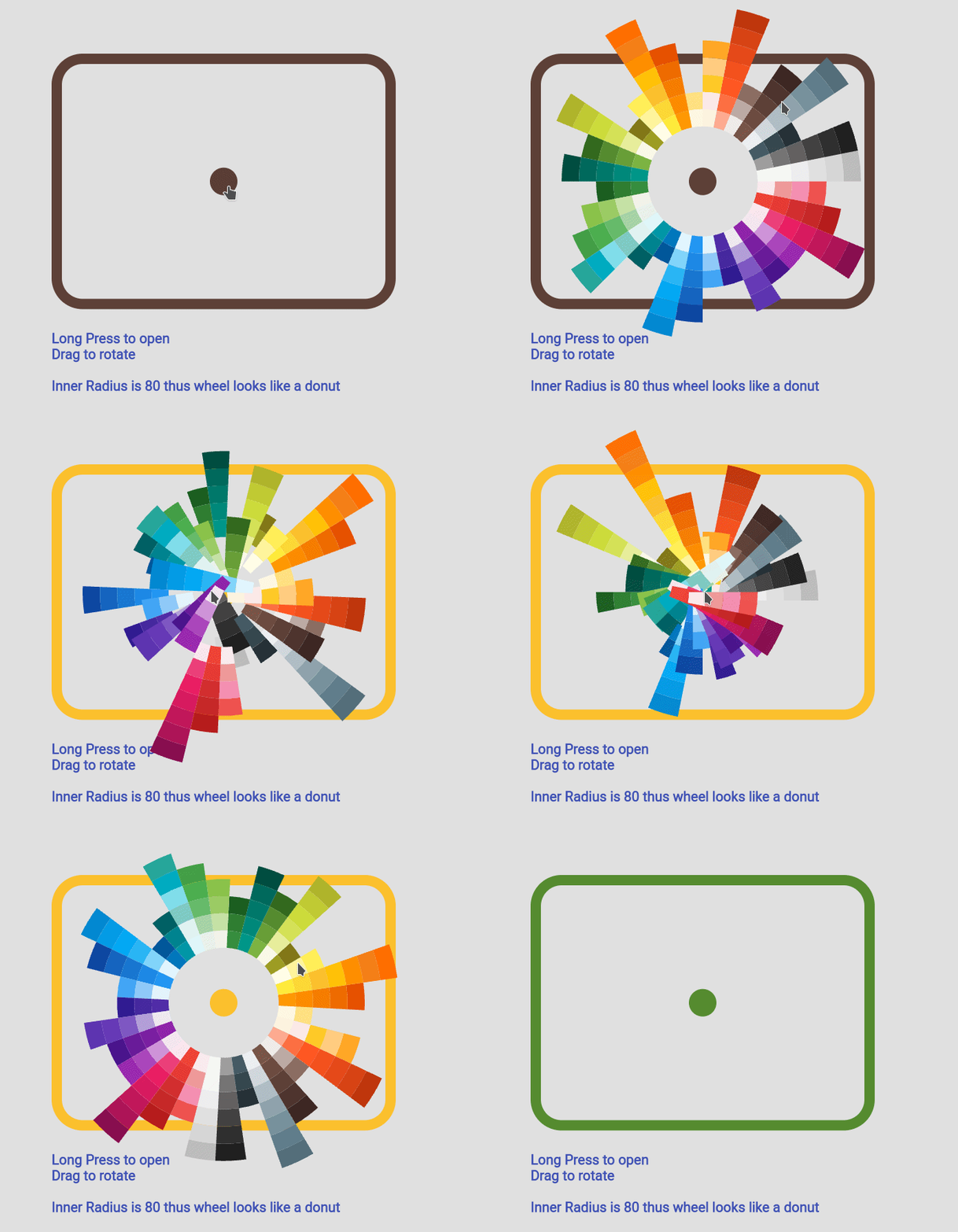 Sun Ray Simple |
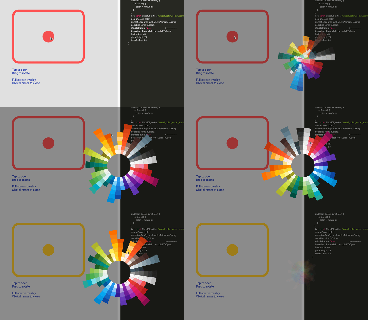 Detached Full Screen without Gap |
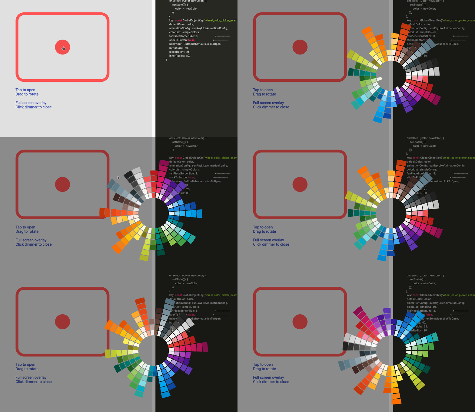 Detached Full Screen with Gap |
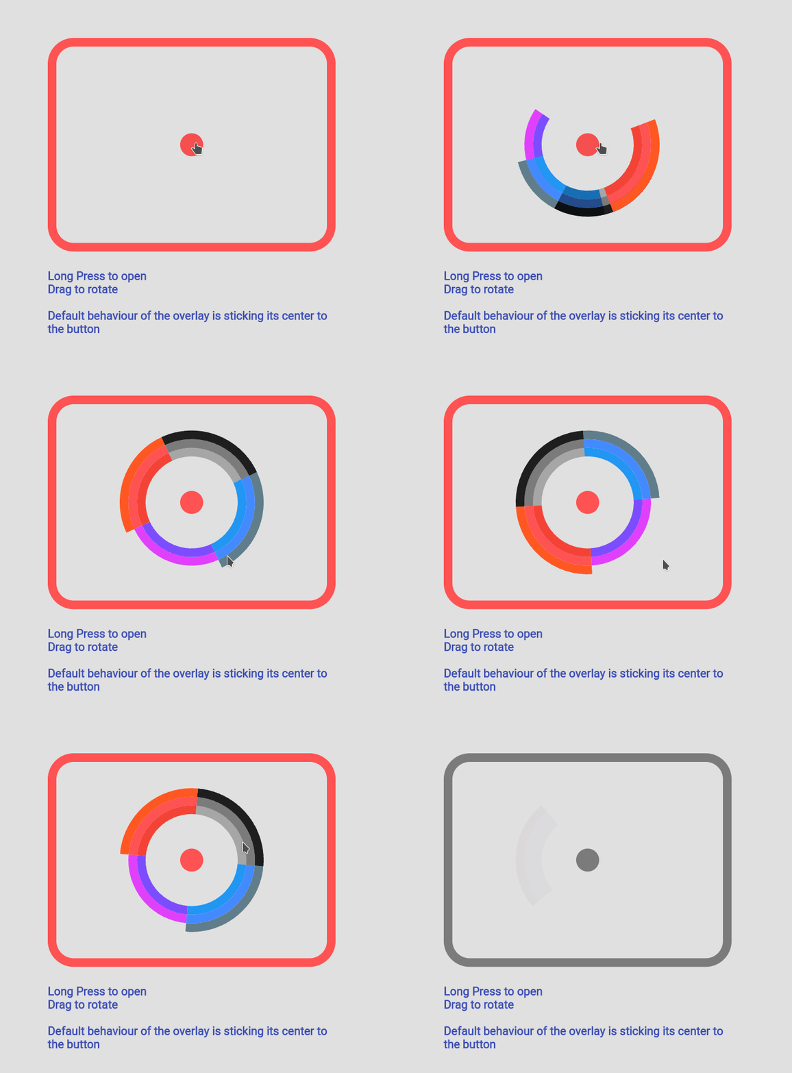 Custom Color Set |
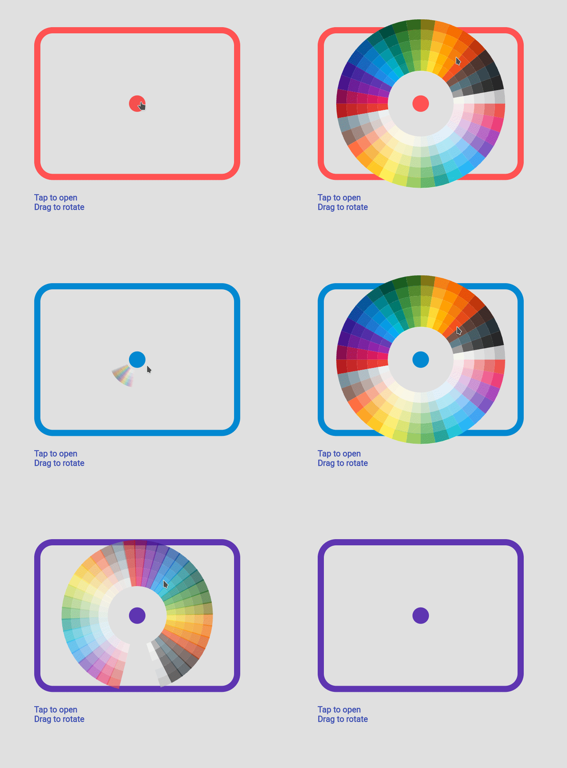 Custom Animation |
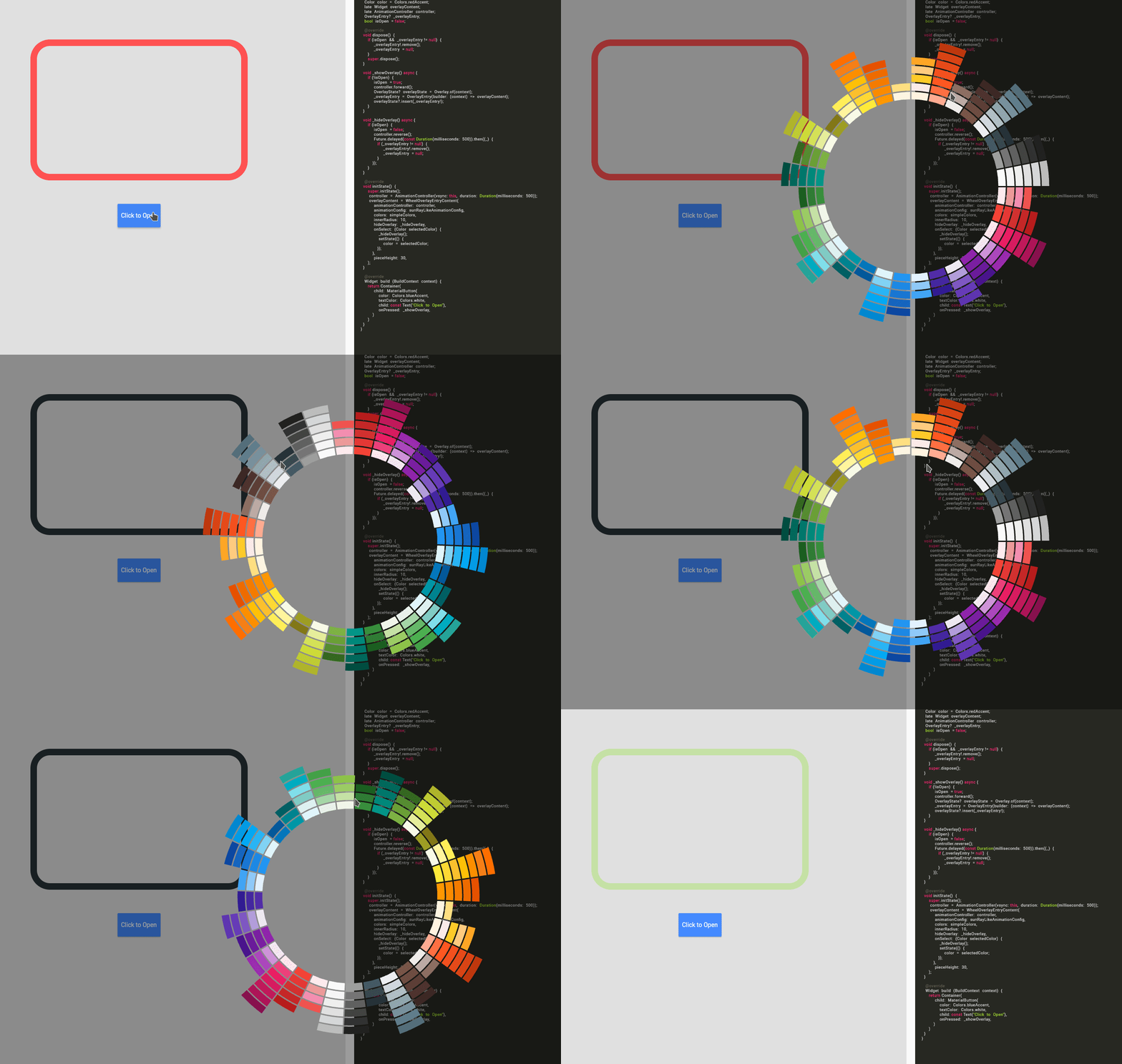 Manage Your Own OverlayEntry |
you can find more examples in the example path of this repository
import 'package:flutter_color_picker_wheel/flutter_color_picker_wheel.dart';

Color color; /// you want to initialize this color in the initState method

Widget myButton = WheelColorPicker(
  onSelect: (Color newColor) {
    setState(() {
       color = newColor;
    });
  },
  /// long press to open, another behaviour is clickToOpen to open
  behaviour: ButtonBehaviour.longPressToOpen,
  /// inital color
  defaultColor: color,
  /// fanLikeAnimationConfig is a preset, you can import this from the package
  animationConfig: fanLikeAnimationConfig,
  /// simpleColors is a preset, you can import this from the package
  colorList: simpleColors,
  /// size of the clickable button in the middle
  buttonSize: 40,
  /// height of each piece (outerRadius - innerRadius of a piece)
  pieceHeight: 25,
  /// starting radius of the donut shaped wheel
  innerRadius: 80,
);
WheelColorPicker(
  onSelect: (Color newColor) {
    setState(() {
      color = newColor;
    });
  },
  defaultColor: color,
  animationConfig: fanLikeAnimationConfig,
  colorList: const [
    [Colors.red, Colors.redAccent, Colors.deepOrange],
    [Colors.black26, Colors.black45, Colors.black87],
    [Colors.blue, Colors.blueAccent, Colors.blueGrey],
    [Colors.deepPurpleAccent, Colors.purpleAccent],
  ],
  buttonSize: 40,
  pieceHeight: 15,
  innerRadius: 80,
);
WheelColorPicker(
  onSelect: (Color newColor) {
    setState(() {
      color = newColor;
    });
  },
  behaviour: ButtonBehaviour.clickToOpen,
  defaultColor: color,
  animationConfig: const FanAnimationConfig(
    animationDurationInMillisecond: 1000,
    rayAnimationConfig: RayAnimationConfig(
      curve: Curves.easeInQuad,
      enabled: false,
    ),
    scaleAnimationConfig: ScaleAnimationConfig(
      curve: Curves.easeInOutCubic,
      enabled: true,
      animationStartDelay: 0,
      animationFinishDelay: 0.2,
    ),
    opacityAnimationConfig: OpacityAnimationConfig(
      curve: Curves.linear,
      enabled: true,
      animationStartDelay: 0.2,
      animationFinishDelay: 0,
    ),
    rotationAnimationConfig: RotationAnimationConfig(
      curve: Curves.easeInQuad,
      enabled: true,
      animationFinishDelay: 0.4
    )
  ),
  colorList: defaultAvailableColors,
  buttonSize: 40,
  pieceHeight: 25,
  innerRadius: 80,
)
Note: This use case is a bit complicated.
If you decided to go this route there are several core ideas that you need to wrap your head around.
WheelOverlayEntryContent should be generated only ONCE but not generated each build. You can have a new OverlayEntry, but you only need one WheelOverlayEntryContent. This helps us to have a decent performance.WheelOverlayEntryContent to some component, you want to use LayerLink.
See WheelColorPicker as an exampleAnimationController to the Widget, thus you want to extend some ticker provider, eg. SingleTickerProviderStateMixinExample:
class ExampleUseOverlayOnlyState extends State<ExampleUseOverlayOnly> with SingleTickerProviderStateMixin {
  Color color = Colors.redAccent;
  late Widget overlayContent;
  late AnimationController controller;
  OverlayEntry? _overlayEntry;
  bool isOpen = false;

  @override
  void dispose() {
    if (_overlayEntry != null) {
      _overlayEntry!.remove();
      _overlayEntry = null;
    }
    controller.dispose();
    super.dispose();
  }

  void _showOverlay() async {
    if (!isOpen) {
      isOpen = true;
      controller.forward();
      OverlayState? overlayState = Overlay.of(context);
      _overlayEntry = OverlayEntry(builder: (context) => overlayContent);
      overlayState?.insert(_overlayEntry!);
    }
  }

  void _hideOverlay() async {
    if (isOpen) {
      isOpen = false;
      controller.reverse();
      Future.delayed(const Duration(milliseconds: 500)).then((_) {
        if (_overlayEntry != null) {
          _overlayEntry!.remove();
          _overlayEntry = null;
        }
      });
  }
  }

  @override
  void initState() {
    super.initState();
    controller = AnimationController(vsync: this, duration:Duration(milliseconds: 500));
    overlayContent = WheelOverlayEntryContent(
      animationController: controller,
      animationConfig: sunRayLikeAnimationConfig,
      colors: simpleColors,
      innerRadius: 200,
      pieceHeight: 20,
      pieceBorderSize: 5,
      hideOverlay: _hideOverlay,
      onSelect: (Color selectedColor) {
        _hideOverlay();
        setState(() {
          color = selectedColor;
        });
      },
    );
  }

  @override
  Widget build(BuildContext context) {
    return Container(
      padding: const EdgeInsets.all(150),
      child: Column(
        children:[
          Expanded(
            flex:12,
            child: Container(
              height: 500,
              width: 500,
              decoration: BoxDecoration(
                borderRadius: BorderRadius.circular(45),
                border: Border.all(
                  width: 15,
                  color: color
                )
              ),
            )
          ),
          const Expanded(flex:2, child: SizedBox()),
          Expanded(
            flex:2,
            child: MaterialButton(
              color: Colors.blueAccent,
              textColor: Colors.white,
              child: const Text("Click to Open"),
              onPressed: _showOverlay,
            ),
          ),
        ],
      )
    );
  }
}
의존성 목록 4 개
^2.0.1{"sdk":"flutter"}{"sdk":"flutter"}^1.0.0사용 목적에 따라 검색하고 개발 활동을 비교한 뒤 원본 저장소에서 요구 사항을 확인하세요.
“A repository is the most basic element of GitHub.”
GitHub Docs — About repositories ↗