Flutter 애플리케이션을 위한 완전히 Dart로 작성된 휠 모양의 색상 선택기입니다. 직관적인 원형 인터페이스를 제공하여 디자인 도구, 테마 커스터마이저 및 창작 앱에 적합합니다. 부드러운 색상 전환을 지원하며 Android, iOS, 웹, macOS, Windows, Linux 등 모든 주요 플랫폼과 호환됩니다. 깔끔하고 사용자 정의 가능한 UI는 개발자가 최소한의 설정으로 시각적으로 매력적인 색상 선택 경험을 쉽게 통합할 수 있도록 합니다.
사용 사례
디자인 도구 통합
테마 사용자 정의 인터페이스
크리에이티브 앱 색상 선택
모바일 및 데스크톱 앱 사용자 인터페이스
웹 기반의 색상 선택기
주요 기능
원형 휠 색상 선택
완전히 Dart로 작성됨
크로스 플랫폼 호환성
부드러운 색상 전환
사용자 정의 가능한 UI
Flutter와의 간편한 통합
적합한 대상
UI/UX 디자이너
창의적 도구를 구축하는 앱 개발자
테마 활성화 애플리케이션
다중 플랫폼 Flutter 프로젝트
고려 사항
휠 기반 선택으로 제한
브랜딩을 위해 추가적인 스타일링이 필요할 수 있습니다
HSL 또는 HSV와 같은 복잡한 색 모델에는 적합하지 않습니다
원본 README
연결된 소스 저장소의 README 원문 스냅샷입니다. 최신 내용은 저장소에서 확인하세요.
Flutter Color Picker Wheel
Flutter Color Picker Wheel is an easy-to-use widget that can be heavily customized.
You can use the WheelColorPicker directly by providing list of colors you want to include and animation configs.
You can use the WheelColorPickerEntryContent and manage OverlayEntry yourself.
This library provides some presets which make it even easier to use this component.
How to use
Add the dependency to your pubspec.yaml
flutter_color_picker_wheel:^0.0.1
Try it out
Currently this Storybook only works well on Web
TODO: [ ] Use another storybook to provide better preview for both web
and phone
https://flutter-color-picker-wheel.kexinlu.com
Showcase
Fan Default Preset
Fan Simple Preset
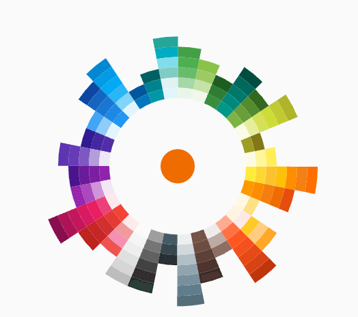
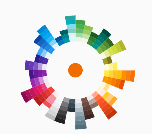
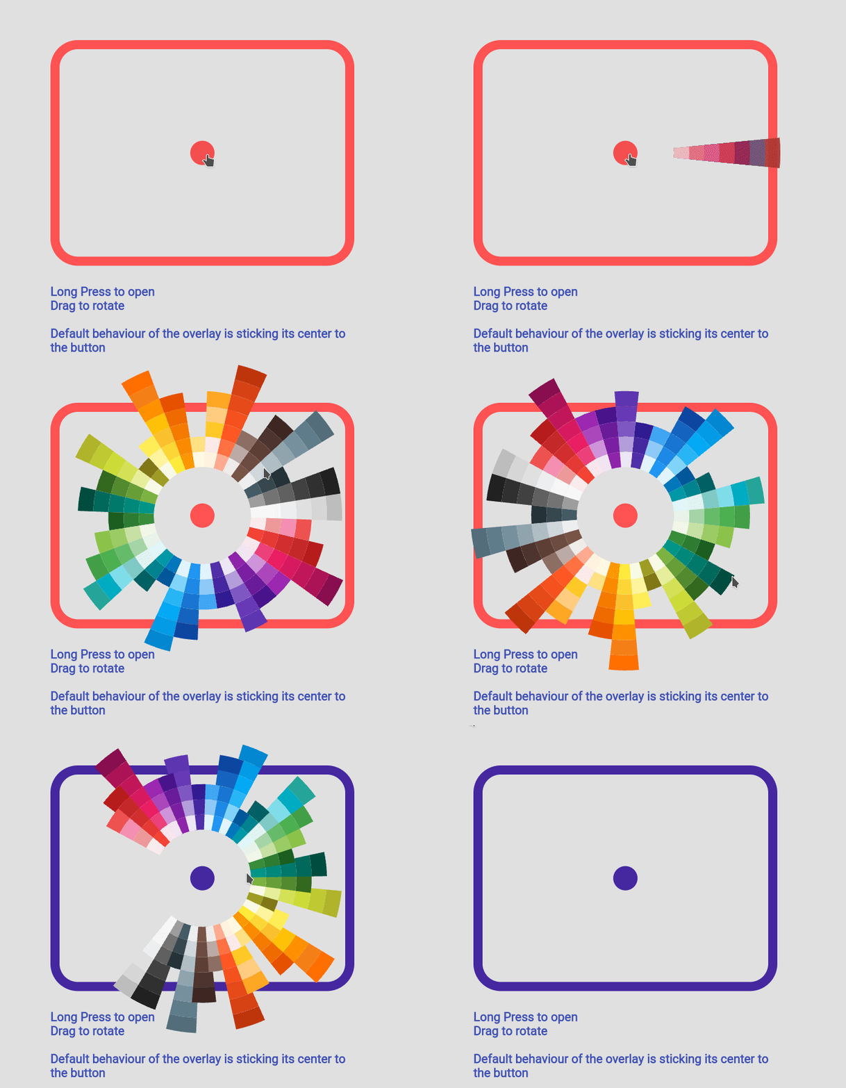
Sun Ray Default
Sun Ray Simple
Detached Full Screen without Gap
Detached Full Screen with Gap
Custom Color Set
Custom Animation
Manage Your Own OverlayEntry
Example Code
you can find more examples in the example path of this repository
Simple Usecase
import'package:flutter_color_picker_wheel/flutter_color_picker_wheel.dart';
Color color; /// you want to initialize this color in the initState methodWidget myButton = WheelColorPicker(
onSelect: (Color newColor) {
setState(() {
color = newColor;
});
},
/// long press to open, another behaviour is clickToOpen to open
behaviour: ButtonBehaviour.longPressToOpen,
/// inital color
defaultColor: color,
/// fanLikeAnimationConfig is a preset, you can import this from the package
animationConfig: fanLikeAnimationConfig,
/// simpleColors is a preset, you can import this from the package
colorList: simpleColors,
/// size of the clickable button in the middle
buttonSize: 40,
/// height of each piece (outerRadius - innerRadius of a piece)
pieceHeight: 25,
/// starting radius of the donut shaped wheel
innerRadius: 80,
);
If you decided to go this route there are several core ideas that you need to wrap your head around.
WheelOverlayEntryContent should be generated only ONCE but not generated each build. You can have a new OverlayEntry, but you only need one WheelOverlayEntryContent. This helps us to have a decent performance.
To stick the WheelOverlayEntryContent to some component, you want to use LayerLink.
See WheelColorPicker as an example
You need to provide AnimationController to the Widget, thus you want to extend some ticker provider, eg. SingleTickerProviderStateMixin

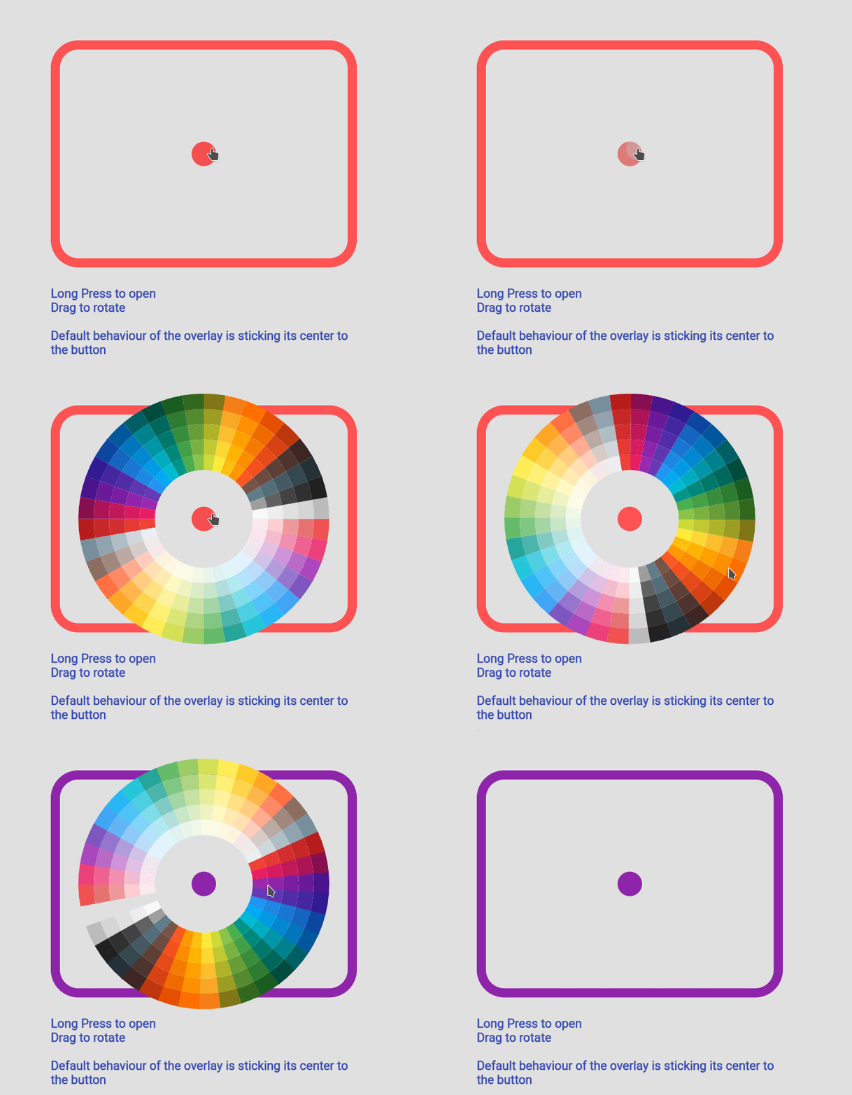 Fan Default Preset
 Fan Simple Preset
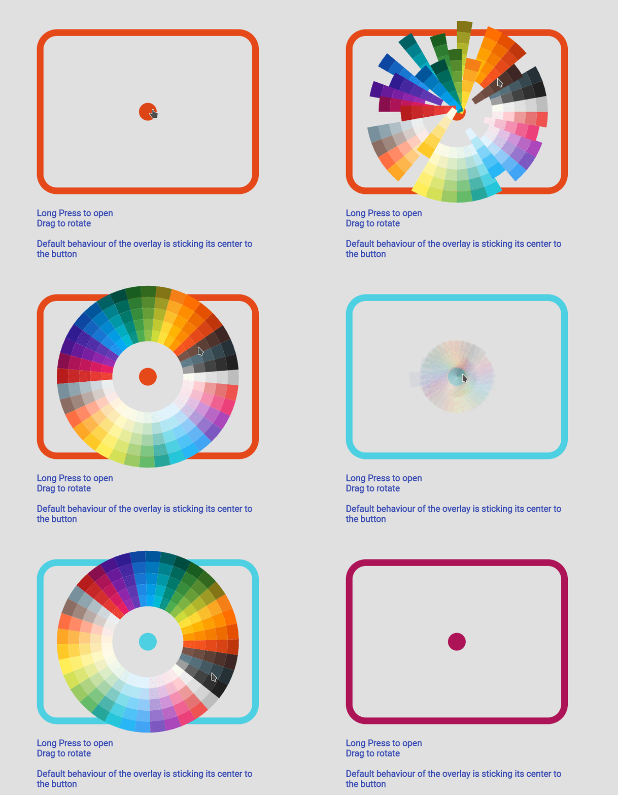 Sun Ray Default
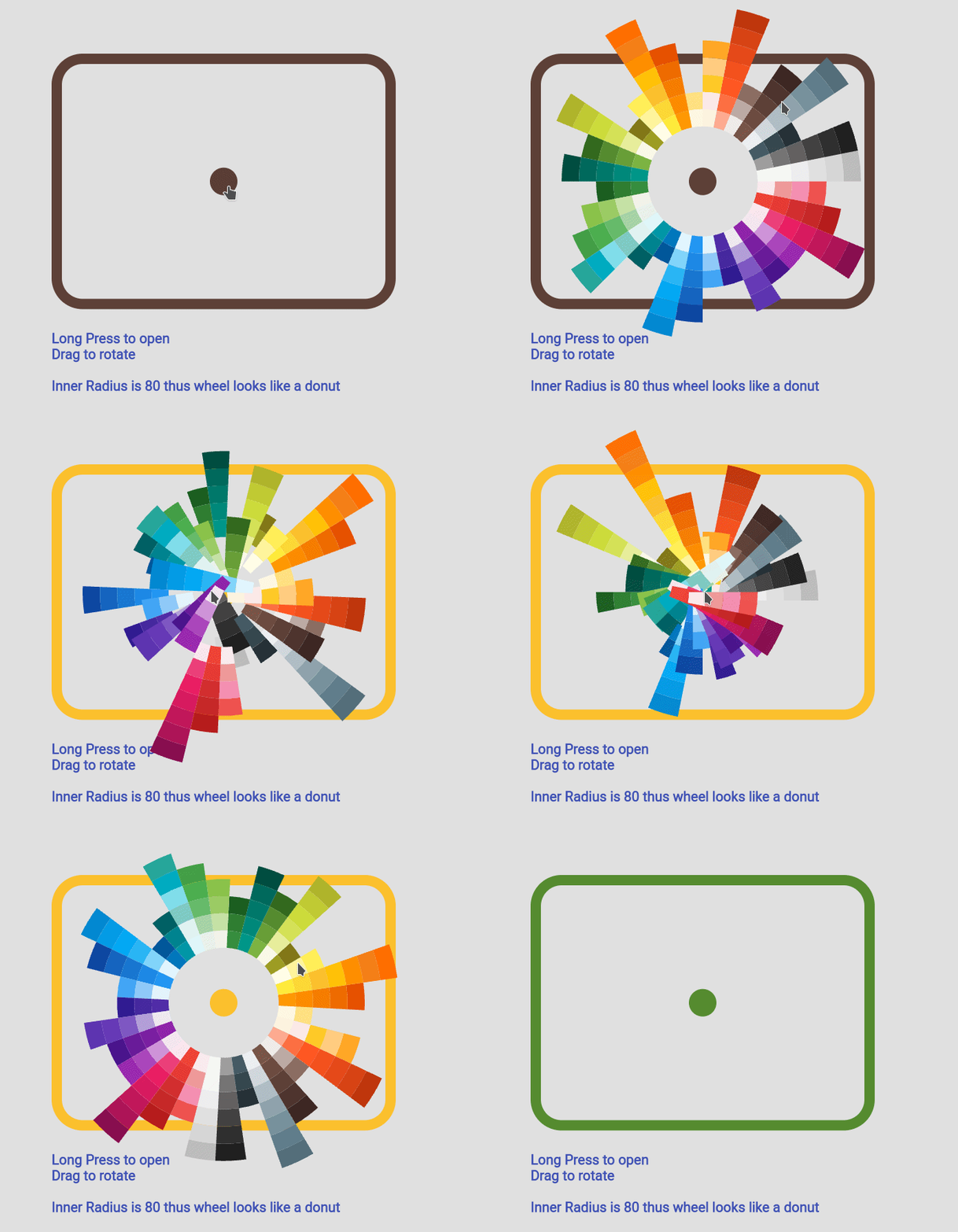 Sun Ray Simple
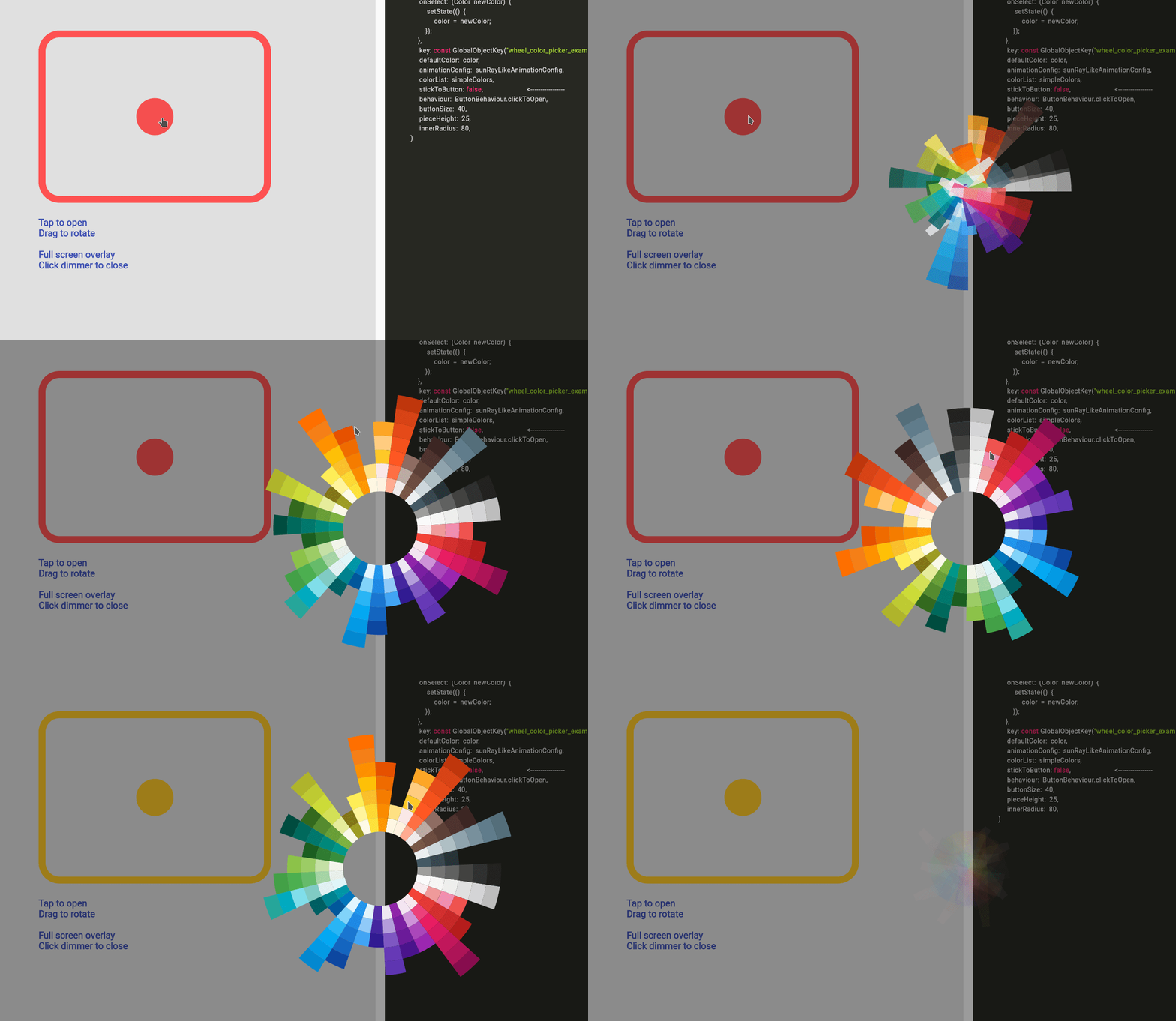 Detached Full Screen without Gap
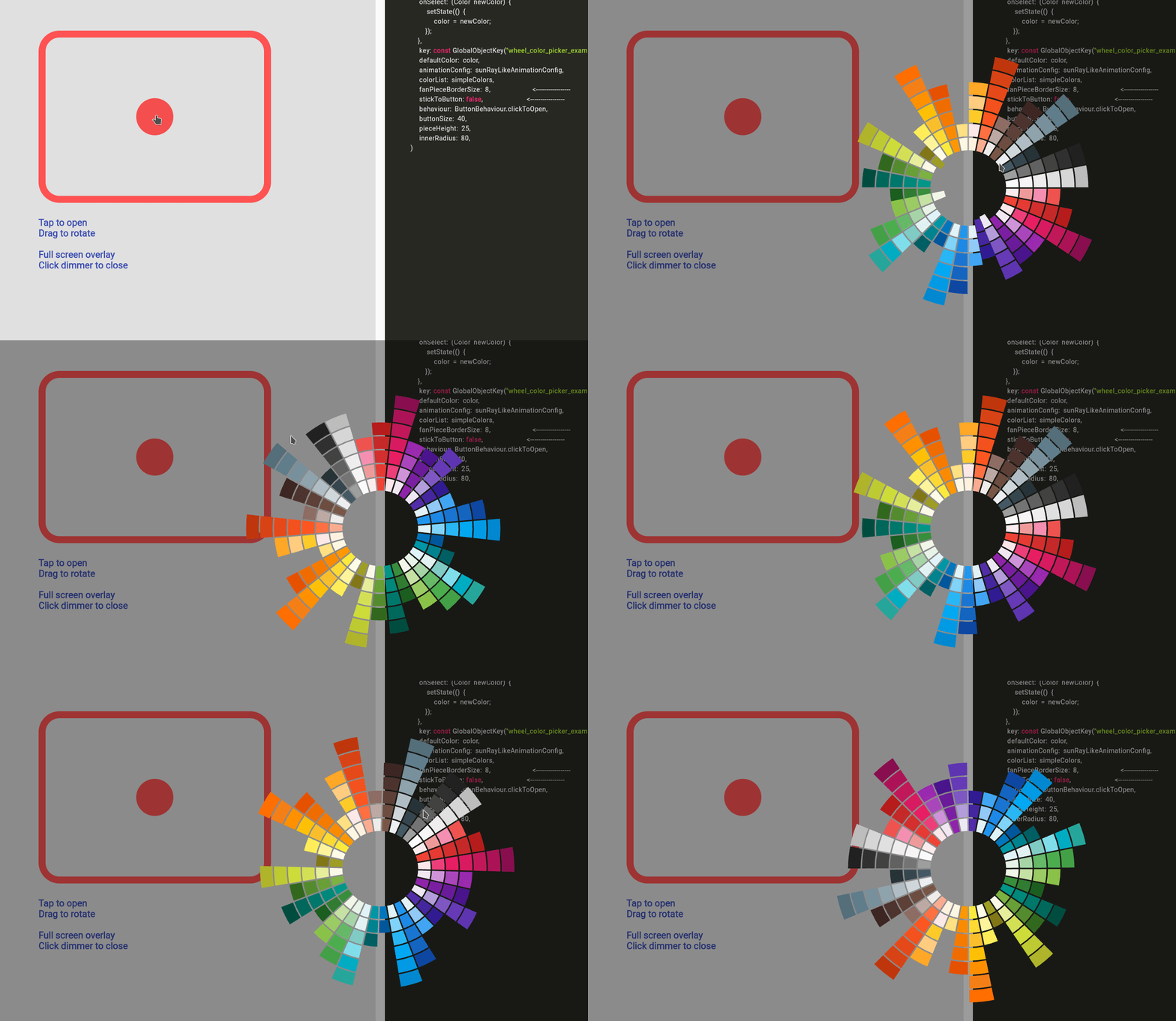 Detached Full Screen with Gap
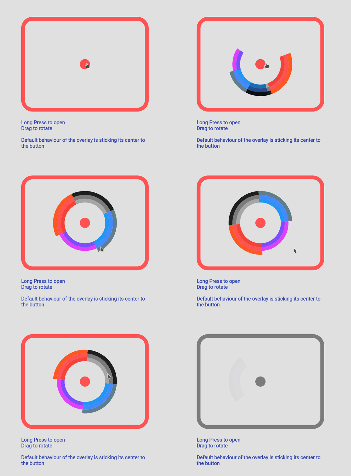 Custom Color Set
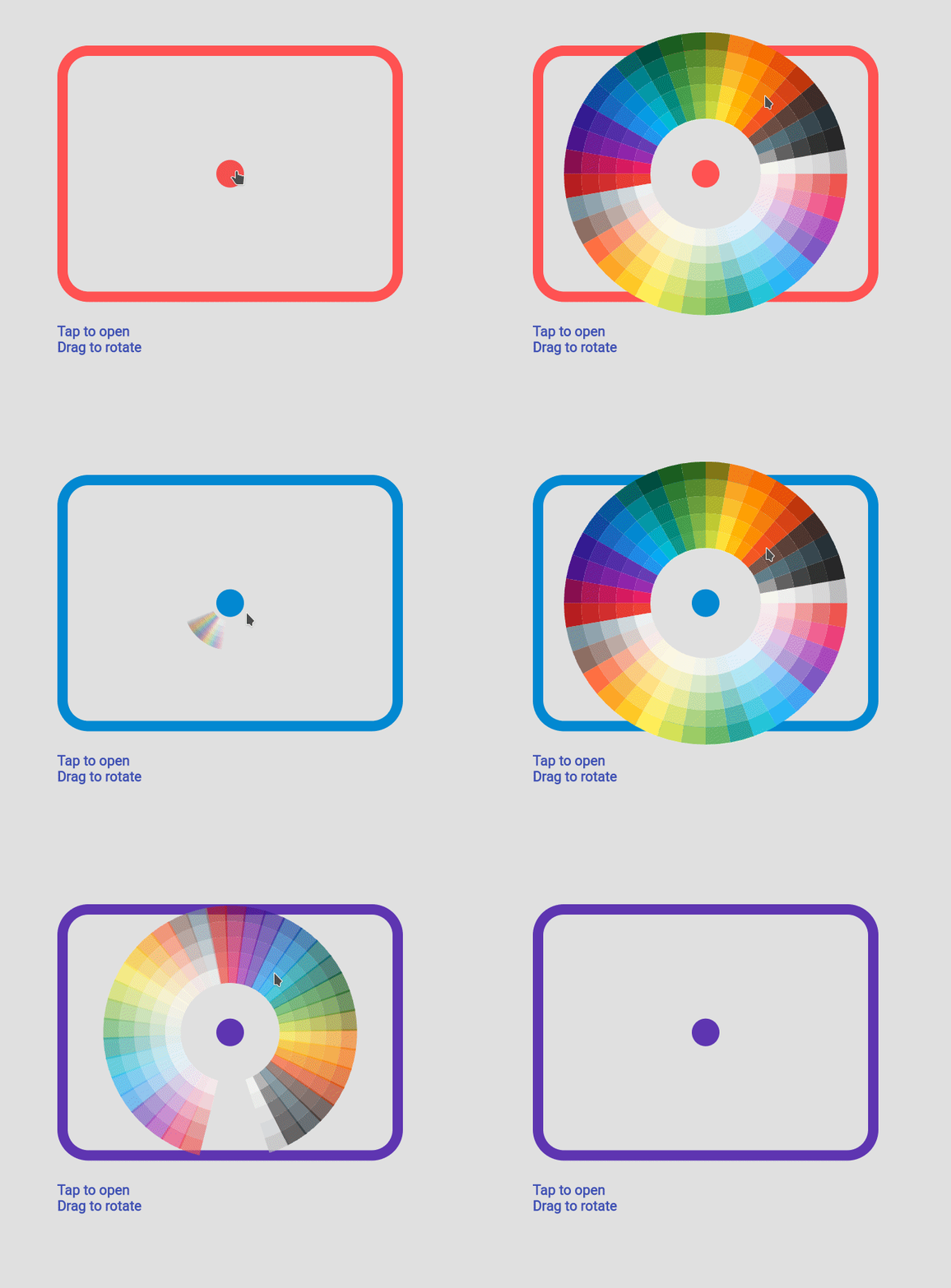 Custom Animation
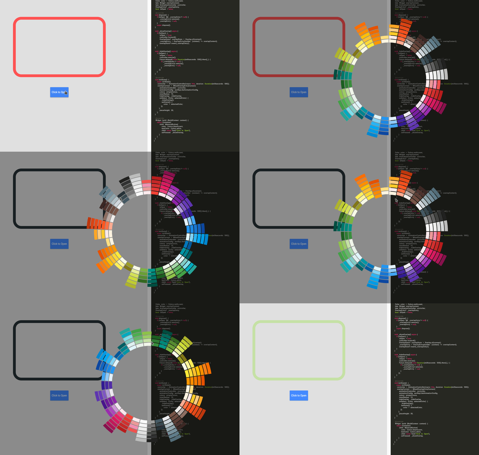 Manage Your Own OverlayEntry