
 v0.0.2
dot_curved_bottom_nav
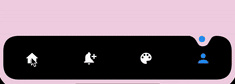
인디케이터 네비게이션 바를 둘러싼 인상적인 애니메이션 곡선 모양. 색상, 배경색, 애니메이션 곡선, 애니메이션 지속 시간 조정 가능.
51좋아요 9130일 다운로드150Pub 점수
AndroidiOSWebmacOSWindowsLinux
Flutter용으로 제작된 커스터마이즈 가능한 하단 네비게이션 패키지로 놀라운 애니메이션과 색상, 애니메이션 속도 등을 조정할 수 있습니다.

{"sdk":"flutter"}{"sdk":"flutter"}^2.0.0아래는 영문 원문 스냅샷입니다. 최신 내용은 GitHub에서 확인하세요.
Preview
Add the dependency at pubspec.yaml:
dependencies:
  dot_curved_bottom_nav: ^0.0.1
bottomNavigationBar: DotCurvedBottomNav(
    scrollController: _scrollController,
    hideOnScroll: true,
    indicatorColor: Colors.blue,
    backgroundColor: Colors.black,
    animationDuration: const Duration(milliseconds: 300),
    animationCurve: Curves.ease,
    selectedIndex: _currentPage,
    indicatorSize: 5,
    borderRadius: 25,
    height: 70,
    onTap: (index) {
    setState(() => _currentPage = index);
    },
    items: [
    Icon(
        Icons.home,
        color: _currentPage == 0 ? Colors.blue : Colors.white,
    ),
    Icon(
        Icons.notification_add,
        color: _currentPage == 1 ? Colors.blue : Colors.white,
    ),
    Icon(
        Icons.color_lens,
        color: _currentPage == 2 ? Colors.blue : Colors.white,
    ),
    Icon(
        Icons.person,
        color: _currentPage == 3 ? Colors.blue : Colors.white,
    ),
    ],
),
| Property | Description |
|---|---|
| scrollController | Used to listen when the user scrolls and hides the bottom navigation |
| hideOnScroll | Used to enable or disable hide on scroll behavior. (NOTE: scrollController must be provided when hideOnScroll is TRUE) |
| indicatorColor | Color of the indicator displayed on currently selected item |
| backgroundColor | Configures the background color of the bottom navigation |
| animationDuration | Configures animation duration of hiding and indicator movement between items |
| animationCurve | Configures curve of the animation of indicator movement and hide on scroll animation |
| selectedIndex | Configures currently selected item / page |
| indicatorSize | Configures the size of indicator displayed on top of the item |
| borderRadius | Configures border radius of border DotCurvedBottomNav |
| height | Configures height of DotCurvedBottomNav |
| onTap | Configures callback function that is invoked whenever user taps on an item |
| items | Configures list of items of bottom nav |
Feel free to create an issue if you find a bug or if you need new features. Of course PRs are welcome!
If you want to connect with me on LinkedIn: Muzammil Hussain