연결된 소스 저장소의 README 원문 스냅샷입니다. 최신 내용은 저장소에서 확인하세요.
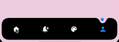
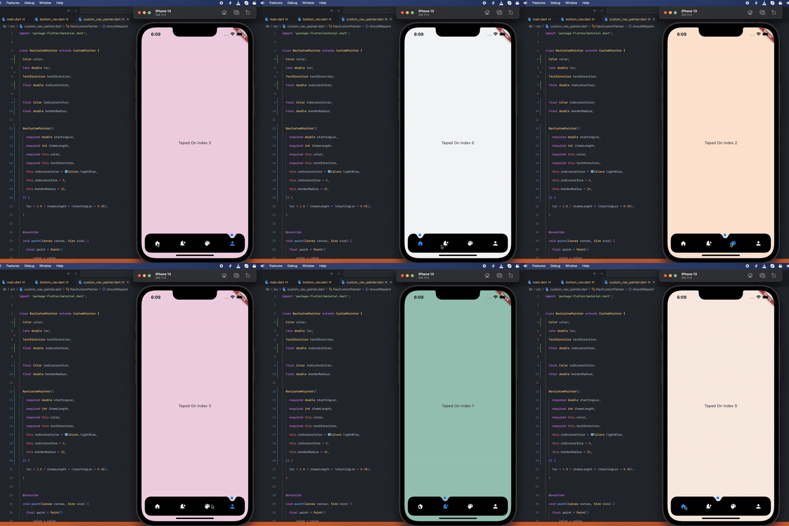
Stunning Curved Bottom Navigation
Preview
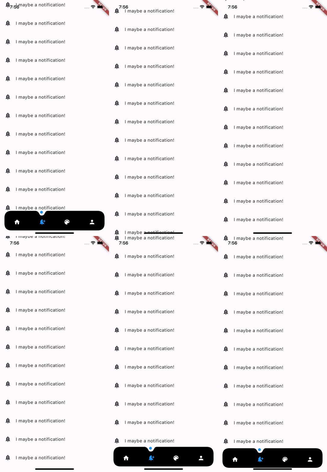
Optional Hide On Scroll
Getting Started
Add the dependency at pubspec.yaml:
dependencies:
  dot_curved_bottom_nav: ^0.0.1
Basic Usage
bottomNavigationBar: DotCurvedBottomNav (
scrollController: _scrollController,
hideOnScroll: true ,
indicatorColor: Colors .blue,
backgroundColor: Colors .black,
animationDuration: const Duration (milliseconds: 300 ),
animationCurve: Curves .ease,
selectedIndex: _currentPage,
indicatorSize: 5 ,
borderRadius: 25 ,
height: 70 ,
onTap: (index) {
setState (() => _currentPage = index);
},
items: [
Icon (
Icons .home,
color: _currentPage == 0 ? Colors .blue : Colors .white,
),
Icon (
Icons .notification_add,
color: _currentPage == 1 ? Colors .blue : Colors .white,
),
Icon (
Icons .color_lens,
color: _currentPage == 2 ? Colors .blue : Colors .white,
),
Icon (
Icons .person,
color: _currentPage == 3 ? Colors .blue : Colors .white,
),
],
),
Properties
Property
Description
scrollController
Used to listen when the user scrolls and hides the bottom navigation
hideOnScroll
Used to enable or disable hide on scroll behavior. (NOTE: scrollController must be provided when hideOnScroll is TRUE)
indicatorColor
Color of the indicator displayed on currently selected item
backgroundColor
Configures the background color of the bottom navigation
animationDuration
Configures animation duration of hiding and indicator movement between items
animationCurve
Configures curve of the animation of indicator movement and hide on scroll animation
selectedIndex
Configures currently selected item / page
indicatorSize
Configures the size of indicator displayed on top of the item
borderRadius
Configures border radius of border DotCurvedBottomNav
height
Configures height of DotCurvedBottomNav
onTap
Configures callback function that is invoked whenever user taps on an item
items
Configures list of items of bottom nav
TODO:
Add More Indicator shapes e.g diamond shape with diamond cut out and more.
Contributions
Feel free to create an issue if you find a bug or if you need new features. Of course PRs are welcome!
If you want to connect with me on LinkedIn: Muzammil Hussain
If you like this work, please consider 👍 the package and ⭐ the repo. It is appreciated.