

 v1.2.0
flutter_material_color_picker
Flutter 앱용 가능한 커스터마이제이션을 갖춘 Material 색상 선택기
126좋아요 4.1천30일 다운로드150Pub 점수
AndroidiOSWebmacOSWindowsLinux
마테리얼 색상 선택기, 사용자가 색상을 맞춤 설정할 수 있습니다. 두 단계로 선택: 먼저 메인 컬러, 그 다음 음영.

아래는 영문 원문 스냅샷입니다. 최신 내용은 GitHub에서 확인하세요.

Material Color picker is a Flutter widget, that can be customizable.
By default, it's Material Colors, but you can define your own colors.
You can also use CircleColor widget to display color in your app. Example, you can set the color picker in a dialog and display the selected color in a ListTile, for settings.
These examples use a static color for 'selectedColor', but you can use a variable (state)
You just need to add flutter_material_color_picker as a dependency in your pubspec.yaml file.
flutter_material_color_picker: ^1.2.0
import 'package:flutter_material_color_picker/flutter_material_color_picker.dart';
MaterialColorPicker(
    onColorChange: (Color color) {
        // Handle color changes
    },
    selectedColor: Colors.red
)
MaterialColorPicker(
    onColorChange: (Color color) {
        // Handle color changes
    },
    onMainColorChange: (ColorSwatch color) {
        // Handle main color changes
    },
    selectedColor: Colors.red
)
MaterialColorPicker(
    allowShades: false, // default true
    onMainColorChange: (ColorSwatch color) {
        // Handle main color changes
    },
    selectedColor: Colors.red
)
If allowShades is set to false then only main colors will be shown and allowed to be selected.
onColorChange will not be called, use onMainColorChange instead.
In this example, custom colors are a list of Material Colors (class who extend of ColorSwatch). But you can create your own list of ColorSwatch.
MaterialColorPicker(
    onColorChange: (Color color) {
        // Handle color changes
    },
    selectedColor: Colors.red,
    colors: [
        Colors.red,
        Colors.deepOrange,
        Colors.yellow,
        Colors.lightGreen
    ],
)
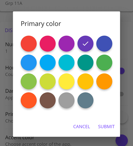
There is two step, first choose the main color, and when you press it, you have to choose a shade of the main color. By default it's all Material Colors, but you can define custom colors, a list of ColorSwatch.


You can insert the color picker into a Dialog


You can use CircleColor widget, to display the selected color into your settings for example.

의존성 목록 2 개
{"sdk":"flutter"}^2.0.0사용 목적에 따라 검색하고 개발 활동을 비교한 뒤 원본 저장소에서 요구 사항을 확인하세요.
“A repository is the most basic element of GitHub.”
GitHub Docs — About repositories ↗