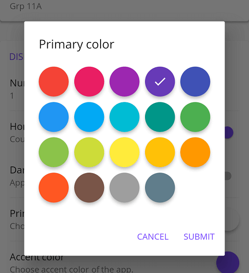
Flutter 애플리케이션에서 사용할 수 있는 Material 스타일의 색상 선택기로, 사용자 정의 가능한 옵션을 제공하는 Flutter 패키지입니다. 시각적으로 매력적인 마테리얼 디자인 인터페이스를 통해 사용자가 색상을 선택할 수 있으며, 안드로이드, iOS, 웹, 맥OS, 윈도우, 리눅스 등 다양한 플랫폼에 통합 지원합니다. 다양한 사용자 정의 설정을 통해 유연성을 제공하여 직관적인 색상 선택이 필요한 앱에 적합합니다. Flutter의 마테리얼 디자인 원칙에 기반하여 일관된 UI 경험을 제공합니다.
사용 사례
앱 테마에서 색상 선택
UI 요소 색상 맞춤 설정
디자인 도구 통합
사용자 선호 설정
인터랙티브 색상 팔레트
프로토타이핑 색상 구성
주요 기능
머티리얼 디자인 미학
크로스 플랫폼 호환성
사용자 정의 가능한 외관
Flutter와의 간편한 통합
색 색상 패널을 지원합니다
반응형 UI
적합한 대상
UI/UX 개발자
앱 디자이너
테마 사용자 정의 도구
인터랙티브 프로토타이핑
색 민감 응용 프로그램
고려 사항
마테리얼 디자인 스타일로 제한
색 상태를 수동으로 처리해야 합니다
내장된 색상 기록 없음
비 마테리얼 테마에 대한 추가 스타일링이 필요할 수 있습니다
Flutter의 Material 라이브러리에 의존합니다
복잡한 색상 모델에 최적화되지 않음
원본 README
연결된 소스 저장소의 README 원문 스냅샷입니다. 최신 내용은 저장소에서 확인하세요.
Flutter Material Color Picker
Material Color picker is a Flutter widget, that can be customizable.
By default, it's Material Colors, but you can define your own colors.
You can also use CircleColor widget to display color in your app.
Example, you can set the color picker in a dialog and display the selected color in a ListTile, for settings.
How to use it
These examples use a static color for 'selectedColor', but you can use a variable (state)
MaterialColorPicker(
    onColorChange: (Color color) {
        // Handle color changes
    },
    onMainColorChange: (ColorSwatch color) {
        // Handle main color changes
    },
    selectedColor: Colors.red
)
Disallow Shades
MaterialColorPicker(
    allowShades: false, // default true
    onMainColorChange: (ColorSwatch color) {
        // Handle main color changes
    },
    selectedColor: Colors.red
)
If allowShades is set to false then only main colors will be shown and allowed to be selected.
onColorChange will not be called, use onMainColorChange instead.
Custom colors
In this example, custom colors are a list of Material Colors (class who extend of ColorSwatch).
But you can create your own list of ColorSwatch.
There is two step, first choose the main color, and when you press it, you have to choose a shade of the main color.
By default it's all Material Colors, but you can define custom colors, a list of ColorSwatch.
Example of usages
You can insert the color picker into a Dialog
Display color
You can use CircleColor widget, to display the selected color into your settings for example.