
 v4.0.0
glassmorphism
간편하게 글래스모포픽 UI를 구현할 수 있는 플러터 패키지입니다.
535좋아요 1.4만30일 다운로드160Pub 점수
AndroidiOSWebmacOSWindowsLinux
Flutter용 글래스모포닉 UI 패키지 || UI ||

{"sdk":"flutter"}아래는 영문 원문 스냅샷입니다. 최신 내용은 GitHub에서 확인하세요.
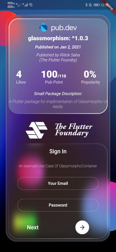
A Flutter package for creating Glassmorphic UI designs in an easy and simple manner! Supports iOS, Android, web, Windows, macOS, and Linux.
https://raw.githubusercontent.com/RitickSaha/glassmophism/master/images/s1.0.5x.jpg
Inspired by Glassmorphism CSS Generator. Highly customizable and helps developing beautiful Glassmorphic UI.
To use this plugin, add glassmorphism as a dependency in your pubspec.yaml file.
Use the below example to get started with the sample example.
You can follow this tutorial and work around with the package.
Glassmorphism UI Package For @Flutter || UI || A Glassy and easy to use Package #flutter
[Full Control to User]GlassmorphicContainer with fixed Height and width:GlassmorphicContainer(
width: 350,
height: 350,
borderRadius: 20,
blur: 20,
alignment: Alignment.bottomCenter,
border: 2,
linearGradient: LinearGradient(
begin: Alignment.topLeft,
end: Alignment.bottomRight,
colors: [
Color(0xFFffffff).withOpacity(0.1),
Color(0xFFFFFFFF).withOpacity(0.05),
],
stops: [
0.1,
1,
]),
borderGradient: LinearGradient(
begin: Alignment.topLeft,
end: Alignment.bottomRight,
colors: [
Color(0xFFffffff).withOpacity(0.5),
Color((0xFFFFFFFF)).withOpacity(0.5),
],
),
child: null,
),
GlassmorphicFlexContainer with responsiveness or take child widgets size. :GlassmorphicFlexContainer(
borderRadius: 20,
blur: 20,
padding: EdgeInsets.all(40),
alignment: Alignment.bottomCenter,
border: 2,
linearGradient: LinearGradient(
begin: Alignment.topLeft,
end: Alignment.bottomRight,
colors: [
Color(0xFFffffff).withOpacity(0.1),
Color(0xFFFFFFFF).withOpacity(0.05),
],
stops: [
0.1,
1,
]),
borderGradient: LinearGradient(
begin: Alignment.topLeft,
end: Alignment.bottomRight,
colors: [
Color(0xFFffffff).withOpacity(0.5),
Color((0xFFFFFFFF)).withOpacity(0.5),
],
),
child: null,
),
example, Simple Glassmorphic Container with Blur.
import 'package:flutter/material.dart';
import 'package:glassmorphism/glassmorphism.dart';
import 'dart:ui';

void main() => runApp(MyApp());

class MyApp extends StatelessWidget {
  @override
  Widget build(BuildContext context) {
    return MaterialApp(
      title: 'GlassmorphicContainer Example',
      home: GlassmorphicSample(),
    );
  }
}

class GlassmorphicSample extends StatefulWidget {
  @override
  State<GlassmorphicSample> createState() => GlassmorphicSampleState();
}

class GlassmorphicSampleState extends State<GlassmorphicSample> {
  @override
  Widget build(BuildContext context) {
    return new Scaffold(
      body: Container(
        height: double.infinity,
        width: double.infinity,
        child: Stack(
          children: [
            Image.network(
              "https://github.com/RitickSaha/glassmophism/blob/master/example/assets/bg.png?raw=true",
              fit: BoxFit.cover,
              height: double.infinity,
              width: double.infinity,
              scale: 1,
            ),
            SafeArea(
              child: Center(
                child: GlassmorphicContainer(
                    width: 350,
                    height: 750,
                    borderRadius: 20,
                    blur: 20,
                    alignment: Alignment.bottomCenter,
                    border: 2,
                    linearGradient: LinearGradient(
                        begin: Alignment.topLeft,
                        end: Alignment.bottomRight,
                        colors: [
                          Color(0xFFffffff).withOpacity(0.1),
                          Color(0xFFFFFFFF).withOpacity(0.05),
                        ],
                        stops: [
                          0.1,
                          1,
                        ]),
                    borderGradient: LinearGradient(
                      begin: Alignment.topLeft,
                      end: Alignment.bottomRight,
                      colors: [
                        Color(0xFFffffff).withOpacity(0.5),
                        Color((0xFFFFFFFF)).withOpacity(0.5),
                      ],
                    ),
                    child: null),
              ),
            ),
          ],
        ),
      ),
    );
  }
}
height (double) [required] - Height for the Widget [required].width (double) [required]- Width for the Widget [@required].borderRadius (double) [required]- Border Radius for the widget 0 - any [@required].linearGradient (LinearGradient) [required]- Fills the container with the gradient passed.border (double) [required]- Gives Width to the ContainerBorder.blur (double) [required]- Gives BlurFilter to the Container.borderGradient (LinearGradient) [required]- Fills the container's border with the gradient passed.child (widget) - [optional parameter] If there is a child widget then the widget will be rendered inside the container.alignment (optional) - Handles the alignment [Default_value] - [Alignemt.topleft].padding (EdgeInset) - Used to provide pading to the child widget [Default_value] - [None].BoxShape (Fixed) - This value is fixed to [BoxFit.rectangle].constraints (ChatUser) - The constructor width and height arguments are combined with the constraints argument to set this property.margin (double) - Empty space to surround the [decoration] and [child]. GlassmorphicContainer(
width: width,
height: height,
borderRadius:borderRadius,
blur: blur,
alignment: alignment,
border:border,
linearGradient: linearGradient,
borderGradient:borderGradient,
child: null),
);
The Flutter Foundry 💙 - Instagram Link
If you found this project useful, then please consider giving it a ⭐️ on Github and sharing it with your friends via social media.
See the glassmorphic.dart for more API details
If you have any suggestion for including a feature or if something doesn't work. Feel free to open a Github issue for us to have a discussion on it.