연결된 소스 저장소의 README 원문 스냅샷입니다. 최신 내용은 저장소에서 확인하세요.
Glassmorphic Container ⭐️
A Flutter package for creating Glassmorphic UI designs in an easy and simple manner!
Supports iOS, Android, web, Windows, macOS, and Linux.
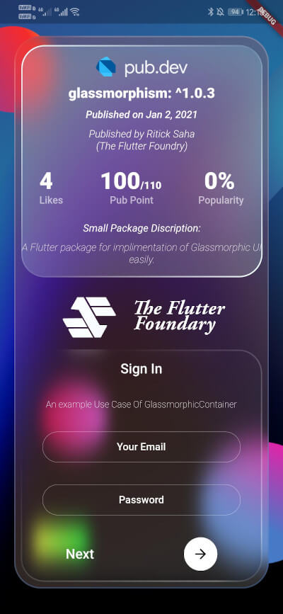
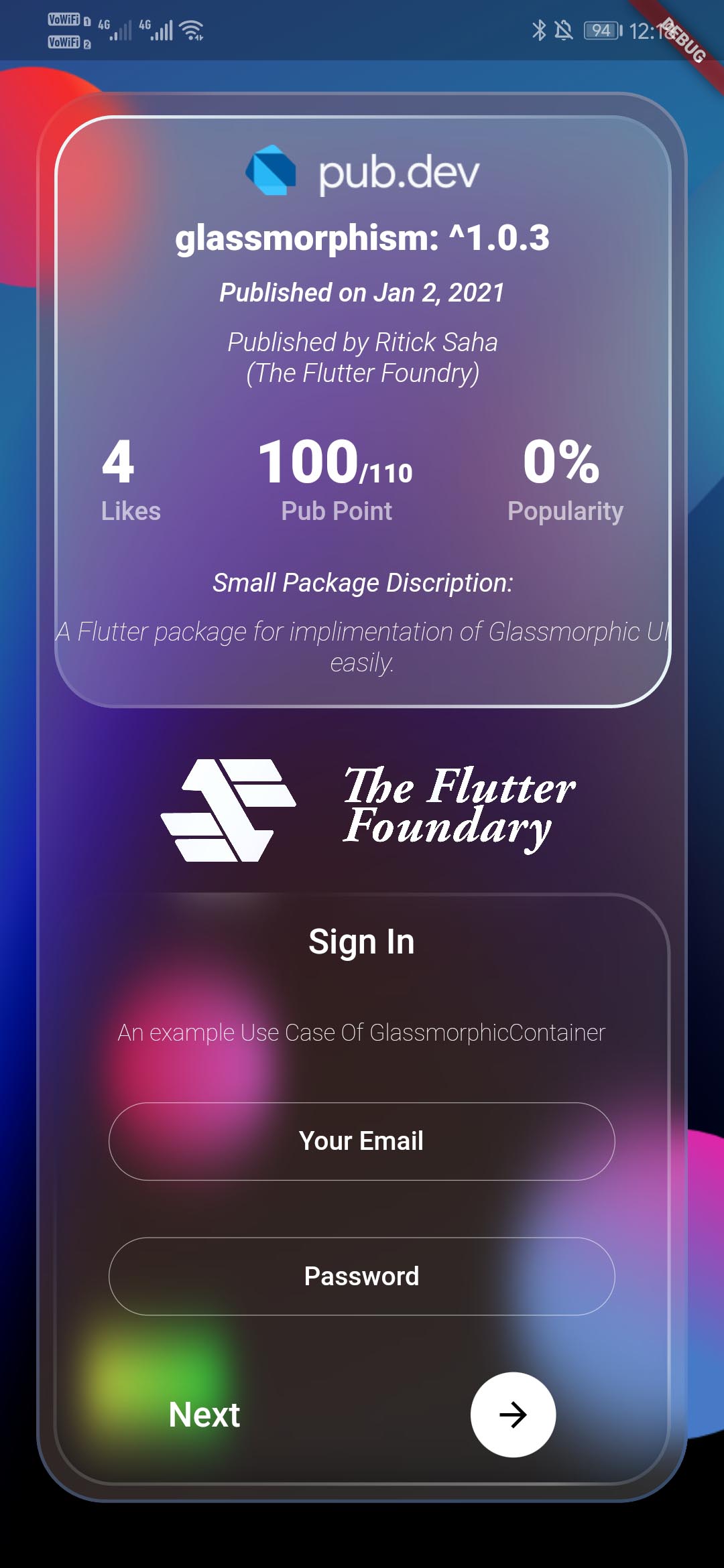
Glassmorphic Example App. With realtime pub.dev stats📱
A package that simplefies your urge to create a interactive Glassmorphic Container.
Inspired by Glassmorphism CSS Generator.
Highly customizable and helps developing beautiful Glassmorphic UI.
Usage 💻
To use this plugin, add glassmorphism as a dependency in your pubspec.yaml file .
Use the below example to get started with the sample example.
You can follow this tutorial and work around with the package.
Glassmorphism UI Package For @Flutter || UI || A Glassy and easy to use Package #flutter
Features 🔮
Fully customizable components
Easy To use
Null Safe version
Multiple Childs widgets supported
Gesture Listener GestureDetector
Circular Border / Traditional Borders
Gradient Borders
Gradient Fill on container [Full Control to User]
To use GlassmorphicContainer with fixed Height and width:
GlassmorphicContainer (
width: 350 ,
height: 350 ,
borderRadius: 20 ,
blur: 20 ,
alignment: Alignment .bottomCenter,
border: 2 ,
linearGradient: LinearGradient (
begin: Alignment .topLeft,
end: Alignment .bottomRight,
colors: [
Color (0xFFffffff ).withOpacity (0.1 ),
Color (0xFFFFFFFF ).withOpacity (0.05 ),
],
stops: [
0.1 ,
1 ,
]),
borderGradient: LinearGradient (
begin: Alignment .topLeft,
end: Alignment .bottomRight,
colors: [
Color (0xFFffffff ).withOpacity (0.5 ),
Color ((0xFFFFFFFF )).withOpacity (0.5 ),
],
),
child: null ,
),
Use GlassmorphicFlexContainer with responsiveness or take child widgets size. :
GlassmorphicFlexContainer (
borderRadius: 20 ,
blur: 20 ,
padding: EdgeInsets .all (40 ),
alignment: Alignment .bottomCenter,
border: 2 ,
linearGradient: LinearGradient (
begin: Alignment .topLeft,
end: Alignment .bottomRight,
colors: [
Color (0xFFffffff ).withOpacity (0.1 ),
Color (0xFFFFFFFF ).withOpacity (0.05 ),
],
stops: [
0.1 ,
1 ,
]),
borderGradient: LinearGradient (
begin: Alignment .topLeft,
end: Alignment .bottomRight,
colors: [
Color (0xFFffffff ).withOpacity (0.5 ),
Color ((0xFFFFFFFF )).withOpacity (0.5 ),
],
),
child: null ,
),
example, Simple Glassmorphic Container with Blur.
Example
import 'package:flutter/material.dart' ;
import 'package:glassmorphism/glassmorphism.dart' ;
import 'dart:ui' ;
void main () => runApp (MyApp ());
class MyApp extends StatelessWidget @override
Widget build (BuildContext context) {
return MaterialApp (
title: 'GlassmorphicContainer Example' ,
home: GlassmorphicSample (),
);
}
}
class GlassmorphicSample extends StatefulWidget @override
State <GlassmorphicSample > createState () => GlassmorphicSampleState ();
}
class GlassmorphicSampleState extends State <GlassmorphicSample > @override
Widget build (BuildContext context) {
return new Scaffold (
body: Container (
height: double .infinity,
width: double .infinity,
child: Stack (
children: [
Image .network (
"https://github.com/RitickSaha/glassmophism/blob/master/example/assets/bg.png?raw=true" ,
fit: BoxFit .cover,
height: double .infinity,
width: double .infinity,
scale: 1 ,
),
SafeArea (
child: Center (
child: GlassmorphicContainer (
width: 350 ,
height: 750 ,
borderRadius: 20 ,
blur: 20 ,
alignment: Alignment .bottomCenter,
border: 2 ,
linearGradient: LinearGradient (
begin: Alignment .topLeft,
end: Alignment .bottomRight,
colors: [
Color (0xFFffffff ).withOpacity (0.1 ),
Color (0xFFFFFFFF ).withOpacity (0.05 ),
],
stops: [
0.1 ,
1 ,
]),
borderGradient: LinearGradient (
begin: Alignment .topLeft,
end: Alignment .bottomRight,
colors: [
Color (0xFFffffff ).withOpacity (0.5 ),
Color ((0xFFFFFFFF )).withOpacity (0.5 ),
],
),
child: null ),
),
),
],
),
),
);
}
}
Parameters ⚙️
height (double) [required] - Height for the Widget [required] .width (double) [required] - Width for the Widget [@required] .borderRadius (double) [required] - Border Radius for the widget 0 - any [@required] .linearGradient (LinearGradient) [required] - Fills the container with the gradient passed.border (double) [required] - Gives Width to the ContainerBorder.blur (double) [required] - Gives BlurFilter to the Container.borderGradient (LinearGradient) [required] - Fills the container's border with the gradient passed.child (widget) - [optional parameter] If there is a child widget then the widget will be rendered inside the container.alignment (optional) - Handles the alignment [Default_value] - [Alignemt.topleft].padding (EdgeInset) - Used to provide pading to the child widget [Default_value] - [None].BoxShape (Fixed) - This value is fixed to [BoxFit.rectangle].constraints (ChatUser) - The constructor width and height arguments are combined with the constraints argument to set this property.margin (double) - Empty space to surround the [decoration] and [child].
GlassmorphicContainer (
width: width,
height: height,
borderRadius:borderRadius,
blur: blur,
alignment: alignment,
border:border,
linearGradient: linearGradient,
borderGradient:borderGradient,
child: null ),
);
My Socials 👩👦👦
Credits 👨🏻💻
The Flutter Foundry 💙 - Instagram Link
Found this project useful? ❤️
If you found this project useful, then please consider giving it a ⭐️ on Github and sharing it with your friends via social media.
License ⚖️
API details 📝
See the glassmorphic.dart for more API details
Issues and feedback 💭
If you have any suggestion for including a feature or if something doesn't work.
Feel free to open a Github issue for us to have a discussion on it.