

 v1.0.2
iconify_design
iconify.design API의 아이콘을 쉽게 사용할 수 있도록 해주는 플러터 패키지입니다.
22좋아요 1.3천30일 다운로드160Pub 점수
AndroidiOSWebmacOSWindowsLinux
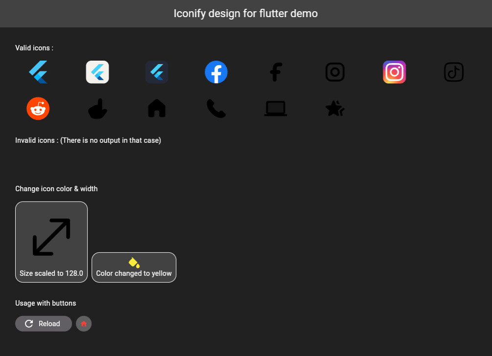
Iconify.design API의 아이콘을 쉽게 사용할 수 있는 Flutter 패키지입니다. 이 패키지는 아이콘 문자열을 받는 IconifyIcon이라는 위젯을 제공하며, 선택적으로 아이콘의 크기와 색상을 지정할 수 있습니다.

아래는 영문 원문 스냅샷입니다. 최신 내용은 GitHub에서 확인하세요.
A Flutter package that allows you to use icons from the Iconify.design API with ease. This package provides a widget called IconifyIcon that takes an icon string and optionally allows you to specify the size, color, placeholder, and error widget of the icon.

Add the following to your pubspec.yaml file:
dependencies:
  iconify_design: ^1.0.2
Then run:
flutter pub get
import 'package:iconify_design/iconify_design.dart';
import 'package:flutter/material.dart';
Here is an example of how to use the IconifyIcon widget:
import 'package:flutter/material.dart';
import 'package:iconify_design/iconify_design.dart';

void main() {
  runApp(MyApp());
}

class MyApp extends StatelessWidget {
  @override
  Widget build(BuildContext context) {
    return MaterialApp(
      home: Scaffold(
        appBar: AppBar(
          title: Text('Iconify Flutter Example'),
        ),
        body: Center(
          child: IconifyIcon(
            icon: 'mdi:home',
            size: 48.0,
            color: Colors.blue,
            placeholder: CircularProgressIndicator(),
            errorWidget: Icon(
              Icons.error_outline,
              color: Colors.red,
            ),
          ),
        ),
      ),
    );
  }
}
The IconifyIcon widget has the following parameters:
null also falls back to Black.You can customize the loading and error states:
IconifyIcon(
  icon: 'mdi:home',
  placeholder: const SizedBox(
    width: 24,
    height: 24,
    child: CircularProgressIndicator(strokeWidth: 2),
  ),
  errorWidget: const Icon(
    Icons.error_outline,
    color: Colors.red,
  ),
)
Feel free to open issues or submit pull requests to help improve this package.
This project is licensed under the MIT License - see the LICENSE file for details.
Don't forget to support (if you can).

의존성 목록 7 개
^2.2.3^0.10.1^2.0.10+1^5.5.0+1{"sdk":"flutter"}{"sdk":"flutter"}^2.0.0사용 목적에 따라 검색하고 개발 활동을 비교한 뒤 원본 저장소에서 요구 사항을 확인하세요.
“A repository is the most basic element of GitHub.”
GitHub Docs — About repositories ↗