패키지, 저장소 및 앱 카테고리 검색

iconify_design 표지
패키지 상세v1.0.2

iconify_design

iconify.design API의 아이콘을 쉽게 사용할 수 있도록 해주는 플러터 패키지입니다.

AndroidiOSWebmacOSWindowsLinux
30일 다운로드
1.3천
좋아요
22
Pub 점수
160

패키지 설치

flutter pub add iconify_design

패키지 개요

공개 정보를 바탕으로 생성한 선택 가이드입니다.

Iconify Design는 Flutter 앱에 iconify.design API의 아이콘을 쉽게 통합할 수 있도록 도와주는 Flutter 패키지입니다. 개발자들은 여러 플랫폼에서 수천 개의 확장 가능한 벡터 아이콘을 쉽게 검색하고 로드하며 표시할 수 있습니다. 이 패키지는 동적 아이콘 가져오기, 테마 인식 렌더링 및 효율적인 캐싱을 지원하여 최적의 성능을 제공합니다. 최소한의 설정으로 앱 크기를 늘리지 않고도 UI 디자인의 유연성을 높여줍니다.

사용 사례

  • 크로스 플랫폼 앱에 확장 가능한 아이콘 통합
  • 요청 시 아이콘을 사용하여 자산 번들 크기 줄이기
  • 풍부한 아이콘 라이브러리를 통해 UI 개선
  • 다크/라이트 모드 아이콘 변형 지원
  • 반응형이고 접근성 있는 인터페이스 구축

주요 기능

  • Iconify.design API와의 직접 통합
  • 동적 아이콘 로딩 및 캐싱
  • 크로스 플랫폼 지원 (Android, iOS, Web, macOS, Windows, Linux)
  • 경량이고 모듈러한 디자인
  • 자동 테마 기반 아이콘 전환
  • 검색 가능한 아이콘 카탈로그

적합한 대상

  • 대규모 아이콘 라이브러리를 찾는 개발자
  • 확장 가능한 벡터 그래픽이 필요한 프로젝트
  • 다중 플랫폼을 대상으로 하는 앱
  • 유연한 아이콘 관리를 원하는 UI 디자이너
  • 성능과 유지보수성을 우선시하는 팀

고려 사항

  • 초기 아이콘 가져오기에 인터넷 연결이 필요합니다
  • 많은 아이콘이 초기에 로드되면 시작 시간에 영향을 줄 수 있습니다
  • 외부 API 사용 가능 여부에 따라 달라집니다
  • 로컬 자산에 비해 사용자 정의 옵션이 제한되어 있음
  • 느린 네트워크를 통해 아이콘을 가져올 때 지연 가능성

원본 README

연결된 소스 저장소의 README 원문 스냅샷입니다. 최신 내용은 저장소에서 확인하세요.

Iconify Design

A Flutter package that allows you to use icons from the Iconify.design API with ease. This package provides a widget called IconifyIcon that takes an icon string and optionally allows you to specify the size, color, placeholder, and error widget of the icon.

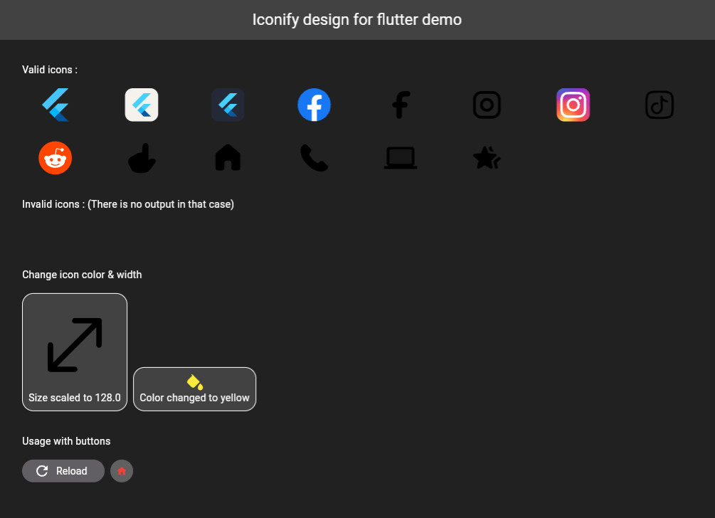
iconify-design

Installation

Add the following to your pubspec.yaml file:

dependencies:
  iconify_design: ^1.0.2

Then run:

flutter pub get
Usage
import 'package:iconify_design/iconify_design.dart';
import 'package:flutter/material.dart';
Example

Here is an example of how to use the IconifyIcon widget:

import 'package:flutter/material.dart';
import 'package:iconify_design/iconify_design.dart';

void main() {
  runApp(MyApp());
}

class MyApp extends StatelessWidget {
  @override
  Widget build(BuildContext context) {
    return MaterialApp(
      home: Scaffold(
        appBar: AppBar(
          title: Text('Iconify Flutter Example'),
        ),
        body: Center(
          child: IconifyIcon(
            icon: 'mdi:home',
            size: 48.0,
            color: Colors.blue,
            placeholder: CircularProgressIndicator(),
            errorWidget: Icon(
              Icons.error_outline,
              color: Colors.red,
            ),
          ),
        ),
      ),
    );
  }
}
Parameters

The IconifyIcon widget has the following parameters:

  1. icon: The icon string (e.g., 'mdi:home', 'iconoir:fill-color-solid', etc.).
  2. size (optional): The size of the icon. Default is 24.0.
  3. color (optional): The color of the icon. Default is Black. Passing null also falls back to Black.
  4. placeholder (optional): The widget to display while the icon is loading. Default is a small circular progress indicator.
  5. errorWidget (optional): The widget to display when the icon cannot be loaded. Default is an empty widget.
Custom Placeholder and Error Widget

You can customize the loading and error states:

IconifyIcon(
  icon: 'mdi:home',
  placeholder: const SizedBox(
    width: 24,
    height: 24,
    child: CircularProgressIndicator(strokeWidth: 2),
  ),
  errorWidget: const Icon(
    Icons.error_outline,
    color: Colors.red,
  ),
)
Contribution

Feel free to open issues or submit pull requests to help improve this package.

License

This project is licensed under the MIT License - see the LICENSE file for details.

Support

Don't forget to support (if you can).

"Buy Me A Coffee"

Maintainers

카테고리

의존성

의존성 목록 4 개

소스 저장소

이 패키지를 사용하는 프로젝트

아직 데이터가 없습니다.