





 v2.1.1
dismissible_page
어떤 방향으로든 페이지를 닫을 수 있는 Flutter 위젯. 지루한 뒤로 가기 버튼과 단순한 전환 효과는 잊어버리세요.
694좋아요 3.8만30일 다운로드160Pub 점수
AndroidiOSWebmacOSWindowsLinux
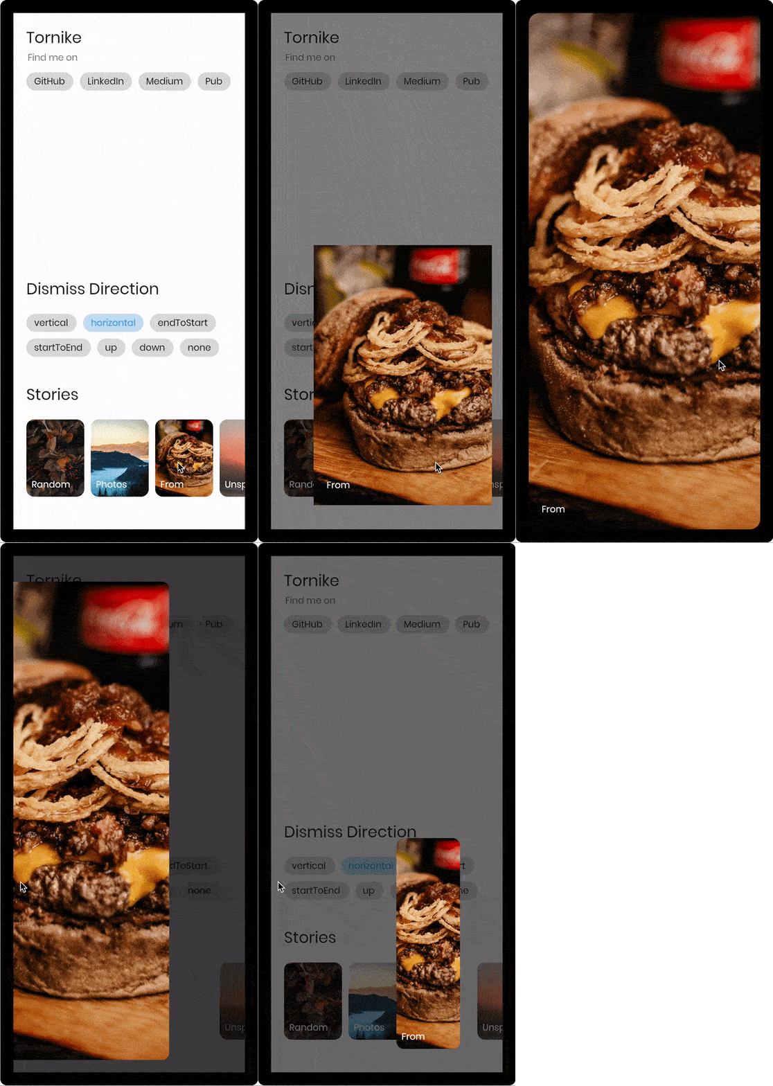
스와이프 제스처로 닫히는 Flutter 페이지 위젯으로, 히어로 스타일 애니메이션을 제공하며, 페이스북과 인스타그램 스토리에서 영감을 받았습니다.

아래는 영문 원문 스냅샷입니다. 최신 내용은 GitHub에서 확인하세요.
Flutter widget that allows you to dismiss page to any direction, forget the boring back button and plain transitions.
| Live Demo | Multi Direction | Vertical |
|---|---|---|
 |
 |
 |
const imageUrl =
    'https://user-images.githubusercontent.com/26390946/155666045-aa93bf48-f8e7-407c-bb19-bc247d9e12bd.png';

class FirstPage extends StatelessWidget {
  @override
  Widget build(BuildContext context) {
    return Scaffold(
      backgroundColor: Color.fromRGBO(228, 217, 236, 1),
      body: GestureDetector(
        onTap: () {
          // Use extension method to use [TransparentRoute]
          // This will push page without route background
          context.pushTransparentRoute(SecondPage());
        },
        child: Center(
          child: SizedBox(
            width: 200,
            // Hero widget is needed to animate page transition
            child: Hero(
              tag: 'Unique tag',
              child: Image.network(
                imageUrl,
                fit: BoxFit.cover,
              ),
            ),
          ),
        ),
      ),
    );
  }
}

class SecondPage extends StatelessWidget {
  @override
  Widget build(BuildContext context) {
    return DismissiblePage(
      onDismissed: () {
        Navigator.of(context).pop();
      },
      // Note that scrollable widget inside DismissiblePage might limit the functionality
      // If scroll direction matches DismissiblePage direction
      direction: DismissiblePageDismissDirection.multi,
      isFullScreen: false,
      child: Hero(
        tag: 'Unique tag',
        child: Image.network(
          imageUrl,
          fit: BoxFit.cover,
        ),
      ),
    );
  }
}
  const DismissiblePage({
    required this.child,
    required this.onDismissed,
    this.onDragStart,
    this.onDragEnd,
    this.onDragUpdate,
    this.isFullScreen = true,
    this.disabled = false,
    this.backgroundColor = Colors.black,
    this.direction = DismissiblePageDismissDirection.vertical,
    this.dismissThresholds = const <DismissiblePageDismissDirection, double>{},
    this.dragStartBehavior = DragStartBehavior.down,
    this.dragSensitivity = 0.7,
    this.minRadius = 7,
    this.minScale = .85,
    this.maxRadius = 30,
    this.maxTransformValue = .4,
    this.startingOpacity = 1,
    this.hitTestBehavior = HitTestBehavior.opaque,
    this.reverseDuration = const Duration(milliseconds: 200),
    Key? key,
  }) : super(key: key);

  /// Called when the widget has been dismissed.
  final VoidCallback onDismissed;

  /// Called when the user starts dragging the widget.
  final VoidCallback? onDragStart;

  /// Called when the user ends dragging the widget.
  final VoidCallback? onDragEnd;

  /// Called when the widget has been dragged. (0.0 - 1.0)
  final ValueChanged<DismissiblePageDragUpdateDetails>? onDragUpdate;

  /// If true widget will ignore device padding
  /// [MediaQuery.of(context).padding]
  final bool isFullScreen;

  /// The minimum amount of scale widget can have while dragging
  /// Note that scale decreases as user drags
  final double minScale;

  /// The minimum amount fo border radius widget can have
  final double minRadius;

  /// The maximum amount of border radius widget can have while dragging
  /// Note that radius increases as user drags
  final double maxRadius;

  /// The amount of distance widget is able to drag. value (0.0 - 1.0)
  final double maxTransformValue;

  /// If true the widget will ignore gestures
  final bool disabled;

  /// Widget that should be dismissed
  final Widget child;

  /// Background color of [DismissiblePage]
  final Color backgroundColor;

  /// The amount of opacity [backgroundColor] will have when start dragging the widget.
  final double startingOpacity;

  /// The direction in which the widget can be dismissed.
  final DismissiblePageDismissDirection direction;

  /// The offset threshold the item has to be dragged in order to be considered
  /// dismissed. default is [_kDismissThreshold], value (0.0 - 1.0)
  final Map<DismissiblePageDismissDirection, double> dismissThresholds;

  /// Represents how much responsive dragging the widget will be
  /// Doesn't work on [DismissiblePageDismissDirection.multi]
  final double dragSensitivity;

  /// Determines the way that drag start behavior is handled.
  final DragStartBehavior dragStartBehavior;

  /// The amount of time the widget will spend returning to initial position if widget is not dismissed after drag
  final Duration reverseDuration;

  /// How to behave during hit tests.
  ///
  /// This defaults to [HitTestBehavior.opaque].
  final HitTestBehavior hitTestBehavior;
의존성 목록 3 개
{"sdk":"flutter"}{"sdk":"flutter"}^5.0.0+1사용 목적에 따라 검색하고 개발 활동을 비교한 뒤 원본 저장소에서 요구 사항을 확인하세요.
“A repository is the most basic element of GitHub.”
GitHub Docs — About repositories ↗